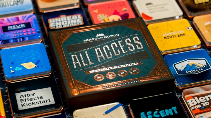
All-Access Pass
Unlimited access to 50+ courses, unlimited critique, live events, and 24/7 community. Join School of Motion All-Access today.
Here are some color theory tips.
Every Motion Designer needs to know a little bit of color theory. With more MoGraphers than ever being self taught a lot you might not know the first thing about color theory. Today we're going to fix that. In this lesson Joey is going to show you his favorite color tips and tricks to get you going in the right direction with color. You'll cover a ton of stuff like how to avoid "buzzing" colors, to using Kuler inside of After Effects to work up a palette, using a "value-check" layer, and color-correcting a composite. This lesson is jam-packed with tips you can use right away in your work.If you want to take your designs to the next level and really get an in-depth look at how to use color and value in your work make sure you check out our Design Bootcamp course. You can find more info on that in the Resources tab.
{{lead-magnet}}
-----------------------------------------------------------------------------------------------------------------------------------
Tutorial Full Transcript Below 👇:
Joey Korenman (00:11):
What's up Joey here at school of motion and welcome to day 14 of 30 days of after effects. Today's video is going to be a little bit different than the previous ones. And what I'm hoping I can show you are some hacks and workflow tips when dealing with color inside of after effects. Now I don't come from a graphic design background and I never really learned color theory the way you're supposed to do so when I'm working with colors, a lot of times, I feel like I'm just guessing and I'm hoping it turns out, right? So over the years I figured out some tricks and I've learned from other artists, and I'm going to show you a bunch of ways that non designers or even designers that struggle with color can really make things a lot easier. And hopefully de-stress you a little bit then obviously the end goal is to make your work look better.
Joey Korenman (00:55):
Now, if you're really interested in getting into the design side of motion graphics, you'll want to check out our design bootcamp course taught by award-winning industry pro Michael Fredrick. You'll learn the art of visual problem solving in this absolute kicker of a course that tackles everything from how to approach a client brief compose, beautiful images that use color properly, create a set of boards that work together as a unit and so much more. Also don't forget to sign up for a free student account. So you can grab the project files from this lesson, as well as assets from any other lesson on the site. Anyway, without further ado, let's hop into after effects, and I will show you some cool stuff. So this is actually the first tutorial where I've used the latest version of after effects CC 2014. Uh, there's a very important reason why, which I'll get into in a minute.
Joey Korenman (01:45):
Um, but what I want to show you guys is just some tricks that I use in after effects, uh, to, to kind of help me pick good colors and make sure my colors are working together, uh, in a pleasing way. Um, so first, uh, why don't we make a new comp real quick and I'll show you guys something that, you know, I still to this day have a tremendous amount of trouble with. Um, and that is picking colors when you have to sort of start from scratch, right? So let me just call this color pick or something, right. That, and let's say that you, you know, really like you have a simple design, you're going to have a background and maybe on that background, you're going to have some type of bar, you know, and it's just make everything black and white for now. And then you're going to have, you know, someone's name like a, I dunno, stinky fart, right?
Joey Korenman (02:35):
So, you know, when, when you have to start from scratch and come up with the design all by yourself, uh, it's very helpful if you have some kind of design background and maybe you've learned a thing or two about color theory, um, how to compose things. And I'm sure a lot of you have, but, uh, I actually never went to school for that. Um, and you know, I'm sure like a lot of you, I sort of fell into motion design and I've had to learn along the way and because I don't have such a great background in it. I don't, you know, I was never taught the fundamentals. I'm, I'm very much self-taught, um, I've had to use a lot of hacks and tricks to, to sort of make sure that I can fake it while I'm learning. Right. Um, and so, you know, what I used to do when I had to pick colors for stuff like this was, you know, I, I would make a new solid, and I'd put it back here and I'd say, okay, what's a cool color.
Joey Korenman (03:31):
Um, let me put the, uh, generate, fill effect on here. And then let me just, let me just think. Hmm. Well, I'm feeling like, like, you know, Green's pretty cool right now, but not like this screen more like in here somewhere, but that's too bright, so I'm gonna make it a little darker. Okay, cool. That's my background color. Um, without really thinking about, you know, and that was literally my thought process. That's my background color and I, and what, that's a terrible way to start, uh, because what you really need to be thinking about before you start is what's my color palette and how are my colors gonna work together? Um, because you know, one of the amazing things about colors is that this green, if I put it next to another color will look totally differently. And if I put a, you know, a yellow color over the screen, it'll feel different than if I put red over it.
Joey Korenman (04:18):
So, um, it's really not a good idea to do this. And, you know, that's why a lot of like, you know, the, the, the best designers kind of go out first and they look for, um, they look for swipe. They look for basically examples that have the color palette in it. Um, so one trick that I use all the time is all go to Adobe color website. Um, there's other websites that are kind of like this, but color works really well. I'm not even sure that's how you pronounce it, cooler color. Um, but basically I can do the same sort of thing, right. I can say, okay, I like a, you know, I want a green background. And so what I can do is, uh, this middle color here, this is your base color. This is the color that your palette will be based off of.
Joey Korenman (04:59):
And that's going to have this little icon appear in the color wheel. And if I sort of drag this over and find something along the lines of that green color, right. And it was a little darker, cool, it's automatically going to let me create pallets from this. So this little color rule box, if you don't know, you know, anything about color theory, you can Google these and you'll see what they are. I don't want to jump too far into that, but, um, these are basically different kind of easy ways of coming up with color palettes that are usually a great starting point. It's just a way of picking colors. They should work together. They don't always, but they should. Um, so if I just try different ones, right, let's say I click on this triad button, right. And you can see a triad kind of creates this triangle shaped color, um, color palette.
Joey Korenman (05:48):
Uh, so here's my base color. And then color is telling me that these colors should work well with it. Okay. Um, and you can try different ones. Complimentary a lot of times complimentary is sorta too harsh. Um, I do, I, I generally go with compound just because there's a lot of contrast. There's a lot of variation, but the colors don't get too, too far apart. And then if you need to, if you really do need some really hot accent color, um, you can, you can sort of, you know, adjust these colors and you can add new colors if you need to. Um, so anyway, so let's say that we like this color palette. Okay. And I want to use it well, the old way of using it. Um, you can sort of look at the values down here and you can just copy and paste those into after effects.
Joey Korenman (06:36):
But what I used to do, I would hold on a Mac shift command for see how my mouse turns into this little crosshair. And I just drag a box right across that. And what that did was it took a screenshot of my, of this color box here. And then I would go into after effects. And I would, I would just import that screenshot. So there it is. Right. And I would double click it. So it opens it up in a footage browser like this. And then I would just kind of stick that somewhere here and maybe lock it. Okay. So now I've got this little window here. That's just going to stay up and now I can just come to my background layer and I can just, you know, just pick these colors and I can go to my shape layer and click on the fill.
Joey Korenman (07:24):
And let's say, let's fill that with that green color. And then on the type I could fill the type with this pink color. Right? Okay. Now these colors aren't working that great together, but let's, let's stop for a minute. This method of sort of creating a palette and being able to use it and pick from it is great. Um, and up until literally today, this is how I did it. Um, but I had heard this rumor that, uh, the new Adobe after effects CC 2014. Um, and if you're, you know, if you subscribed to creative cloud, you get this upgrade for free. Uh, I had heard this rumor that color, that tool is now embedded in after effects. And I thought, well, that's amazing. Why don't we try that? And this is amazing. You go up to window and you go to extensions and you pick Adobe color and this window opens up and it takes a minute for it to sort of, uh, start working.
Joey Korenman (08:19):
Um, but now you literally have that whole website right in this little window inside of after effects. Uh, and, uh, I believe, uh, that and someone please correct me if I'm wrong, but, um, the technology that sort of allows after effects to do this is going to open the door for a lot of really cool plugins and scripts that actually pull information off of the internet in real time and apply it to after effects. So this is really, really cool. And it's, it's amazing for someone like me, um, you know, w who has trouble picking good colors. It's like, it's, uh, it's always been a challenge for me, um, that I can use a tool like this just to kind of, you know, get myself started and make sure that, you know, at the very least, um, you know, the color combinations that I'm picking are, are sort of scientifically designed to work together.
Joey Korenman (09:05):
Another cool thing is you can click the explore button and you can look through, uh, other people's themes here. Um, and, uh, you know, on the site, you can look through hundreds of these, but, you know, sometimes these are just kinda cool. Um, you can look at most popular and you can look at, you know, what's, what's been popular this week and these are pallets. Other people have made and saved. And what I think is cool about it is, you know, like I, I'm an American and, and I've lived here my whole life. And there are colors that are just more common here than say south America or Japan or China. And so there's color palettes that I'm just very unlikely to come up with on my own because of the environment I've been raised in. And so, you know, I see a color palette, like a, you know, like this one here, this looks pretty American to me, but then, you know, something like this here, right?
Joey Korenman (09:57):
Hebridean beach, I don't even know what that means, but, um, you know, just the way these colors work together, that's something that I wouldn't necessarily come up with very easily on my own. Um, and so then you can click, and now you have this, this theme loaded up in color and you can adjust it. If you want to, you can adjust the colors, uh, you can adjust the base color, right. And you can move all these things around. And then all I have to do is use my, you know, use my color picker and I can pick those colors. It's pretty great. All right. So let's, uh, let's actually pick, um, uh, let's pick some theme here, right? Why don't we try, why don't we try this one? This is kind of a neat one. All right. All right. So, so where do I go with this?
Joey Korenman (10:39):
Right. How would actually apply it to something like this? Well, first I would pick my background, um, and there are a few rules that you can use in color theory, um, that they're, they're very helpful and of course rules are meant to be broken and the best artists know how to do this, um, all the time and they'll break the rule and it looks great. Um, but if you think of colors in terms of how much they weigh, right? Like this red feels pretty heavy. Um, but then this blue that's next to, it feels lighter. So, uh, you know, you, you wanna, you know, in general, put heavier colors underneath lighter colors, just think of it, you know, like you're stacking them and you want it to be a stable structure. Right. Um, so if I was going to have that red be the background, uh, I mean, and I'm not sure I would ever want to do that cause it's such a strong red color.
Joey Korenman (11:29):
Um, so what I might actually do is use this blue, alright, this blue can be the background. And that way I can put the lighter colors on top of it, right? Like this is a lighter color. This feels lighter, the red and the orange. It's kind of hard to tell those, those might be heavier colors. Um, but let's, let's pick a color for our band. All right. And actually I'm going to use my fill effect here, uh, just to make it easier to pick these colors and change things. Right. So maybe the band is yellow. Okay. And let me turn off stinky mink fart for a second. You can see that these two colors work great together. There's a ton of contrast. Um, you know, and, and they just, they look nice. They look good together. Um, all right. So what if I duplicate this band?
Joey Korenman (12:12):
Right. And I take the bottom copy and I nudge it down a little bit, and then I make that bottom copy, have that orange color. Okay. So the yellow and the orange look good together, but there's something going on here. Let me turn the yellow band off for a minute. All right. And this is something I'm kind of glad this happened, because this is a, this is a problem that a lot, it happens all the time, even though this pallet looks great. When you look at it like this, you have to be careful because this color looks great next to this color. It looks great next to this color and so on and so forth. But when you put the orange and this dark blue next to each other, it's buzzing. All right. Um, and what I mean by buzzing is when you, when you look at it, the boundaries between the colors sort of vibrates, and it almost gives you a headache and it just doesn't look right.
Joey Korenman (12:59):
And, uh, in general, the reason that's happening is because the values for these two colors are too close together. No, what the heck does that mean value? Uh, it basically means the amount of black in, in each color. So, um, you know, and it's, and it's hard when you're looking at colors, especially if you, if you're, don't have a ton of experience doing it, it's hard to tell what's causing the problem and how to fix it. So there's a really cool trick that, um, I honestly don't remember where I learned it otherwise I would, I definitely would give them credit, but it's a, it's a trick that a ton of, um, Photoshop painters use and, and illustrators, um, to basically look at a black and white version of your composition. And so what I do is I make an adjustment layer on top of my comp and I use the color correction, black and white filter.
Joey Korenman (13:49):
Okay. And it, and it strips all the color out of your comp, uh, but it does it in a way where it sort of maintains very closely, uh, the value of those colors. Right. And so, you know, when this is off, it looks like, wow, look, how much contrast there is between these two colors? Of course they should. They should work together well, in reality, there's very little contrast in the value between those two colors. So that's why we're getting this buzzing kind of effect here. So if we wanna fix that, uh, easy thing to do is turn on this adjustment layer and then, uh, I'll select the band. All right. So we're going to tweak the orange color a little bit. And if I click on the color here, all right. Um, in general, when I'm adjusting colors and I'm trying to just get them to work together, I use the H S B values here to adjust them.
Joey Korenman (14:43):
Okay. This stands for hue, saturation, and brightness, and you can think of brightnesses value, uh, down here, you've got the red, green and blue component, and you can adjust either these three or these three, they sort of work together. Okay. Um, and so when you're really dialing in the color and you say, Hey, I'd like a little more blue in there. It's kind of nice to just come into the blue channel and just add a little more blue. Okay. Um, but when, when the problem we're having is a value problem, I can just go to the brightness and I can adjust that. Okay. And you can see if I bring it down, there's a point where it, it totally blends in, um, with the, with the background. Right. Um, and so I either need to crank it up higher, which isn't really gonna work because it's already about as bright as it can go or I can make it darker.
Joey Korenman (15:35):
Okay. So let's try that. Now. There's a lot more contrast. And if I turn this adjustment layer off, I can see, okay, it's not buzzing as badly anymore, but now it's turned into this ugly color. So now I'm going to leave this adjustment layer off, and now I can sort of manipulate the color. I can try to bring some of the brightness back. Right. Um, and, and what's probably happening too, is these are totally complimentary colors. And so that's creating that, you know, sometimes it's really complimentary colors are so harsh that they can kind of create that buzzing too. So if I just roll the Hugh one direction or the other, right. Maybe push it a little more yellow, right. And actually now having, having pushed it a little more yellow and, and pushing the brightness up to a hundred percent now, it's not buzzing anymore.
Joey Korenman (16:21):
Okay. And if I look through the adjustment layer, there's more contrast. It's, it's still not great. Um, so maybe another, another thing I could just do is grab that background and just lower the brightness just a little bit. Cool. And now you're getting, you know, plenty of contrast and it's not buzzing. Um, and so this little adjustment layer is just kind of a neat little trick to help you do that. Okay. Um, now we can turn that yellow band back on and look now the colors, they, they still work together because this color and this color are still very close to the two from the color palette. Um, but because we just did those subtle little adjustments, now they work better. All right. Now let's turn on our steam, our stinky fart. And, uh, it's funny. I mean, that color actually reads fine and works well.
Joey Korenman (17:07):
Um, but let me add my fill effects. All right. And let's pick, let's now try this, this cool, crazy, you know, red slash blue color here and there you go. And that actually works pretty well. Um, and now I've got this color I haven't used in a trick that it's funny. I find myself overusing tricks. Like I'll find a trick. I like, and I'll literally just beat it to death, bring it back to life and beat it to death again. And the trick of the day for me is, uh, making sort of a highlight layer. Um, so what I do is I'll make a new layer, let me add my fill effects. Uh, and then we'll pick this brighter blue color. I'm going to put this over the background like this, and then I'm going to make a mask over it. I'm going to click here.
Joey Korenman (17:56):
I'm going to hold shift to constrain it to 45 degrees. And I'm just going to sort of cut out like a triangle portion. And then I'll just, just play with the opacity a little bit, right. There we go. So now we've made a stinky McFarlane flag and the colors are working together. Um, and you can always check it with your, with your adjustment layer, right. Um, and this works great. And, and, you know, using this, this color, this sort of embedded color tool is just incredible. Um, and now, because these are all, you know, these are all using the effect to set their colors. It makes it pretty easy to adjust things. So, um, cool. So that's the first thing I wanted to show you guys is how to use this to pick a color palette, but then you can't just use those colors blindly.
Joey Korenman (18:42):
You have to adjust them sometimes and make sure that they don't buzz and that they actually work well together. So that's trick number one. So, uh, let, let's take another look at another example of this. Let me copy my black and white adjustment layer here. And this is the comp I used for the, um, or one of the comps I used for the gears tutorial. Okay. And what I wanted to show you, uh, was, you know, how th like using this adjustment layer, it can help you find, um, it can help you avoid buzzing colors, right. Colors that are sort of too close together or too far apart, uh, you know, in either one of those can make them buzz and give you a headache. It can also help you make sure that you've got enough contrast in your, in your composition. So, you know, these colors I've already picked from actually another, uh, color theme.
Joey Korenman (19:33):
So, so let's now try, let's pick a different theme. Now let's mix it up a little bit. And what I'll do is I'll just change all these colors and then we'll use the adjustment layer and we'll see what, you know, what else we can, we can come up with and fix it. So it's, so it works together. All right. So why don't we try, I don't know this Japanese village, it's kind of interesting. All right. So I picked Japanese village as my color palette, and, uh, I set up my gears comp so that I can change all the colors using this one kind of color control. Now this is going to make it pretty easy. So let me pick a background color. Um, and I think this kind of beige color would be a good background, and then we'll start picking the gear color. So there's four other colors.
Joey Korenman (20:15):
So I'm just going to sort of pick real quick 1, 2, 3, 4, all right. And now we've got all of our gear set up. Okay. Lovely. And, you know, none of the colors are buzzing. They all sort of work and have good contrast. But one thing that, that I don't love about it is that all of the gears feel like they're kind of the same darkness, right. If I turn on the adjustment layer, we take a look at this and actually let me make this the size of my comp. There we go. Um, you could see that there's not that much contrast in the brightness values of the gears themselves. Okay. Um, and so it just kind of looks, just kind of looks boring. You know, like if you look at this brown color and this blue color, the value of them's very close together, so it would be nice if we had a little bit more contrast to it.
Joey Korenman (21:07):
Um, so what I want to do is, uh, let me just sort of leave that on for a minute. And I'm gonna, I'm just gonna adjust these colors a little bit. So, you know, I know that the brown color is probably the darkest, so I'll leave that where it is, but then the blue color is pretty dark too. So why don't I just click on the blue color? I'm going to go to the brightness and I'm just going to hold shift and hit up and knock it up, you know, 10%. Okay. And now let's take a look at it. All right. It's a little bit better. Why don't I do that again? Up to 40%. Cool. Okay. And that's pretty good. I feel like if I go too much further, it's going to start buzzing a little bit. Um, and since I've done that, you know, colors, it's very interesting when you, when you up the brightness, it tends to take down the saturation. Um, and that's kinda, I feel like that's kind of what's happening, so I'm just going to up the saturation a little bit.
Joey Korenman (22:05):
Okay. And that's super subtle. I don't even know if you guys can tell that that did anything, but, um, but that's something you need to watch out for is, you know, when, when things get darker, um, you know, it, it can add saturation when they get brighter, it can take away saturation. All right. So now let's look through this again, and now look at the blue and the greens, the blue and the green are very close together now. So why don't I try to make the green much, much brighter. So right now the brightness is 48. Why don't we try 75? Right. And now we've got a lot, a lot more contrast between the blue and the green, and now let's see if we can actually see the green and we still can. Um, and it doesn't really look that green anymore. So I'm going to just shift the hue down a little bit more.
Joey Korenman (22:49):
And what I'm doing is I'm holding shift and using the up and down arrows and, and I'm pushing the Hugh down. Okay. So I'm adding a little bit of yellow to it and you can see, it's kind of, it kind of makes it feel a little bit more green and maybe I'll saturated a little bit more to, and we'll see what that, we'll see what that does for us. Cool. All right. And so now we've got a lot more contrast between the gears and, you know, and it's really easy to see with our black and white adjustment layer because you can see all these different values. And so it's just a way of tricking your brain and tricking your eye into getting more contrast. Um, and, uh, you know, another reason that this is very important is, you know, when, when I have this off, right, and I want, I want you all to do this.
Joey Korenman (23:36):
Okay. I want you to, uh, let me make this full screen, right. I want you to close your eyes, count to three, and then open them and notice where your eye goes first. If you're, if you're like me, your eye goes to this gear, because this is sort of, you know, it like compositionally, it's probably the most contrast depart of this composition. Okay. Which is which maybe that's where you want people to look. But if it's not, um, you know, you want to make sure that you put something contrast where they are supposed to look. So for example, if I wanted someone to look at this gear first, right? Um, I can change the color. Let me change the color of this gear. I, I was, I did have the foresight to, um, to actually add a control on each gear to let me offset the color.
Joey Korenman (24:24):
So let me offset this color. There we go. Don't we make that one, leave that one blue, and then now let's make this gear brown. All right. So this color offset is just, um, it's just an expression, um, that allows me to sort of individually offset the color of each gear. And so now, if you look at it, look, now your eye goes there. Okay. Um, and if it's not immediately obvious where your eye is going, sometimes it's easier to look at this with the black and white adjustment layer on, because color can kind of fool you, but, but value is a lot easier to see. All right. So now that's where my eyes going. All right. So now I'm gonna show you, uh, this is, this is kind of along the same lines, but, um, so this is the example I used in the color cycling, um, tutorial.
Joey Korenman (25:16):
And you know, it, this is totally uncolored corrected. The final result that I rendered after you guys had a ton of color correction to it. And I wanted to show you, um, just sort of the, the lengths that, that you can go to, to, to make an image look good. Right. Um, so the, the first thing I did actually, um, let's see here, I'm going to have to Google this again. So when I, when I did this tutorial, I was using this as a reference. Okay. And so I wanted my, I wanted the tutorial to have a similar feel color-wise right. And so when I was working, you know, on getting the effect and getting the animation and all that to work, right. I wasn't too concerned with color. And now at the end, I want to color correct everything. So, so it feels more like more like this.
Joey Korenman (26:06):
And so what I decided to do was start by color, correcting the mountains to something that's kind of in this, you know, very red color range. Okay. So I have everything separated out on the layers. And so why don't we start by color, correcting this mountain? Okay. There's a lot of ways to color, correct things in after effects. There's going to be more than one tutorial on this. Um, but a really simple way to do it is a, and actually, this is kind of an interesting color palette here, but why don't we look for a different color palette in a second, but why don't we, we, um, use the tint effect to color, correct this mountain. Okay. Um, now this is just sort of a, this is going to be sort of video game looking. Um, I have an adjustment layer that's turned off right now, which poster arises and applies this mosaic effect.
Joey Korenman (26:54):
So it looks very pixely and like a video game. Um, and so I know that the colors can be pretty stylized here. So what I'm gonna do is use this tint effect and, you know, I'm going to look over here. Like I can, I can use color in a bunch of different ways, this color, if I go back to the website, I mean, it's, you know, it's a little bit more, it's a little bit more orangy feeling than this. This is a little Pinker maybe. Um, so what I'm going to do is I'm going to pick whip both black and white to this, and then I'm going to go into, um, I'm going to go into black and I'm going to darken it a little bit. Okay. And then I'm going to go into white and I'm going to brighten it a little bit. Okay.
Joey Korenman (27:39):
And this just sort of gives me a base tone for it. And then I'm going to use this amount to 10, and I'm just going to kind of fade it back like this until it looks good to me. Okay. Until it's the kind of the color I want. Um, and you know, I'm looking at this, okay. This, this feels like it's got more yellow in it than this does. Right. This has more red to it. Um, so what I could do is just adjust these tint colors. Um, so maybe what I'll do is I'll go to the map white and I need to add more red to it. So I'm just going to go to the red channel and I'm going to up that. Right. And then I'll go to the black and I'll add more red to that. Okay. And so now let's come back here and you can see that the colors a little bit closer now.
Joey Korenman (28:25):
Cool. Um, and now let me solo this for a minute. You can see that I've got, I've kinda got the color cast that I want. Um, but there's barely any contrast to it. So I'm going to use the levels of facts to get the contrast. Okay. Um, and using levels. I can see, you see how everything's sort of ends right here. And then on the black side, everything kind of ends right here. That means that nothing in this scene is really black. Nothing in the scene is really white. So an easy way to just make sure you have contrast is to just sort of take these, um, these input arrows up here and just make sure that something in your scene as white and something in you're seen as black. Okay. And there you go. Now I've got kind of the color cast I want and I've got some contrast to it.
Joey Korenman (29:12):
Cool. Okay. So now the mountain looks pretty, it's super stylized. Um, and you know, there there's some other tricks I could show you to make it look less stylized, but that's actually what I was going for here. So now what if I want, you know, now I want a nice sky color to go with this, and I want to, I want some other colors that I know will work with this. Um, so what I can do, um, is actually use a color picker to pick this color, and then I can stick that right into color inside of after effects. So let's go to the create tab here and let's turn on compound. Okay. Um, and so first thing I need to do is set my base color. Cause the base color is the color that it builds the pallet off of. And I want it to be this color here.
Joey Korenman (29:59):
Um, so one, one quick way you can do it is you, if you look up in this info box here and I move my mouse over color, it'll tell me the RGB value of that color. Okay. Uh, very important to note, if you're not in eight bit mode in after effects, if you hold command and you click on eight bit, it goes to 16 bits and then it goes to 32 bit. Right. Um, and if you pick a color, can you pick a color? And one of these modes, the RGB values are different, right? In 32 bit mode, it goes from zero to one and in 16 bit mode, it goes all the way up to I think, 32,000 something. Um, and so those numbers, and if you look up in the info box that it happens up there too, these numbers do not work inside of color color.
Joey Korenman (30:48):
The tool works inside of in eight bit mode. Um, so what you got to do is, is just be in a bit mode when you do this. Okay. Um, so yeah, so you can look at the RGB values or what I like to do just to kind of cheat is, uh, I'm just gonna use this color picker here on the, um, character palette, just because it's handy and I'll pick sort of a mid-tone value of my mountain. Right. Then I'll click it. And down here is the hex value for that color. So I'm going to just select it and hit command C, copy it. Then I'll come here into my color palette. All right. Um, and I'm going to, I'm just going to double click this hex value and hit, delete, and then paste in the hex value, which it's not letting me do for some reason.
Joey Korenman (31:34):
So I guess I am going to have to do it the other way. Um, all right, well, let's look at the RGB values for this it's 1 46, 80 50. So I'll just type in 1 46, 80 50. And now that is my base color. And now I've been given colors by the tool that should work and there's no blue color, so that's not really gonna be all that handy for me. Um, so what I'm gonna do is, uh, I'm gonna switch this back over. Let's switch this to try, add, there we go. Um, and now I have to re update this one more time to a 1 46, 80, 50, 46, 80 50. There we go. Cool. So now we have our brown, we actually have a green color, which I don't think we really needed, but we've got a dark brown color and we've got these two blue colors. Okay. So let's start by, by making a sky using these blue colors.
Joey Korenman (32:32):
So what I did for the sky, I, um, I started with just a base solid, no, nothing special. So let me pick this color. And then I added another solid to it, and I sort of masked it around the shape of the mountain and feathered it a little bit. All right. And so that can be the darker color. Okay. And then I added this noise adjustment layer, um, which I believe also has levels effect on it. So let me turn that off. Uh, I added some noise to it, um, just because when I turned on this mosaic effect, um, if you don't have that noise on there, you get all this banding. And so by turning the noise on it makes it look a little bit more, uh dithered I think is the word. Um, all right, so let's turn all that stuff off. Let's turn to go back to this.
Joey Korenman (33:18):
Okay. So now let me turn the waterfall and everything else off for a minute. So now, if I look at this, right, let me go to 100%, excuse me. When I look at this, I mean, the colors work together. It's, it's sort of beautiful, but, um, it's that, that sky feels way too dark. So now I can just tweak it, right. This gave me a really great start. Now I can just tweak this noise adjustment layer. I'm going to add a levels of act on top of it, and I'm going to push the gamma. So it gets a little bit brighter. Okay. And I want to show you something, you notice how red, this is starting to look, um, it's, it's surprising if you pick these colors, right? I mean, the, you know, the, this dark color is very, very blue, but this color here, it actually has a decent red component to it.
Joey Korenman (34:08):
And when you brighten up the color, you're going to start to see more and more of that red. Um, and so sometimes, you know, if I'm brightening this and I'm like, oh, that's starting to look a little red. I might switch my levels effect to the red channel and pull some of that red back out. Okay. Um, and when you're doing sort of overall adjustments, this middle arrow, which is called the gamma, uh, this, this is sort of what you want to play with. Right. And if I push it this way, it puts more red in. If I pull it this way, it pulls some of that red out. Right. Keep that a little bit more blue. All right. So that's, without the levels of fact, and that's with the levels of fact. Okay. And it's kind of nice, it's got this nice warmth to it.
Joey Korenman (34:46):
Okay. And, and, you know, I'll keep kinda going back and comparing to this. Um, you could see the sky here is actually a lot brighter. Um, so maybe I'll also go to my, I'll go back to the normal RGB channels and I'll push this white value a little bit. Right. So I'm getting, I'm getting those brighter colors down there. Um, and I'm still seeing a lot of red in there, so I'm going to pull even more out. Cool. There we go. All right. So I use these as my base color. Um, right. But, but then I adjusted it actually adjusted it quite a bit, but the overall kind of, you know, th th the, the vibe of that color is still there and I got it from this plugin. Um, cool. All right. So then the same thing for the water, um, you know, I want the water, you know, using just like a little bit of color theory here, like the, the parts of it.
Joey Korenman (35:37):
I know, um, if you have a composition right now, for example, if I, if I look at this, the, the color of the water doesn't make a lot of sense. Um, this mountain is so red and it should be reflecting in that water, that water should look a lot more red. Um, and also it just kind of feels like this mountain, it feels like it doesn't, it's not sitting on anything. This water should be darker. It should feel a little bit more like, like, it ha it has the, the weight and the mass to hold this mountain up. And it doesn't feel that way. So what I'm going to do is I'm going to base the water off of this dark blue color. Okay. So why don't I do the same trick? Why don't I take this tint effect and just copy it and paste it onto the water.
Joey Korenman (36:22):
Okay. And then let me map black to that blue color and map white to that blue color. And then I'm gonna do the same trick. I'm going to grab the black and darken it a little bit, and I'm gonna grab the white and brighten it a little bit. Okay. And then I'm going to, I'm going to add my levels of facts. And so here now, here's where, you know, my eyes starting to get fooled too. And this is also a great place to grab your black and white adjustment layer, paste it on there and take a look right. Because you know what I want, I want it to feel like this, this water is much darker than this mountain. And when I look at it here, it feels like it is. But when I actually look through the adjustment layer, you can see, there's not as much contrast as you might think.
Joey Korenman (37:13):
Right. So don't, don't always trust your eye, your eye, your eye lies. You just can't trust your eyes. Um, didn't mean to do that, let me put the levels of effect on the water layer. And I'm just gonna push the gamma like this. And, you know, I like how dark it's getting, and that's kind of nice, but there's a couple problems. One is it's far too saturated. All right. So we'll deal with that in a minute. Um, but also there's not enough red in it because remember it's reflecting this mountain, there should be more red in it. So I'm going to push a little bit back in there. Okay. And then I'm going to add a hue saturation effect and just bring that saturation down a little bit. Okay. Maybe like that. Okay. And let's look through our adjustment layer when we do this, and now you can see there's a little more contrast there.
Joey Korenman (38:04):
It's feeling a little darker, it's working a little better. Um, and I may even want it to be a little bit darker. Um, so why don't I, why don't I push the GAM a little further and maybe even crush the blacks a little bit. This is called crushing the blacks when you move the black input over, because it adds more, more true black to your scene. Um, and then I just need to make sure that I didn't make this too, too red. Um, you guys can see this yellow mask that I drew here. If you click this little button, it'll your mask outlines, which is kind of handy when you're doing color correction. Um, I think I added little too much red there. Yeah. You just need a little bit like that. Cool. All right. So I'm kind of digging that. Um, so next we've got the waterfall.
Joey Korenman (38:52):
Now here's the interesting thing, right? Uh, you know, you'd think I could just make this the same color as, as this water or the same color as the sky, and that would make sense. Right. But the problem is that waterfall is the most important thing in my scene. It really is. That's what I want you to look at. And when I look at the value of this scene, your eye doesn't really know where to go yet because there's no focal point to it. So what I need to make sure I do is I need to make sure that waterfall is, has a lot of contrast to it. All right. So I'm going to leave that adjustment layer on, I'm just going to put levels on and what I'm going to do. I'm put levels on the waterfall layer and I'm going to take the white input and I'm really going to crank it.
Joey Korenman (39:32):
Okay. And then I'm going to, I'm going to take the GAM. I'm going to push that. Okay. And it's starting to get more contrast, but now I think I may also have to push the mountain back a little bit. Right. So maybe I need to go into the levels for the mountain and darken it just a little bit. Okay. And you can see how much easier it is to see what you're doing. Um, when you're working in this, in this black and white mode. And as I warned you, when you dark in the mountain, it gets a lot more saturated. So, um, I also need to put a hue saturation effect on there. Just dial that back down a little bit. Okay. Um, all right. So now let's look through there and we're starting to get more contrast out of that waterfall, but still not enough for my liking.
Joey Korenman (40:19):
I mean, I'm afraid I'm going to kill the color on it if I go too far. Um, and then I can push them out and maybe a little bit further, maybe pull the whites down. Okay. So now you can see that your eye does sort of go right to that, that waterfall. Um, and I could also dark in the sky a little bit too, that would help. So I'm gonna grab the levels effect that's on the sky and I'm just gonna push it a little bit darker. Okay. Take a look at that. Cool. Um, and so, uh, so another thing that, you know, that can help with contrast is color. Um, and obviously there's a lot of contrast between the mountain and the water. It's not a lot of contrast between the water and the sky right now. So, you know, maybe what I'll do is, uh, I'll push a little bit of, you know, there's like, there's kind of this nice green color. That's part of the triad of this color palette. So maybe I can push some of that into the waterfall. Um, so maybe what I'll just do is I'll, uh, I'll grab my tint effect.
Joey Korenman (41:25):
Um, and I'll just push, I'll just grab that green color. And I'm just going to tint it just a little bit. I don't want to tint it much, and I want to tint it before the levels effect. Right. Um, and the reason you want to do that is because you want the levels effect to be working on the result of this. All right. Um, and you can see how muddy in green that looks right. Cause when I've got it up to a hundred percent, so what I want to do is maybe tint it just a little bit, like maybe, maybe 30%, um, and brighten that green color too. There we go. All right. And it just, it's just giving it a little bit of a, of a cast. Um, and then with the color on why don't I take a look at just increasing the contrast in that?
Joey Korenman (42:11):
Okay. All right. So that's a little bit better. Um, and just to show you guys too, if I turn off the effects on the waterfall, that's what we started with and here's where we are now. Right. And of course we did a little bit of work to the mountain too, and the sky, but you can see how much more contrast you're getting. Right. And it's, it's so much easier to see in black and white. I know I keep repeating myself, but I want to stress that this adjustment layer really can, can be very helpful. All right. And so then the last thing, uh, we want to do is add the splashes and the phone back on and, and the splashes, you know, they're just basically, um, a white animation over a black background that I have screen mode turned on. Um, and you know, that that's fine, but sometimes what you want to do is you want to maintain a little, a little bit of a color cast to it.
Joey Korenman (43:03):
So instead of just having it be black and white, you can use that same tint effect and maybe tint that white, not green, don't want green, maybe one of the, maybe this blue color, and then go in and adjust the brightness and the saturation down a little bit, just so there's a little bit of that blue color in there, right. Just to help it kind of fit in the scene a little bit better. And then the same thing with the foam, right? This is that this is the foam. Actually, let me show you guys what this is. Um, so you can kind of see it and I've turned the animation off by the way, so that I could work faster. So let me just quickly show you what this looks like as it's animating. Right. You can see that it looks sort of like steam or foam coming out of the water.
Joey Korenman (43:49):
Um, but there's no contrast to it. Um, so the first thing I did actually was put a levels of fact on there and crush those blacks, like pretty good, bring those whites up. And so now you get a lot more of that cycling kind of feel to it. Okay. Um, and then I can use that tint effect. So let me copy this tent effect over from the splashes. So you get a little bit of that. Okay. And that's a little bit too much there. Um, so I'm going to just turn that tent down just, just a little bit. Um, and then I can use the levels of fact, this is also a screened layer, so I've screened those, that kind of animation over everything else. Um, and so this bottom part of levels, I'm going to do a whole, a whole tutorial on levels. Uh, this top row is the input.
Joey Korenman (44:41):
This bottom row is the output. So if I tell it to output less white, it's going to, it's actually going to bring down the transparency, those. Okay. Um, cool. And so now color correction wise, everything is working together overall, right? I mean, like my eye goes to this, uh, this waterfall and, and one thing, and my friends who've worked with me at toil are gonna laugh right now because this is something that I, again, I do way too much. Um, but if I want you to look here, I'm going to make you look there and the way I'm going to do that is with my good friend, Mr. Vignette, Mr. Van Yeti. Uh, the way I like to do vignettes, uh, is just make an adjustment layer, grab my ellipse mask tool and sort of draw a mask around the part of the frame. I want you to look at.
Joey Korenman (45:31):
Then I'll hit F and invert the mask and maybe feather this, you know, like 200 pixels or something. And then I'll put either levels, levels works very well or curves, any color correction effect where I can darken the scene a little bit. Right. And bring down the white level. Cool. Right. And I'll just, I mean, it's subtle, right? Well, it's actually not subtle when I do it, but it should be subtle. And I can adjust the, uh, the opacity this a little bit. Um, and if I look at the adjustment layer, you know, it's just the sod, a little dark knitting at the edges that kind of subconsciously it makes you want to look there. Okay. Uh, I put vignettes on just about everything. Um, and then the last thing I want to do is just overall color correctness, because it's just way too saturated.
Joey Korenman (46:22):
It's, you know, if that's what you want. Cool. But, um, it's not what I want. So now I'll just put one more adjustment layer, wherever the top of this whole thing. And I'm going to start by just knocking down the saturation overall. It's pretty, it's pretty brutal. All right. Yeah. That's a little bit better. Okay. I'm going to grab a curves effects, um, and you know, curves the way that I generally use curves is just really simple. I'll just sort of like increase the contrast by pushing the whites up. And if you, if you don't really understand how curves work, I will, I'll explain that in another video, but it's actually one of the most versatile tools and after effects, but you do have to practice using a little bit. This is the new version by the way of curves, which is an after effects, CC 2014, which works a lot better.
Joey Korenman (47:13):
Um, and as I darkened the blacks down here, that's what this little part of the curve did. It increased the saturation back. So now let me push this back a little bit. There we go. Um, and then if there's any overall color correction I want to do, you know, now that have that on there, I say, I'll look, the water's getting super dark. So let me just bring a little bit of that, of that brightness back to the water. Let me, um, let me add to my color correction adjustment layer here. Let me just add another effect I use all the time, which is color balance. Um, and with this, you can sort of make overall decisions about the color cast, right? So if I look at this color down here, right, if I hold my mouse over it, and I look right here, I can see that this is almost a monochromatic black pixel.
Joey Korenman (48:04):
There is more blue to it. Then red and green, right. Blue is 21 green and red, a 13. Uh, if I hold my pixel here, there's more red to it. So, so there is kind of a cast to the mountain, to the water, but if I want to apply it to the whole scene, I can add blues across the board to the shadows. Right. For example. So look at the water. Right. It's very noticeable in the water. Um, right. So that's too much. So I'm just going to add like a little bit of blue to it. Um, and then in the mid-tones right where the mountain, most of the mountain is, and most of the waterfall, um, maybe there, just to get a little more contrast, I want to subtract some blue. Okay. So I just did a minus 20 on mid-tone blue balance. Um, and then in the highlights.
Joey Korenman (48:52):
Right. And that's just the brightest parts of your image. Maybe I want to add some more blue back in there too. Okay. Um, and not too much, maybe just 10. All right. So this is without color balance. This is with it's super subtle, super subtle. I'm really just seeing it kind of in the water. Um, and if we turn our color correction layer off and then on, you can see that it's just sort of that last little piece of, of special sauce that really gives it the look that we're going after. Okay. And if I turn the mosaic effect off, you can see, this is what it looks like. Um, until I turn on my, my sort of magic pixel effect here. All right. And, uh, and there you go. And so, you know, if you want to double check it again, move your adjustment layer, make sure your adjustment layer, your black and white kind of value checker is at the top.
Joey Korenman (49:41):
Okay. And it helps you check your values. Um, and there you go. So take a look at this, right. And, and, you know, maybe what I should have done, I'll do this real quick. I'm going to duplicate this. I'm going to call this scene color corrected, and I'm going to duplicate it. And on the duplicate, the duplicate on the duplicate, I'm going to turn off the color, correction, the vignette. I'm going to turn off all of the effects that we've put on all these things. Cause I just want to show you one more time. Exactly how much work we did just with the color. Um, and hopefully you guys also saw, you know, like a few of my little cheat methods, um, to, to get this, to, to get this to work. Right. Okay, cool. So this is where we started. If it's hard to believe, that's where we started and this is where we end up.
Joey Korenman (50:37):
Right. And it's the exact same scene, just color corrected. Okay. And you know, this takes some practice and you know, and all that, of course like anything, but you can also help yourself. And if you, if you didn't go to design school and you're not good at picking colors, um, use whatever tools you have. Don't be ashamed to use these things, um, and give yourself a starting point. You are going to have to know a little bit about color to, to be able to make, make your composition work and draw the eye to where it needs to go. Um, but you know, hopefully I gave you some tools to do that now. Thank you guys so much for hanging out and I'll see you next time. Thank you so much for hanging around. I hope you learned a bunch of tips and tricks to make picking colors on your next project. Easier. Now we can only cover so much ground in just one short lesson. So if you really want to deep dive in 2d design world, make sure you check out our design bootcamp. Course. If you have any questions or thoughts about this lesson, definitely let us know. And we'd love to hear from you if you use this technique on a project. So give us a shout on Twitter at school emotion and show us your work. Thanks again. I'll see you on the next one.
ENROLL NOW!
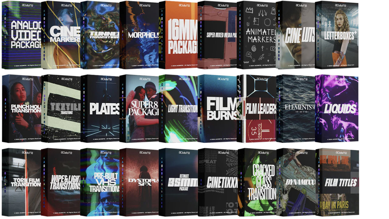
Acidbite ➔
50% off everything
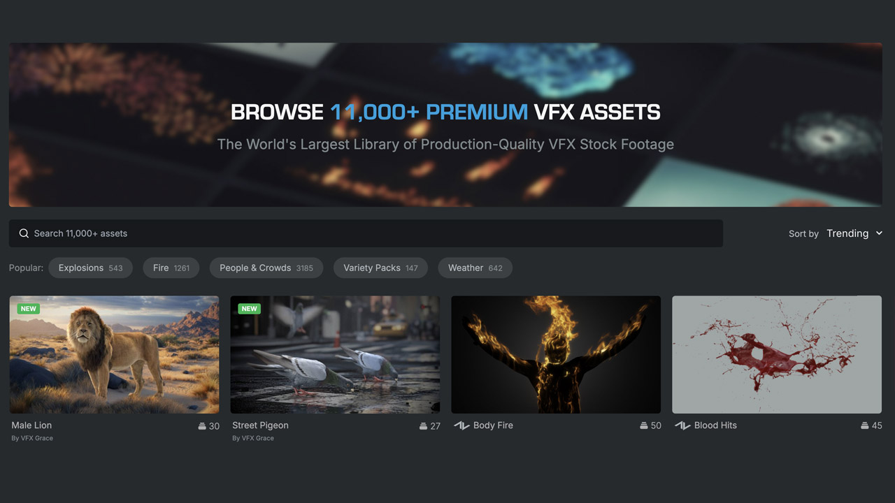
ActionVFX ➔
30% off all plans and credit packs - starts 11/26
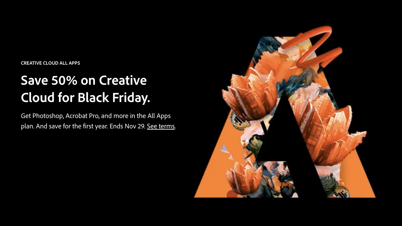
Adobe ➔
50% off all apps and plans through 11/29
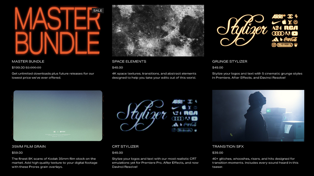
aescripts ➔
25% off everything through 12/6
Affinity ➔
50% off all products

Battleaxe ➔
30% off from 11/29-12/7
Boom Library ➔
30% off Boom One, their 48,000+ file audio library
BorisFX ➔
25% off everything, 11/25-12/1
Cavalry ➔
33% off pro subscriptions (11/29 - 12/4)
FXFactory ➔
25% off with code BLACKFRIDAY until 12/3
Goodboyninja ➔
20% off everything
Happy Editing ➔
50% off with code BLACKFRIDAY
Huion ➔
Up to 50% off affordable, high-quality pen display tablets
Insydium ➔
50% off through 12/4
JangaFX ➔
30% off an indie annual license
Kitbash 3D ➔
$200 off Cargo Pro, their entire library
Knights of the Editing Table ➔
Up to 20% off Premiere Pro Extensions
Maxon ➔
25% off Maxon One, ZBrush, & Redshift - Annual Subscriptions (11/29 - 12/8)
Mode Designs ➔
Deals on premium keyboards and accessories
Motion Array ➔
10% off the Everything plan
Motion Hatch ➔
Perfect Your Pricing Toolkit - 50% off (11/29 - 12/2)

MotionVFX ➔
30% off Design/CineStudio, and PPro Resolve packs with code: BW30
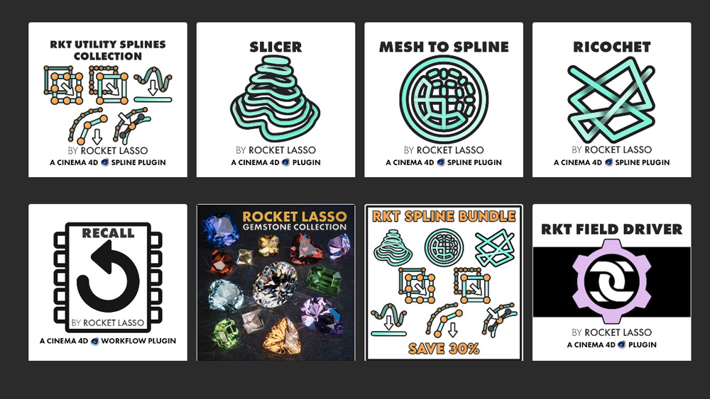
Rocket Lasso ➔
50% off all plug-ins (11/29 - 12/2)
Rokoko ➔
45% off the indie creator bundle with code: RKK_SchoolOfMotion (revenue must be under $100K a year)
Shapefest ➔
80% off a Shapefest Pro annual subscription for life (11/29 - 12/2)

The Pixel Lab ➔
30% off everything
Toolfarm ➔
Various plugins and tools on sale

True Grit Texture ➔
50-70% off (starts Wednesday, runs for about a week)
Vincent Schwenk ➔
50% discount with code RENDERSALE
Wacom ➔
Up to $120 off new tablets + deals on refurbished items


All-Access Pass
Unlimited access to 50+ courses, unlimited critique, live events, and 24/7 community. Join School of Motion All-Access today.