
All-Access Pass
Unlimited access to 50+ courses, unlimited critique, live events, and 24/7 community. Join School of Motion All-Access today.

How do you use the After Effects Text Animator more creatively?
We know you might find this hard to believe, but the After Effects text animator is TOTALLY AWESOME. Once you learn how to use the tools properly, and more creatively, you'll be making incredible animated text in no time at all. This means getting away from presets and excess layers to craft custom designs all your own. The text animator may not be very intuitive, but we're here to help with that. Joey also made a great tutorial on text animators a couple years ago—he approaches it a little differently than we will, but it’s extremely informative and highly recommended! For now, let's start thinking outside the [text] box.
Download the free text animator project files to follow along.
ENROLL NOW!
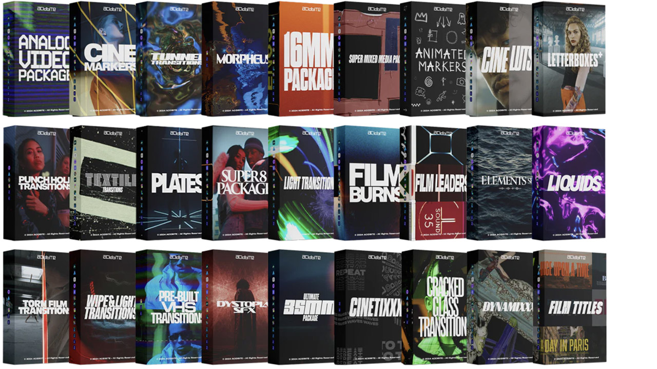
Acidbite ➔
50% off everything
ActionVFX ➔
30% off all plans and credit packs - starts 11/26
Adobe ➔
50% off all apps and plans through 11/29
aescripts ➔
25% off everything through 12/6
Affinity ➔
50% off all products
Battleaxe ➔
30% off from 11/29-12/7
Boom Library ➔
30% off Boom One, their 48,000+ file audio library
BorisFX ➔
25% off everything, 11/25-12/1
Cavalry ➔
33% off pro subscriptions (11/29 - 12/4)
FXFactory ➔
25% off with code BLACKFRIDAY until 12/3
Goodboyninja ➔
20% off everything
Happy Editing ➔
50% off with code BLACKFRIDAY
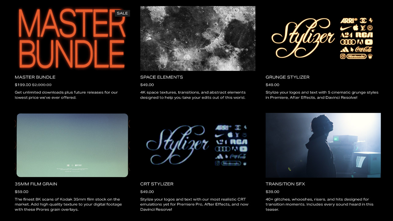
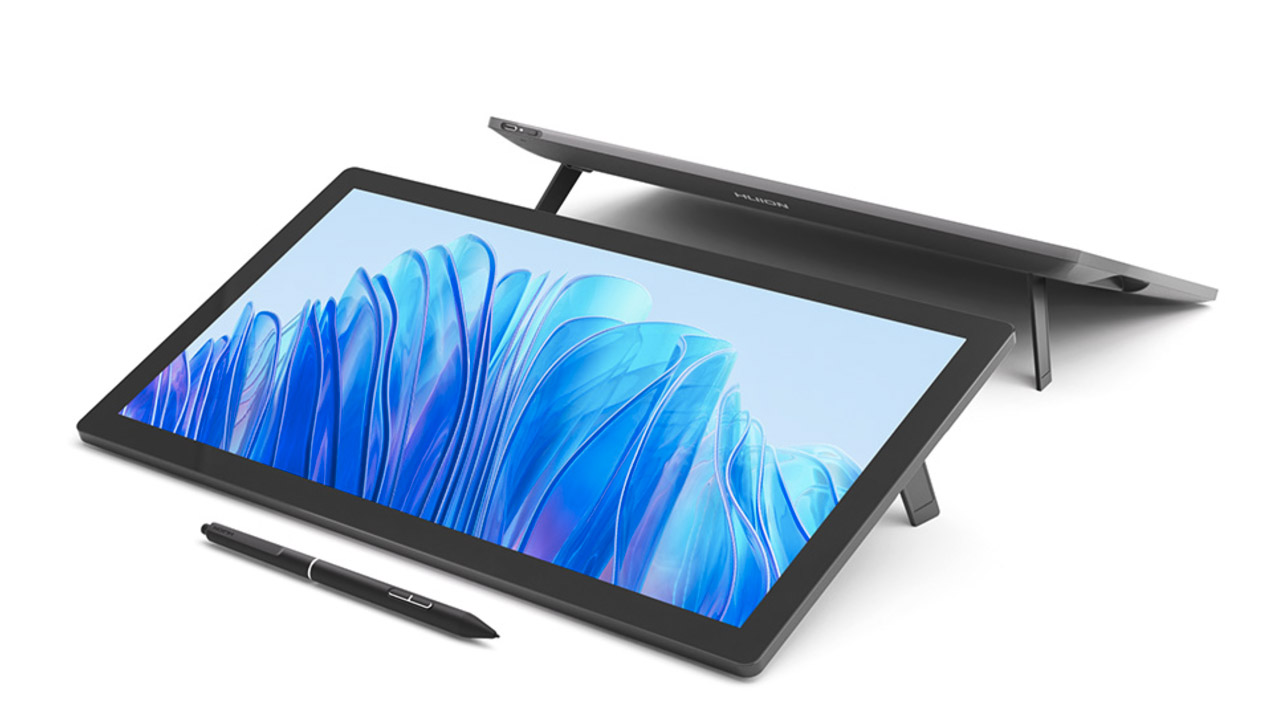
Huion ➔
Up to 50% off affordable, high-quality pen display tablets
Insydium ➔
50% off through 12/4
JangaFX ➔
30% off an indie annual license
Kitbash 3D ➔
$200 off Cargo Pro, their entire library
Knights of the Editing Table ➔
Up to 20% off Premiere Pro Extensions
Maxon ➔
25% off Maxon One, ZBrush, & Redshift - Annual Subscriptions (11/29 - 12/8)
Mode Designs ➔
Deals on premium keyboards and accessories
Motion Array ➔
10% off the Everything plan
Motion Hatch ➔
Perfect Your Pricing Toolkit - 50% off (11/29 - 12/2)
MotionVFX ➔
30% off Design/CineStudio, and PPro Resolve packs with code: BW30
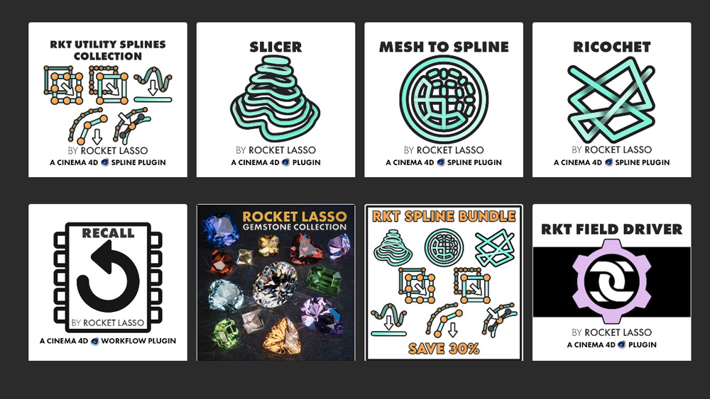
Rocket Lasso ➔
50% off all plug-ins (11/29 - 12/2)
Rokoko ➔
45% off the indie creator bundle with code: RKK_SchoolOfMotion (revenue must be under $100K a year)
Shapefest ➔
80% off a Shapefest Pro annual subscription for life (11/29 - 12/2)

The Pixel Lab ➔
30% off everything
Toolfarm ➔
Various plugins and tools on sale
True Grit Texture ➔
50-70% off (starts Wednesday, runs for about a week)
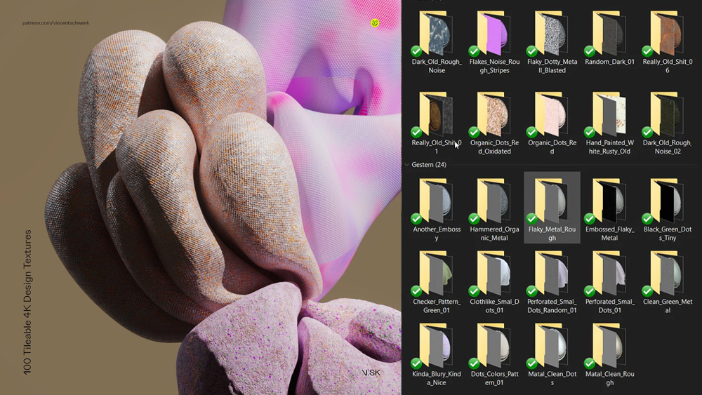
Vincent Schwenk ➔
50% discount with code RENDERSALE
Wacom ➔
Up to $120 off new tablets + deals on refurbished items


Follow along with these free Text Animator project files!
Let’s take a moment and expand our minds a little. What is text [in the context of design software] anyway? Well, text is really just a bunch of vector shapes. Text just happens to be vector shapes we have collectively given linguistic meaning to... are we starting to sound like Plato?
Once you stop viewing the text animator as just a way to bring on words, and understand how it works, you’ll realize it’s actually a procedural (step-by-step) effector-based animator for vector shapes. You can quickly create tapered strokes, cool bendy arrows, and abstract backgrounds. You can make groups of objects easily travel along paths, create awesome self-animating elements without keyframes, use it like a particle generator … You can do a lot of really cool stuff with it!
In this video, we'll review:
- What is the After Effects Text Animator?
- How to Create a Tapered Stroke in After Effects
- Fine Tuning a Tapered Stroke
To help you understand out what the heck I’m talking about, I’ve put together this video tutorial on the text animator, and the weird, abstract ways I like use it. I’ll start off with explaining how it works, then dive into some creative ways to apply it to your motion design projects.
And if this tutorial scratches a particular itch, it may mean that you've been craving some detailed training in animation and motion. Sadly, there's only one cure: Check out Animation Bootcamp! Discover the hidden techniques behind organic animation and bring your designs to life in this essential After Effects course from Joey Korenman.
What is the After Effects Text Animator?
Do you just really love reading words instead? Here's the basic idea:
Create a text layer of only periods. Adjust your typeface to get squares or circles - whichever you prefer.

Add a text animator (or multiple!) and experiment with the properties. We found it so much easier to grasp what all of these properties were doing once we stopped reading the words we were animating and just viewed them as abstract shapes to move around. Hopefully the same is true for you!

ProTip: Just because it’s the “text animator,” you don’t always have to be actually animating something with it - they can just be offsets/adjustments. Think of them more like effectors that can also be animated.Oh, you wanted more detail? That’s why we made that video up there. We’ll be nice, though, and give you a quick step-by-step for a commonly-requested element: a tapered stroke. No plugins, no expressions, no nothin’!
How to Create a Tapered Stroke in After Effects
No need to download a fancy-schmancy Tapered Stroke tool; you can actually create a tapered stroke using Text Animators.
- Create a long line of periods/dots - you’ll probably want like 100-150 of them. (Copy/paste will be your friend here.) You’ll want your font size set decently large, around 300-ish, depending on your typeface. You’ll probably want to use one with rounded periods (like Azo Sans, available with your Creative Cloud subscription) instead of squared-off ones.
- Twirl open your text layer. Under More Options, there’s a setting for Grouping Alignment. This allows you to adjust the “anchor point” of each unit (it’s per character by default) that the text animator will be using. Adjust the values until you see the little Xs centered up within your dots. We suggest zooming in for this.
- In the character panel, adjust the tracking (into the negatives) until the dots form into a solid line.
- Create a text animator for Scale; set that new Scale property to 0%.
- Under Advanced, change the Shape from the default of Square to either Ramp Up or Ramp Down. Voilà! Tapered stroke. Let's fine-tune some things.
Fine Tuning a Tapered Stroke in After Effects
- Adjusting Ease High and/or Ease Low will allow you to shape the taper. (This is actually controlling the easing of the change on the property you’re animating - sort of a distant cousin of using the graph editor to ease your keyframes.)
- With the layer selected, use the pen tool to draw a path (preferably open-ended) for your taper to follow. Under Path Options, set Path to the mask you just drew.
- If you’d like your stroke to be centered on the line, you may need to adjust the Baseline Shift in the character panel. Eyeballing it is fine.
- You can now animate your tapered stroke along the path by animating the First Margin and/or Last Margin property. If it’s facing the wrong way, enable Reverse Path.
- Now you can impress your friends with your fancy new tapered stroke. You can add additional animators or properties to add more complexity, apply color gradients, have the tail fade away - whatever you like. The world is your proverbial oyster. There are several effects that play really nicely with this as well.
- Bonus Tip: Since you built this all on one layer, you can save it as an animation preset!

This is just the tip of the iceberg!
We've made a TON of cool stuff with just periods, dashes, plus signs, etc., but that’s just the beginning. Depending on the typeface you’re using, you potentially have access to thousands of cool glyphs, ASCII characters, Unicode characters, and Dingbats, and that’s not counting the nearly limitless number of custom ornamental fonts people have already made. If you decide the text animator is the best way to accomplish what you want to do, but you can’t find the symbol you need anywhere, you can even create your own fonts to use for your projects.
Now, get creative!
Now you can make cool animated doodles, easily create super-useful motion design elements, and can probably be way more efficient at knocking out those boring text chunks, too. It’s bigger than that, though - not only will this help you be faster, more efficient and more creative with a tool you probably need to use all the time, it should help open you up to a mindset I think is really important: Don’t focus on what the tool is named. Take some time to explore it, and see what it actually does. After Effects is full of so many complex tools and effects that can be used and/or combined in creative and interesting ways. What amazing things can you create when you explore features you thought were scary or lame or useless, or combine a few you’d never thought to use together?
If you want to learn more about animating in After Effects check out Animation Bootcamp. The course is a fantastic intermediate course for growing your skills and understanding professional animation techniques.
-----------------------------------------------------------------------------------------------------------------------------------
Tutorial Full Transcript Below 👇:
Music (00:02): [intro music]
Kyle Hamrick (00:11): Hey, what's up. This is Kyle Hamrick with school of motion. In this tutorial, we're going to be talking about a feature that you probably use all the time, but may have never really explored the aftereffects text animator. It's actually one of my favorite features. And after this, maybe it'll be yours too. You can actually use the text animator to create all kinds of cool non-text motion, designing stuff, which could otherwise take tons of layers or complicated expressions to build. You can often create things like this on a single layer with just a couple of key frames. Once you really understand how this tool works, you'll be much more efficient when you do need to animate actual text. There's a free project file included with the article on school of motion.com. But most of the examples we'll be working through are things we'll just be able to build from scratch.
Kyle Hamrick (00:55): Let's check it out and see what we can do with this really powerful tool that you might have totally overlooked. I'm guessing that a lot of people have their first experience with the text animator by typing out some words, and then they dive into these presets over here. Uh, they look at a couple, they apply one and it's okay, but it's kind of lame and weird. And you know, maybe you just assume that it's kind of an outdated tool or something, right. Or maybe you get ambitious and start looking into the properties, but they just seem confusing and they're different than everything else. You just kind of give up there too, but you still needed to get your titles done. So you just broke them all up into individual words or letters and maybe just use the transform properties to bring them in. So, pretty soon you've got like 20 layers here for this basic title and you've got like 50 titles to do.
Kyle Hamrick (01:44): So that's a mess too. Right? So let's stop for just a second and talk about what texts on a computer actually is. It's just a bunch of vector shapes, right? These just happened to be vector shapes that we have collectively given meaning to once you stop viewing the text animator as a way, just to bring on words and understand what it's actually doing, you'll realize it's a really awesome procedural effector based animator for vector shapes. I know what the heck is he talking about? Right. Let's dive in and I'll show you as you can see, I've changed my layout a little bit. When you twirl a text layer open all the way you end up needing quite a bit of vertical space. So this is my timeline over here, just making it so I can see a lot of height. This next portion is going to be a little bit technical.
Kyle Hamrick (02:31): I'm just going to explain how all the different parts of the text animator work. I think it's important for us to understand the tool. So then we can start exploring and have some fun with it. So I'm going to start off by right clicking new text. There's a couple other ways that you can create this. I liked doing it this way because it will be centered in the composition, which is going to be good for this example. I'm just going to hit my period key several times until I've kind of filled up the width of the screen. I find this to be a very helpful way to help understand these various properties and tools are working in here because you're not focusing on this being words. You can just view it as abstract shapes for the purposes of this demonstration. I'm going to go ahead and control D duplicate this layer.
Kyle Hamrick (03:13): And then I'm going to set the bottom one to be a very low opacity. I'm going to choose 10. And this way we'll sort of be able to see where we came from. That'll make sense in a minute on my top layer, I'll twirl, this open and every text layer has this little animate fly out, which is how you access the text and meters. I'm going to choose animate position. And now this is giving us a position property, which in this case is per character. And I can choose to change these things from their default value. See how that copy back here is still sitting at its default. And then I've changed each of these two minus 300 on Y. Now, if we twirl open this range selector, it gives us some options about which portions of this thing we want to be effecting by default, it's set to percentage.
Kyle Hamrick (04:02): And so let's say we want the first 20% to be normal and the last 20% to also be normal. So we're currently affecting the region from 20% to 80%. If you have this highlighted, you can actually see the start and end values and you can kind of push it through. When you're doing this with words, you'll be able to see this. If you're animating opacity or something, this is each character fading on because you've changed it from its default opacity a hundred to zero. And so when you're changing it back to the default, they're fading into view. I'm going to set this back to 20 and then we'll take a second to explore this offset value. So I've defined a range within here. That's going to be effected an offset, lets you offset where that's happening. Okay? But the same amount of characters are still going to be changed.
Kyle Hamrick (04:55): Even though you can actually push this off the edges, I'm going to go ahead and undo to reset that to zero under the advanced section is where you actually get a lot of the power in this text and demeanor. Now the first thing I'm going to do is change the units from percentage to index, which means the actual character count in this case. As you can see right here, it's based on characters, but you can also choose words or lines. And now it's actually counting. The first one is zero. By the way, counting up to let's go ahead and set these two whole numbers. I'm going to bump them up a little bit here. So let's set this from 10 to 20 and you'll see, it's kind of taking this nice middle section. Everything else is still the default. And then from character 10 to character, 20 is being affected by whatever property or properties I've given it here.
Kyle Hamrick (05:44): The next thing on the list is this mode setting, which is very similar to the way that mode works on masks. You have add, subtract, intersect, et cetera. Right now I'm adding this change. But if I wanted all the characters be changed except the region I had chosen, I could set this to subtract and now you'll see that's exactly what's happening. These have all been changed. These are the default value and these have all been changed. I'm going to go ahead and undo that next. We have an amount property, which actually lets you change even go negative here. How much of this change is actually happening? So you could just set a region to be changed and without animating the start and end values at all, you could animate this property to push the things into whatever affected state you wanted. These next couple of properties are the ones that are probably the most mysterious.
Kyle Hamrick (06:34): The default shape is square. And as the name implies, this is actually telling you what shape after effects is using to apply the change that you have given it. If you look closely here, you can see, this is essentially pushing a square through this line. I'm going to change this to ramp up. And now we have several characters that the default value and then it's slowly ramping up to be in that effected state that we've given it. If we set this to ramp down, it's the inverse of that. So it's affected and then ramping down back to the default value. I find these shapes to be very helpful when you're animating text on and you want a smoother transition. So you're not waiting for each previous character to finish doing whatever it's doing before the next one starts animating. So using ramp up or ramp down and then animating the offset property.
Kyle Hamrick (07:28): Like this is how you can get these really smooth text transitions. So these next couple shapes here again are extremely mysterious when you're trying to do this with words. But if you see it like this, it's actually quite clear what's happening in this case. There's a triangle shape being kind of run through the line of dots, right? Again, if we push around this offset value, you can see what's happening. It's animating up to the property and back down, if we widen this out, it'll just make it a bigger, wider triangle round is essentially the same thing. It's just pushing around shape through here. And then smooth is that same shape, but eased. And again, now that we're looking at this with these abstract shapes, I hope you're already seeing how useful this could be for all kinds of cool motion, designing things that don't have anything to do with text.
Kyle Hamrick (08:22): So I'm gonna go ahead and undo that again. And I'm going to set this back to one of the ramps. As you can see over here, we have a constant value, a sudden change. This is constantly changing at one rate here and then it suddenly stops changing and is again a static value. Does that sound familiar? That's exactly what linear key frames are. If you want your animations to be smoother, you just ease those key frames, right? So if you want this change from one value to an effected value, to be smoother, you can ease it right here. Ease high is kind of this top part in this example where it's easing into that change, ease low is easing out of the default value in this example. So see if you push these a bit, you can get this nice S curve and while this is kind of abstract, this is what's happening when you're using these to animate on by opacity or rotation or something like that
Kyle Hamrick (09:19): Again, we could push around the offset value here and you can see some really cool possibilities. You could change the start and end value to decide how long it takes for this change to be happening over what span of your line. Lastly, we have this randomized value, which just randomizes the order in which these things are happening. You can always add another selector if you'd like, let's add another range selector just to explore what happens here. So by default it seems like it's canceling out the other one. And it is at the moment because we need to set some things. I'm going to go ahead and set this to index. I'm going to crank this up to be, you know, somewhere around here. Um, let's make it a full value and then let's make this say 22. So this is the range that this range selector is now effecting.
Kyle Hamrick (10:08): And you can see it's overriding that previous one. I could set this to subtract if I wanted to. And now it's subtracting what this change is doing. So it's setting this portion back to its default value and totally ignoring what we'd done with the other animator. Obviously, if we were to set this to a more smooth sort of change, maybe widen this out of it, see how you can create some really interesting stuff here. Now I'm going to go ahead and get rid of this range selector. And we're going to take a look at the wiggly selector. So add selector, just to point this out, there's also an expression selector, which I'm going to save for another day, cause that's a whole other can of worms wiggly. So what the wiggly selector does, if it's all by itself, it's one of these property driven wiggles directly within after effects.
Kyle Hamrick (10:58): If I do a Ram preview here, you can see it's actually wiggling each of these characters randomly by the amount that I had chosen and by the opposite of that amount. So every one of these dots is wiggling up to 300 pixels in Y both up and down, we can of course change a lot of these properties. You can change how this interacts with other selectors that might be on the layer. Again, whether it's based on characters, words, lines, you can change the wiggles per second. I find correlation to be quite interesting. If you turn the correlation way up, these will start wiggling a lot more in unison and you can actually create some really cool wiggly line based things where they actually stick together as a group, right? I actually like to set wiggles per second to zero and then actually animate either the temporal spatial phase, because I think that gives you a little bit more control over what's happening, but look how we can get this nice, smooth fluid motion in this line of dots here.
Kyle Hamrick (12:02): Pretty cool. Right? We're obviously doing this with dots right now, but just imagine that any shape that you could put into a font file is something that you could animate like this. The cool thing about wiggly selectors is they can of course be combined with other types of selectors. I'm going to turn this range selector back on and get some really interesting results. So the range selector is kind of holding this first portion of the line at the default values. And then the wiggly selector is only able to wiggle that later portion of this. So if I allowed those wiggles per second to go, or I can be animating this value, check that out. I can have this really cool wiggly motion, but still keep one side pinned down for this next part. I'm going to go ahead and delete the wiggly selector. And just to point this out, you can actually create multiple animators, which is why this is called animator one. You can, of course always change the name if you like, but as long as you don't have this selected, you can come back up here and animate something different like rotation. And you can have a whole separate animator with its own set of properties and changes and do whatever you like. And that will of course interact with this in different ways, depending on what you do.
Kyle Hamrick (13:19): So to this animator, I'm going to add property scale. And then I'm also going to have these dots scale up, see what's happening here again, we've got our default value, a hundred percent scale, and then it's scaling way up to 449%. I think scale is the best way to demonstrate the thing I'm about to show you, which is up here under this more options. Each of these characters has its own anchor point and that's because the anchor point grouping is set to character. You could choose word line or all if you want it to. So each chunk of this text, whatever you want that to be is going to have its own anchor point around which it does transform moves. You can change the position of that anchor point right here under this grouping alignment. So if I wanted these to be scaling, not from the bottom, which is what they're doing, but more from the middle, you can just change this value here and actually have these be scaling from the middle instead.
Kyle Hamrick (14:17): See if I reset this position to zero, that might be a little clear here's grouping alignment at zero, and they're all scaling from the baseline. Here's grouping alignment, just eyeballed to the middle. As you probably know, from doing other animation where your anchor point sits has a huge influence on how things look. So if you're doing a rotation in one of these, be very mindful about where your anchor point is placed per character or per word or whatever, because that'll have a big impact on how your text animation looks. Now there's a dropdown here to override how the fill and stroke display. I've never found a lot of use for this personally, but it's here if you want it. I think this next setting is very interesting. Inter character blending, to be able to show this, I'm going to change the color of these characters real quick.
Kyle Hamrick (15:07): You actually have access to most of the blending modes right here, and you can choose what happens when characters overlap one another. In this case I chose ad. So you can see as they overlap, they're adding to each other. You can create some really interesting effects by doing this. So hopefully talking through these properties like this has given you a much better understanding of how they work. Now, we're going to jump into a couple of specific examples and see these in action. First, we're going to use the same dot setup to create a tapered stroke that can follow a path. A lot of people ask how to do a tapered stroke and after effects. And it's actually been here since the mid two thousands. They just didn't know where to look. So I'm going to select my text layer. You can see I'm using AYSO sands, which is available from Typekit now, Adobe fonts, but you can use any type face with a round period. It'll work the same. Your numbers might just be a little different than mine. I'm going to set my font size way up to about 500 here. And then I'm going to condense the tracking way into the negatives until you can see these converge into a solid line eventually. Perfect. Then just for fun, instead of boring old white, let's set this to be maybe the yellow from the school of motion logo.
Kyle Hamrick (16:21): I'm going to open this up animate scale. And then if I set this to zero, the whole thing will disappear. That's because the entire range is currently being affected. Meaning the whole thing is being set to zero, right? So let's open up advanced. And if we set the shape to ramp up, now we have regular size ramping down to zero. Perfect ramping up to zero. Technically obviously we have a little bit of cleanup to do here. Let's fix this grouping alignment. I'm going to zoom in a little bit so we can see better. And if we just kind of eyeball this to about minus 6.3, you can see that it looks pretty centered. There is a little bit of an issue here with some separation. I'm not going to worry about it for this example, cause I'm going to be adding some effects that will essentially erase that if you're using this clean, then you'll probably want to just add some more dots, compress your tracking, add some more dots, compress your tracking, just tinker with it until it looks perfect. I think this is a pretty good looking taper, but we could use these eases right here to kind of give it a little bit more of a teardrop shape, which I think is a little more interesting. Maybe just get them both up a little bit like that. Then you get this nice ease, Taber looking good. I'm going to zoom out. Hit G to grab my pen tool. Let's give this something to do.
Kyle Hamrick (17:44): Here we go. Maybe adjust these down a bit more. Now we have this nice swoopy path for our taper to follow zoom back in and under our path options. We can now choose mask one that we just drew. Perfect. Sort of you'll notice the first option right here is reverse path. So if you drew your path backwards, like I did, you can just click that and there we go. Obviously we're a little bit off the path, so you can just adjust your baseline shift to get it in the right spot. And we're good. Now we can adjust either this first or last margin setting to animate our stroke along the path.
Kyle Hamrick (18:30): We'll go up a bit and back up off the opposite corner. Let's see how that looks. There we go. Tapered stroke folks. I think we can make that a little more interesting. Let's see what else we can do for starters. These key frames could probably use a little attention. I'm going to hit F nine to easy ease. I'm gonna hit my Tilda key to make this particular panel. Full-size let's open up the graph editor. I'm going to bring this one straight down, bring this one straight up so that we've got a nice fast start and a fast finish and a little bit slower in the middle. Let's see how that feels
Kyle Hamrick (19:12): Yeah, that's a lot more energetic. Pretty cool. So we could certainly be done right now. I think that looks great with a little bit of motion blur. You'd never see that separation in the tail. I've used this just like this plenty of times. I think maybe we can do something a little cooler with it though. Let's select it. Maybe add a rough edges effect to give it a little bit more of an organic feel. You can see, even with the default settings, it works pretty well. I'm going to turn up the scale just a bit. Turn up the border just a bit. Just kind of eat away at it. Not quite that much. There we go. Let's see how that looks pretty cool. It gives it more of a hand drawn feel almost has kind of a fiery look to it. Speaking of which let's maybe turn this logo back on.
Kyle Hamrick (20:02): I'm going to go ahead and name this animator scale taper, and then I'm going to de-select this animator come up here and animate fill a color RGB so you can animate the fill color of the stroke, but we don't want to do the whole thing. Of course, we just want to do the front. I'm going to go ahead. And I drop her this red color from the logo, turn that back off. And then if we set the shape to ramp down, we can have the front of this little fireball. Maybe it's a little bit of easing here. We can kind of fine tune that. Now we have a gradient along a stroke following a path and it's tapered pretty sweet, right? It's not exactly the same as a cell animated fireball stroke thing, but it's pretty close. And considering this only has two key frames and took us just a couple of minutes
Kyle Hamrick (20:58): I'll take it while you can do a ton with dots and lines and letter forms. If you want even more options, there's an almost infinite supply of ASCII characters, Unicode characters, custom ornament, fonts, dingbats, all that. So you have tons and tons of different looks and shapes and things like that that you can bring into use like this. If you follow some of the links in the article, you'll find some of these characters, which I use all the time to make arrows specifically bendy arrows that can follow a very precise path, which is a really useful thing. So let's tweak these a little bit. We'll compress the tracking and select just the Arrowhead. Use the baseline shift to kind of get it down into the right spot. Looks good. And now we need to give this a path to follow I'll, press G from my pin tool, zoom out a little bit, draw a nice curvy path for it to follow zoom back in, open this up.
Kyle Hamrick (22:00):Text paths, options mask one. There we go. Since I've already done some baseline adjustments on individual pieces, I'm going to use animate position to just nudge this into place here. Just because it's called an animator. Doesn't mean it needs to animate. It can just be an adjustment and I'm going to use this first margin property again, to animate this arrow into place. Let's push it off screen, make a key frame, come up a little bit. Let's maybe overshoot just a little bit, come up a few more frames and ease into place. We'll just easy. Ease these key frames for now. See how that feels. It looks great. As you can see with just a few simple shapes on the text animator, you can do some things that are otherwise really tough to do, or sometimes impossible without third-party scripts or plugins. Next up, we're going to be working with this screen pattern of dots, which I got by just copy pasting that single line down here in my text settings, if that's helpful to you, but again, you can just, I have all this make it work for you. I find this really helpful if you need to bring on a pattern like this, because it makes it pretty easy to do this entire pattern of dots with one layer and one set of key frames. If you figure out how to decipher the mysteries of the expression selector, you can even add overshoot and other cool stuff, but we're going to be doing something a little different right now, which is using this to create a cool abstract pattern.
Kyle Hamrick (23:37): So I've got my dots. I'm going to animate scale and you can see need to fix our anchor points here. So I'm just going to eyeball that up. In my example, it's about minus nine. I'm going to go ahead and set the scale to zero. So they all disappear because again, the whole range is being affected. We actually don't need this range selector. So I'm going to go ahead and delete it. We do need, however, a wiggly selector. There's obviously a few things we need to fix here. The first being locked dimensions, which will keep these scaling uniformly. So already you can say, okay, that's kind of interesting, probably a little fast for my taste. So I'm going to go ahead and turn the wiggles per second down to 0.5 and then I'm going to hit tab, jumped down to correlation, set that to zero, just so that they're totally random.
Kyle Hamrick (24:31): If you wanted them to be in sync with each other, set them up high, like 85 to 90. So let's preview that and you can see that's kind of cool. I think it could be more interesting, but it feels like a nice start. So here's where the power of this starts coming in. This is all one layer, so we can very easily add effects to this. I'm going to go ahead and add echo and I'm going to set the echo time 2.5 right now. You're not going to see a lot of difference because you have white dots, time offset with other white dots. So it pretty much looks like the same thing, but next we're going to add the set mat effect by default set mat is set to itself, which is actually what we want here. And while you can potentially use effects and mask, we actually want this to use the source and leave it set to alpha channel.
Kyle Hamrick (25:30): And then I want to click this little box for invert mat. So what's happening here is the affected version of this layer. Using echo is actually using the unaffected version of this layer without echo as its own mat, and then inverting that. So you're getting a slightly time offset version of the layer matting itself. So you get these cool kind of growing bubbles here. I think that's pretty cool, but there's probably one more thing we could do to clean this up just a little bit. We do end up with some edges here just as a remnant of that matting process. So I'm going to go ahead and also add a simple choker and set that to about 1.5. Again, you can eyeball this, just see what works best for you. Just kind of cleans up those little rings there, and now we have this nice abstract bubbly pattern
Kyle Hamrick (26:23): I like that quite a bit, but I think there's one more thing we could do to really set this off. I'm going to turn that logo back on. Go ahead and rename this. We'll call it scale, wiggle, and then let's add another animator notice. I made sure this one is not selected. So I'm going to animate fill a color RGB. I'm going to eyedropper that yellow from the logo and then open up this range selector. I'm going to go ahead and rename this as well. I don't want them all to be yellow. Let's maybe set it to be about 30% of them. And then if I set randomized order two on it's just going to randomize, which ones appear yellow. Perfect. I'm actually going to go ahead and command or control D duplicate three, name this one, red, open this up. I drop her the red color and then just set the random seed to something different.
Kyle Hamrick (27:30): So it'll also be effecting 30% randomly chosen and it'll be selecting different parts of this. Then the yellow is close that up. Turn off the logo, make another preview. Very cool. So now we have this great abstract background. You can see it would be easy to keep adding other colors right now. The colors are stuck to specific circles, but if you wanted that to evolve a little bit more, you could just animate the offset property or something like that. The really cool thing about working like this is since everything's on one layer, you could actually select all of it, text effects and you could save this as a preset. If this were something you were going to use frequently, there's one last thing I should probably show you because of course there's an entire dimension. We haven't even explored yet. You can of course make a Texler 3d like anything else, but you can also enable per character 3d.
Kyle Hamrick (28:28): So I'm going to go ahead and do that, which means that any of these transformed properties, I choose like rotation. We'll have all three dimensions available and that's pretty cool, but not as cool as this. If I changed my render to the cinema 4d or this actually works with the old Ray trace engine as well, the cinema 4d render enables extrusion of text and shapes wait, text. Hm. Yeah, you can extrude these because they're texts layers. So if I were to say set my X rotation to one and twirl this open and set this to ramp up, you know, that's fairly interesting, but it'll be a lot more interesting if I change my extrusion depth to 300. So I could put some lights in here. These will cast shadows and catch shadows because of course they're a totally native 3d object. Or I could take this environment layer that I built drag it in here, right? Click choose environment layer. Then I could open up my material options, maybe set metal to 30 reflection, intensity to 80 and reflection sharpness to 80. Hmm. That's pretty interesting. What if I were to now open up my transform and animate the layers X rotation from zero to one full rotation, let's do a quick preview and see how that feels.
Kyle Hamrick (30:03): Is it the most amazing 3d thing that ever happened? Maybe not, but it's one layer and two key frames. And I think that's pretty cool. So that's it. Hopefully you picked up some cool new tricks and if you can figure this stuff out, you can definitely be more efficient. Next time you just have to bring on some bullet points, right? I hope this inspires you to not only explore this tool, but some other ones as well. Don't get hung up on the name of the thing and don't be afraid to just get in here and play and explore. It's a really great way to learn this stuff. If you want to learn more about motion design, check out all the other great tutorials, podcasts and articles we have over at schoolofmotion.com. And of course, if you want to step up your skills, even further, check out the awesome courses and bootcamps we offer. I've taken NTA for several of them, myself, and they truly are an excellent way to really level up your skills in a very short time. If you'd like to share anything cool, you've created using the text animator like this. Please let us know in the comments. And if you have any questions, of course, feel free to send those our way too. Thanks for watching. This has been Kyle Hamrick with school of motion. We'll see you next time.
All-Access Pass
Unlimited access to 50+ courses, unlimited critique, live events, and 24/7 community. Join School of Motion All-Access today.