
Design Like a Pro Motion Designer
Master layout, color, typography, and composition for motion. Enroll in All-Access to unlock Design Bootcamp and 50+ other courses.

Wait... aren’t fonts and typefaces the same thing?
Ever wonder how to choose fonts for your projects? What about typefaces? Wait a minute… what’s the difference? These terms are mistakenly used over and over again. So to help break through the noise here's a quick overview.
Typefaces vs. Fonts
Let's start with the most confused type terms in the world...
Typefaces refer to a font family. Arial, Times New Roman, and Helvetica are all examples of a typeface. When you refer to a specific styles of a typeface you are talking about a font. For example, Helvetica Light, Helvetica Oblique, and Helvetica Bold are all examples of Helvetica Fonts.
- Typeface = Helvetica
- Font = Helvetica Bold Italic
Way back in the olden times, words were printed using letters made of metal that were rolled in ink then pressed on to paper. If you wanted to use Helvetica, you had to have a giant box of metal letters that contained Helvetica in every size, weight, and style. Now that we have magical computer machines, we can use all kinds of different fonts just by choosing them. Meanwhile the ghost of Johannes Gutenberg is cursing us under his lifeless breath.
{{lead-magnet}}
The 4 (Major) Types of Typefaces
The major categories of font families (aka typefaces) that you have most definitely heard of by now are serif, sans serif, script, and decorative. If you want to get super nerdy about it, there are many types of families within those categories and you can check them all out at fonts.com.
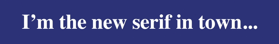
Serif - Serif font families have flourishes or accents (aka serifs) that are attached to the ends of the letter parts. These are typically used more in printed material rather than video.
Sans-Serif - Sans-Serif typefaces don't have the little accents or tails at the end of the letters. These fonts are usually easier to read in MoGraph. Note: “Sans” is another word for “without”. Right now, I am sans coffee and I will have to rectify that situation asap.

Script - Script fonts look like cursive handwriting. If you were born after 1990 you might not know what that is, but that’s OK. Just think of scripts as typefaces that look like handwriting.

Decorative - The decorative category basically catches all the other typefaces that don’t fall into the first three categories. They can get weird...

Type Anatomy
There are some properties of type that can be changed without changing the font itself. Here’s a quick illustrated rundown of the basics:
KERNING
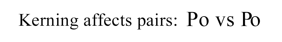
Kerning is the horizontal space between two letters. This is typically done to a single letter pair to adjust an issue caused by a capital next to a lowercase. There's also a wonderful reddit dedicated to bad examples of kerning called keming (Get it? because the r and the n are too close...) Here's an example of kerning.
TRACKING
Tracking is like kerning, but affects the horizontal space between all letters:
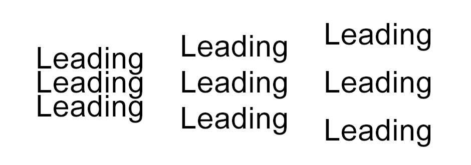
LEADING
Finally, leading (pronounced “ledding”), affects the space between lines of text.
Nerd Fact! In the old metal letter printing days, strips of lead (that toxic stuff in your drinking water) were used to space the lines of text apart from each other in the printing press, thus the term:
By adjusting those type modifiers on your projects you will be a type rock star. Speaking of type rock stars in the MoGraph world, let’s drop a few typography names.
Typography Inspiration
SAUL AND ELAINE BASS
If you don’t know Saul Bass, time to get inspired. He’s basically the granddaddy of film titles as we know them. Originally a graphic designer working on movie posters, he became one of the first to create main titles to introduce the mood of a film. You probably recognize his work in classic titles like The Man with the Golden Arm, Anatomy of a Murder, Psycho, and North by Northwest.
These are not only bad ass awesome motion design, but they are also a serious labor of love in a world before After Effects. Check out the amazing legacy of his work at Art of the Title.
KYLE COOPER
Remember the first film title you saw that made your brain explode? For quite a few of us motion nerds it was the title for Se7en. If you don’t know it, watch it right now...
Mind blown? OK good. Se7en is kinetic type at its best (in a 1995 kind of way).
The man responsible for that is the one and only Kyle Cooper, co-founder of the agency Imaginary Forces. Pick your top ten favorite film titles of all time and chances are, his name is on at least one of them.
Inspired yet? There are loads of amazing examples of kinetic type out there. I’m going to leave it there for now so we can get down and dirty with some techniques for picking type.
Choosing Type for Mograph
Type is communication. Type communicates the meaning of the word but the visual style of the type communicates so much more than simply the word itself.
Finding the right typefaces and fonts for a project is a subjective process. It’s a bit like choosing your color palette.
Think about what you want to say and then how you want to say it.
Is it a strong statement? A nuanced detail? A directive? Is the message insistent? Hurried? Scared? Romantic?
Emotions and ideas can be created in the viewer’s mind with the choice of font, hierarchy, scale, tone, and color. The most important thing is that the meanings are understood. We talk a lot about typefaces and layout in our Design Bootcamp.
While there are some generalizations that can be made, it really comes down to making your own personal design choices. Think of the key words in your composition and how your choice of font can create personality and contrast. This piece from MK12 is a great example of kinetic typography that tells a story:
Like animation, kinetic typography takes time and practice to master.
Where to Find Fonts
There are loads of places to find both free and paid fonts. Here are a few of our favorites:
- Fonts.com - $9.99 per month
- TypeKit - Different levels both included and in addition to Creative Cloud (We use TypeKit quite a bit here at School of Motion)
- DaFont - Lots of freebies
Animated Type
If you don’t already know about this, you might want to kiss me after you read this next bit... This is a mega cool time saver.
A little company in Amsterdam called Animography has been hard at work making animated typefaces available for us MoGraph nerds to purchase and use. Think After Effects text animation presets on MoGraph crack. You can thank me later.
Go check it out over on Animography, and while you're there browse their entire library. It's pure MoGraph gold.
There's a lot more where this came from...
Awesome Type Pairings
We asked the School of Motion team to share some of their favorite type pairings. Here are some of the favorites. Feel free to use them in your next project.

Best of luck with all of your new typography knowledge. But the most important thing to remember when it comes to type is...
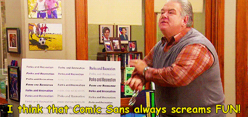
Never use Comic Sans... Ever.
Take Your Skills Further with Design Bootcamp
Check out Design Bootcamp, available with School of Motion All-Access.
ENROLL NOW!
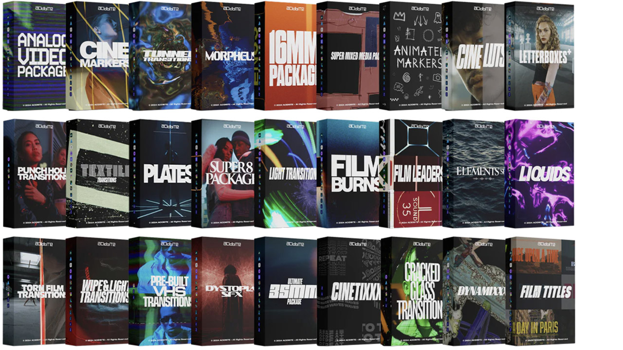
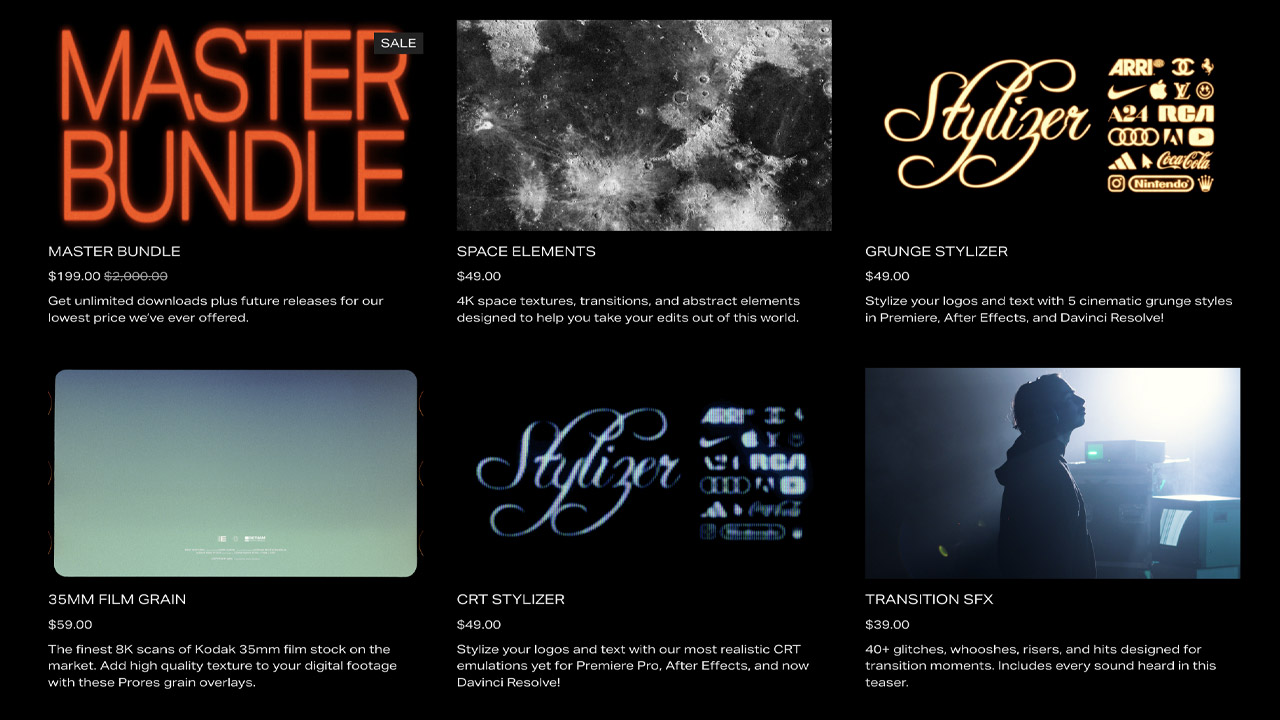
Acidbite ➔
50% off everything
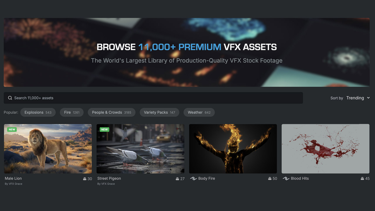
ActionVFX ➔
30% off all plans and credit packs - starts 11/26
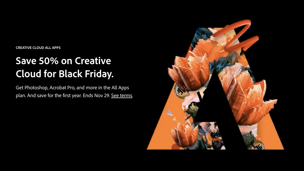
Adobe ➔
50% off all apps and plans through 11/29
aescripts ➔
25% off everything through 12/6
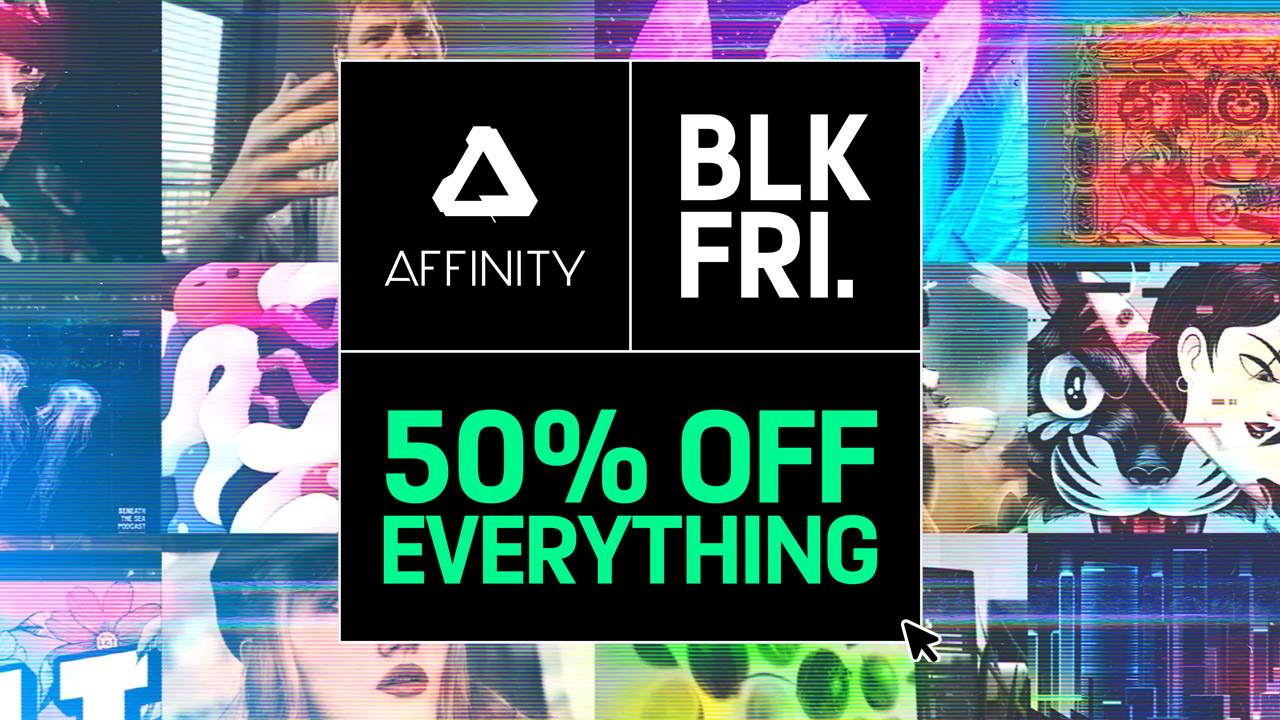
Affinity ➔
50% off all products
Battleaxe ➔
30% off from 11/29-12/7
Boom Library ➔
30% off Boom One, their 48,000+ file audio library
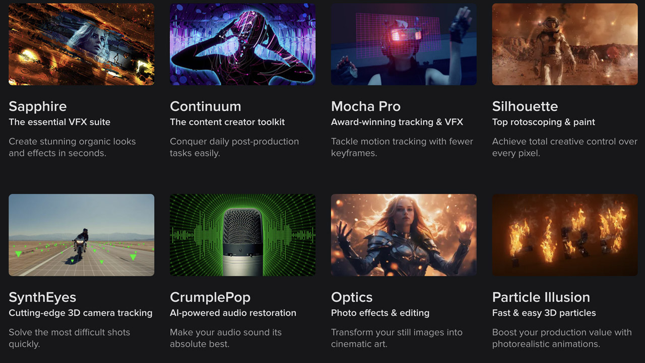
BorisFX ➔
25% off everything, 11/25-12/1
Cavalry ➔
33% off pro subscriptions (11/29 - 12/4)
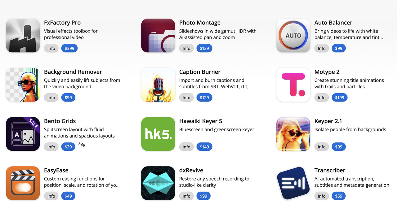
FXFactory ➔
25% off with code BLACKFRIDAY until 12/3
Goodboyninja ➔
20% off everything
Happy Editing ➔
50% off with code BLACKFRIDAY
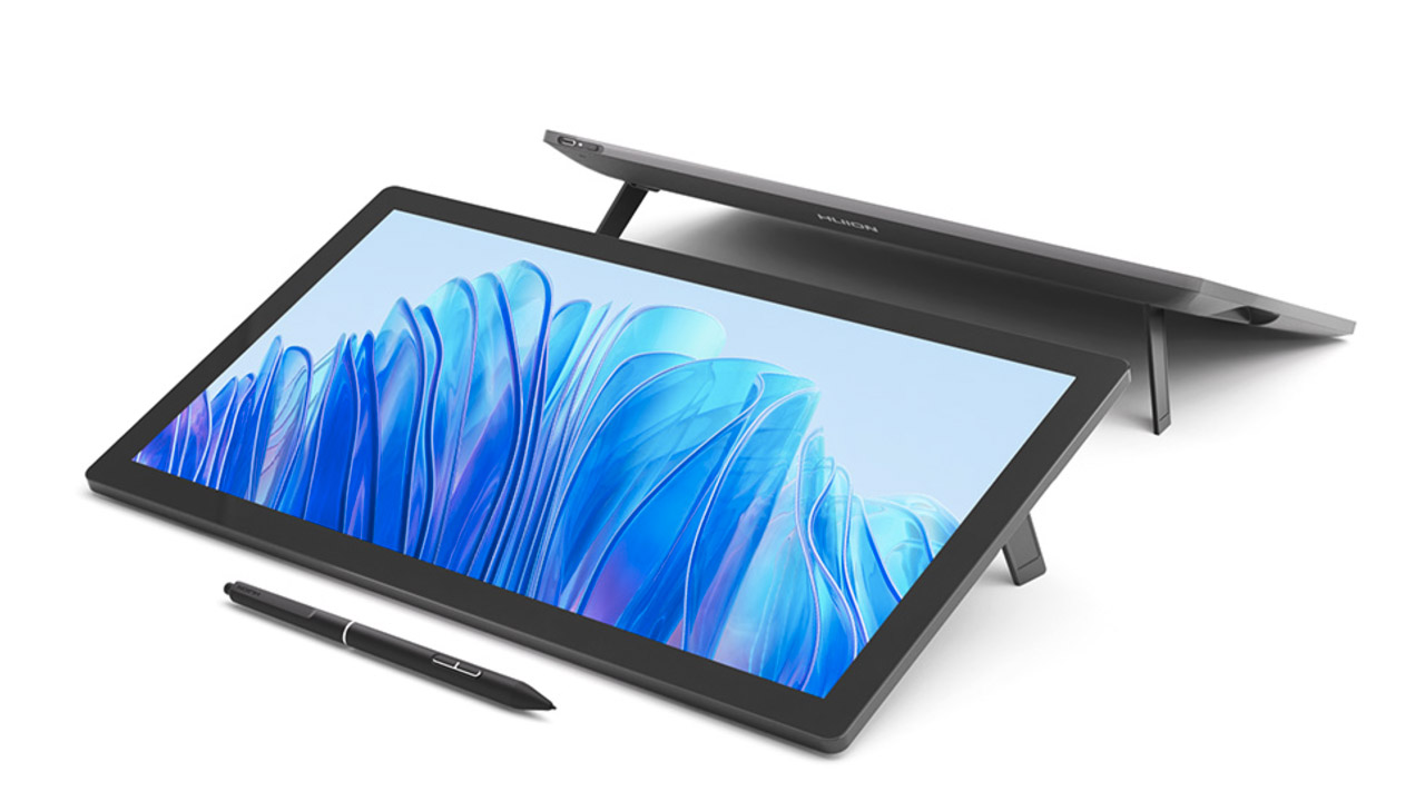
Huion ➔
Up to 50% off affordable, high-quality pen display tablets
Insydium ➔
50% off through 12/4
JangaFX ➔
30% off an indie annual license
Kitbash 3D ➔
$200 off Cargo Pro, their entire library
Knights of the Editing Table ➔
Up to 20% off Premiere Pro Extensions
Maxon ➔
25% off Maxon One, ZBrush, & Redshift - Annual Subscriptions (11/29 - 12/8)
Mode Designs ➔
Deals on premium keyboards and accessories
Motion Array ➔
10% off the Everything plan
Motion Hatch ➔
Perfect Your Pricing Toolkit - 50% off (11/29 - 12/2)
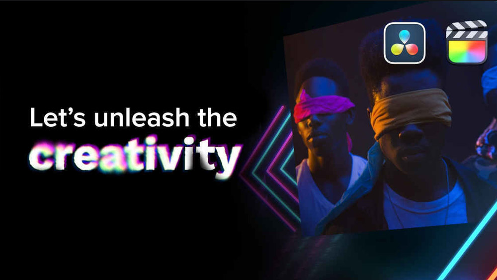
MotionVFX ➔
30% off Design/CineStudio, and PPro Resolve packs with code: BW30
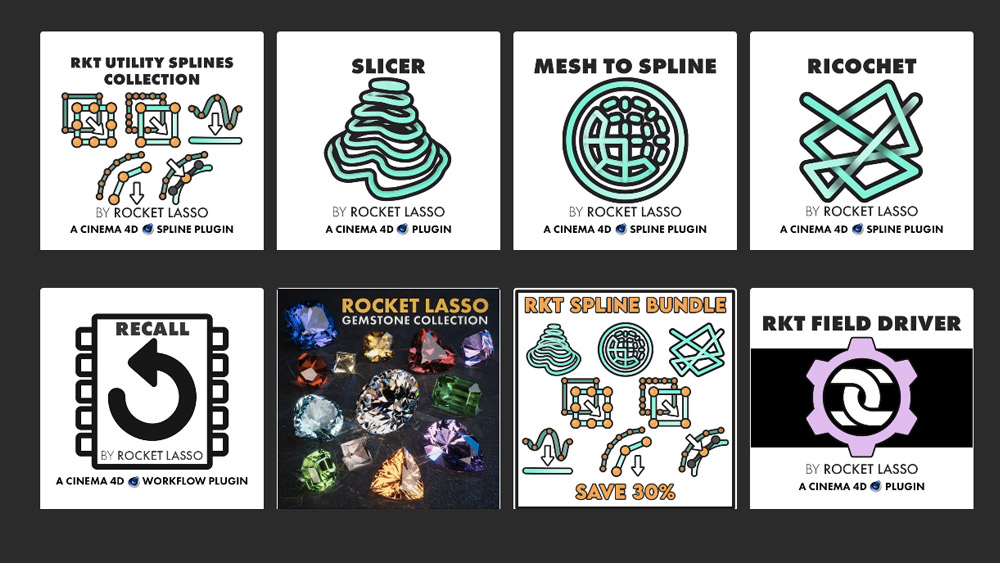
Rocket Lasso ➔
50% off all plug-ins (11/29 - 12/2)
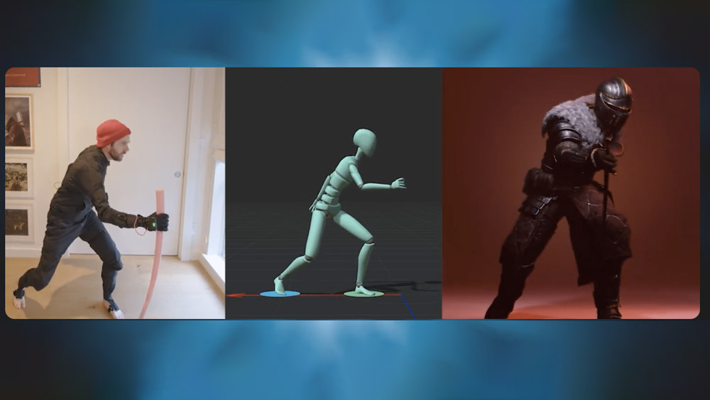
Rokoko ➔
45% off the indie creator bundle with code: RKK_SchoolOfMotion (revenue must be under $100K a year)
Shapefest ➔
80% off a Shapefest Pro annual subscription for life (11/29 - 12/2)
The Pixel Lab ➔
30% off everything
Toolfarm ➔
Various plugins and tools on sale
True Grit Texture ➔
50-70% off (starts Wednesday, runs for about a week)
Vincent Schwenk ➔
50% discount with code RENDERSALE
Wacom ➔
Up to $120 off new tablets + deals on refurbished items


Design Like a Pro Motion Designer
Master layout, color, typography, and composition for motion. Enroll in All-Access to unlock Design Bootcamp and 50+ other courses.