
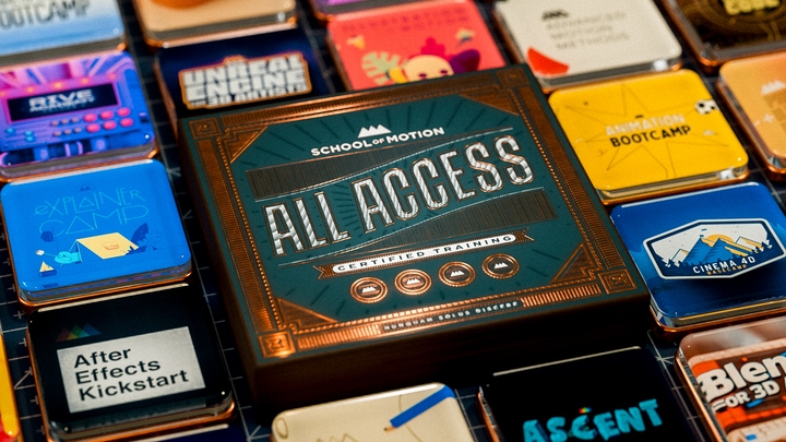
All-Access Pass
Unlimited access to 50+ courses, unlimited critique, live events, and 24/7 community. Join School of Motion All-Access today.
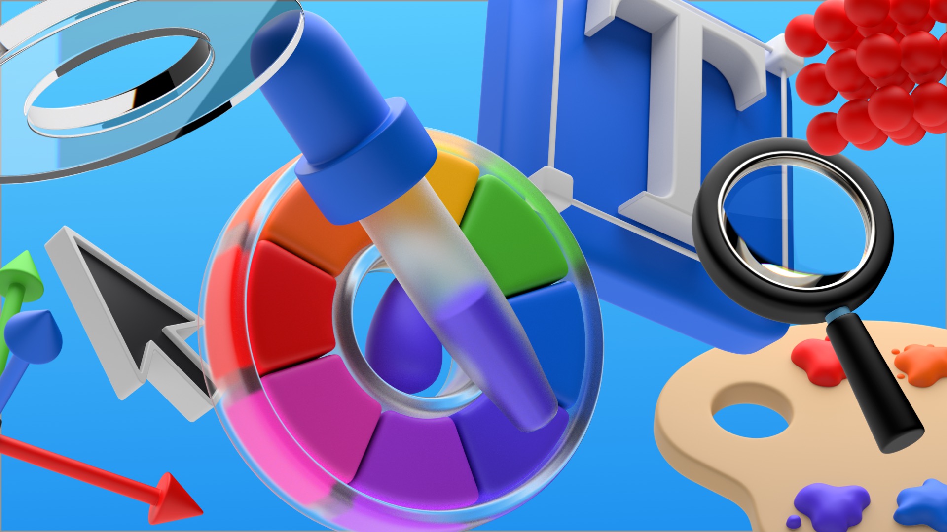
Looking to up your design game? Understanding a few basic rules can go a long way to getting you there!
A well-designed composition stands out from the crowd. It pops, but sometimes it’s hard to put your finger on exactly what makes this image special. You know it looks good, but why? It’s not an accident. There are fundamental rules for Design, and learning to use—and bend—them elevates your work.

When you fumble around on a project, you waste time and energy that could be spent polishing a better product into something stunning. The difference comes down to the basics. If you understand the principles of design and how to employ them, you'll make better art...faster!

In this exploration of the fundamentals, I'm going to talk about a few simple rules for design that can help you avoid a number of problems. Even if you've seen all of these before, it's never a bad time to refresh the ol' gray matter with a spoonful of knowledge. Today we'll cover:
- Using Grids
- Using Contrast
- Setting Focus
- Achieving Balance
- Using Hierarchy
Grids - What are they and why do you need them?
Grids are your foundation. They give you structure. They give you a framework within which to build. Your eye craves order. It wants to make sense of what it is seeing. That is why things set up on a grid look so good. It makes your eyes happy. Grids help remove the guesswork.
If you are staring at a blank page and wondering where to put something, your grid can help solve that.

The best place to start is with the Rule of Thirds, a guideline for composing images in any visual medium, including photography and film. It’s a simple 3x3 grid concept that helps you frame or place things in a way that is pleasing to the eye. It’s the same grid that you have in your phone's camera. This is a great place to start, and it's super easy to position your objects.
Placing something on a cross point in a 3x3 grid instantly gives you a pleasing composition. Why does this work? The eye already drifts naturally to these cross points. By utilizing the natural tendencies of the human eye, you create something that is effortlessly pleasing to the brain. Try it out and see for yourself.

But don’t stop there. You can set up a grid in any combination. 4x3, 8x8... 7x6 is a favorite of mine, along with a nice 12x10. Experiment a little. Try different combinations and find what works for you. The main thing is to start using grids for all of your design projects. You’ll wonder how you lived without them.


Contrast is key
You know we love contrast here at SOM. Contrast simply means the variation in values across an image. As far as color and values go, the human eye prioritizes value over chroma. A simple S-curve on your Contrast is an easy way to add instant pop to your image. I almost always add that before calling it done.

But contrast can be applied to more than just value. It can be a difference in size, shape, color, or detail. Contrast in detail translates into negative space, which is crucial. That contrast gives the eye a place of rest outside of the places of interest.
x
All of these points of contrast can be used to improve your composition and help lead the eye right where it needs to be. Which leads us to our next topic...

Focus your attention
A good composition has a strong focal point: the area that immediately draws the viewer's attention. The focal point is where things are happening. It’s where you want to be, all the cool kids are going there. It’s the place that has the information most important to the viewer; a dominant element that all the other components support thereby forming a hierarchy of importance.

Using contrast is a great way to set a focal point. Once you have decided on your focal point, make sure all of the other elements support that. A different shape or color or a dramatic shift in size tells the viewer where they need to look.
A great technique is to set your image to black and white and squint at it. What pops out at you? Is the focus where you want it to be? If not, this can help you dial things in. You now know what to focus on.
Too many focal points or too much contrast can distract the eye, so it's important to find balance in your composition.

Bring balance to the force
The elements in your frame carry visual weight, and the eye knows when things are off. The spatial relationships of these elements are the key indicators. Think of your frame as a see-saw. In order to achieve balance, you must place things relative to one another according to their visual weight.
Two like-elements spaced evenly apart creates a nice symmetrical balance. It looks "right." Elements with different weights would need to be spaced further apart to create an asymmetrical balance.

Hierarchy
Hierarchy is the way elements are arranged to signal their importance. This is especially relevant when working with type. Well established hierarchy helps a viewer quickly identify the most important information and work through it easily.

How does this apply to motion design? Often we are creating information that is on the screen for a very short period of time, such as a tag to a broadcast spot. The information needs to be clear and easy to read. Using scale or contrast and even color, we can create a clear hierarchy for the viewer. Everything they need to know can be delivered quickly while looking sharp at the same time.

We’re all friends here
By now I am sure that the overlap in these ideas is obvious. They do not function independently from one another. They work together to bring clarity to your design so that you can deliver an idea or information in a way that is pleasing to the viewer. These ideas are just the tip of the iceberg. There are more rules for composition and design that you can leverage to elevate your work.
- Density
- Scale
- Color
- Repetition
- Pattern
- Proximity
- Weight
- Negative Space
Like anything, the more you learn and the more you practice the better you will get, and the easier it will be to use these concepts to bing your ideas into reality. I have a personal project that I am working on just to help me develop and refine my design skills: 99 Style Frames. It's a place to just have fun and explore, and I can’t overstate how helpful that is in improving your work and upping your confidence.
Art...by Design
Hopefully this gave you some things to think about and start working into your own designs.
If you want to dig deeper into the Principles of Design, School of Motion offers two excellent courses in this area: Design Bootcamp and Design Kickstart. Led by the incomparable Mike Frederick, these show you the fundamentals and challenge you to grow from beginner to intermediate.
ENROLL NOW!
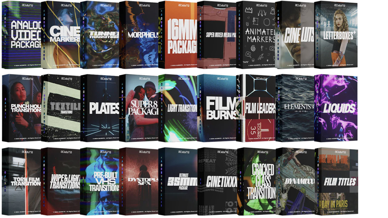
Acidbite ➔
50% off everything
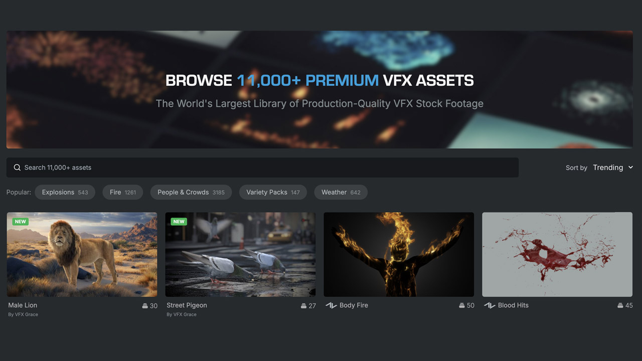
ActionVFX ➔
30% off all plans and credit packs - starts 11/26
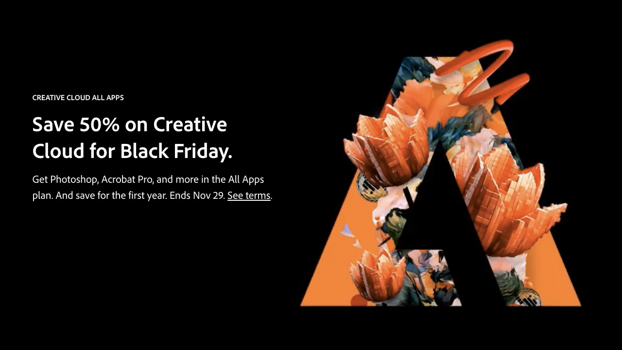
Adobe ➔
50% off all apps and plans through 11/29
aescripts ➔
25% off everything through 12/6
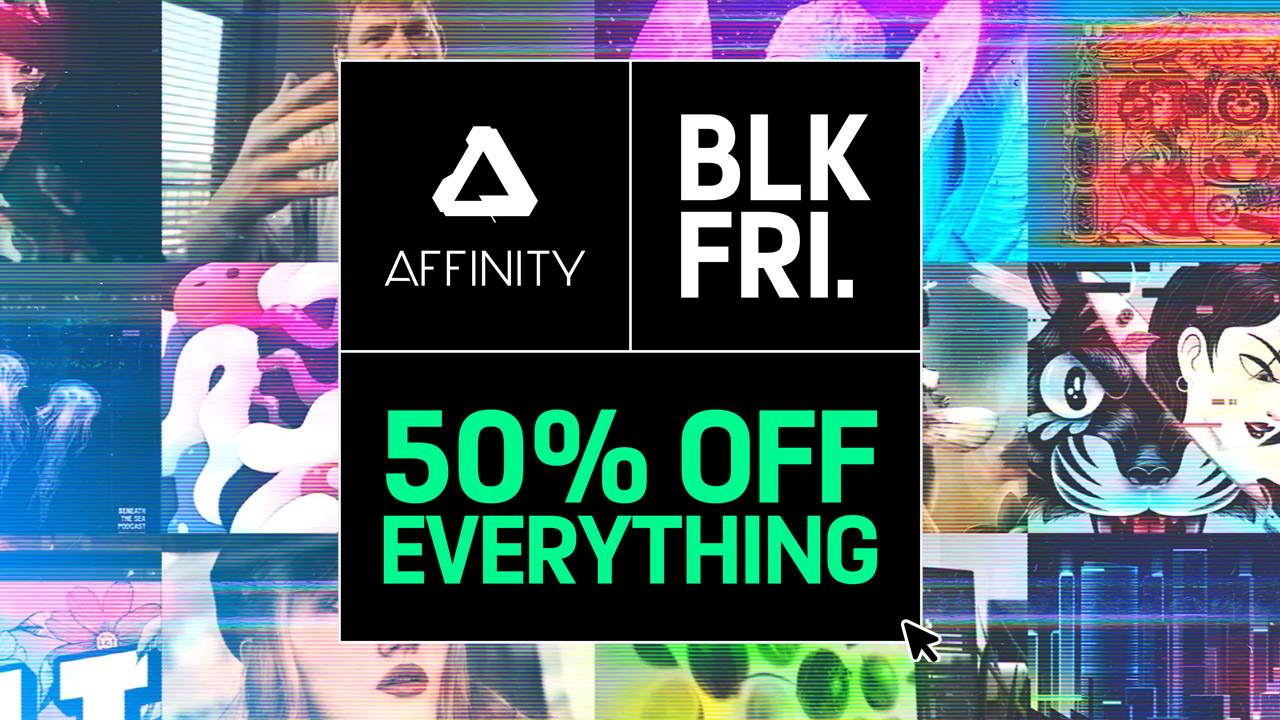
Affinity ➔
50% off all products
Battleaxe ➔
30% off from 11/29-12/7
Boom Library ➔
30% off Boom One, their 48,000+ file audio library
BorisFX ➔
25% off everything, 11/25-12/1
Cavalry ➔
33% off pro subscriptions (11/29 - 12/4)
FXFactory ➔
25% off with code BLACKFRIDAY until 12/3
Goodboyninja ➔
20% off everything
Happy Editing ➔
50% off with code BLACKFRIDAY
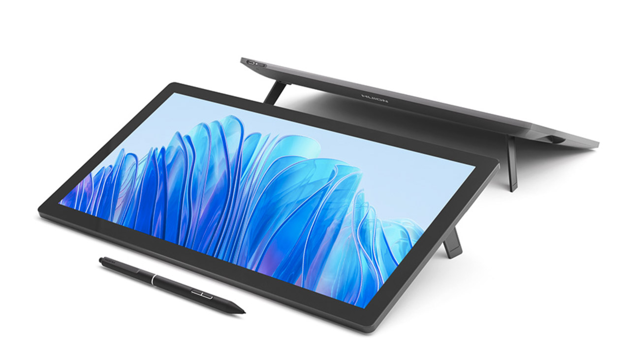
Huion ➔
Up to 50% off affordable, high-quality pen display tablets
Insydium ➔
50% off through 12/4
JangaFX ➔
30% off an indie annual license
Kitbash 3D ➔
$200 off Cargo Pro, their entire library
Knights of the Editing Table ➔
Up to 20% off Premiere Pro Extensions
Maxon ➔
25% off Maxon One, ZBrush, & Redshift - Annual Subscriptions (11/29 - 12/8)
Mode Designs ➔
Deals on premium keyboards and accessories
Motion Array ➔
10% off the Everything plan
Motion Hatch ➔
Perfect Your Pricing Toolkit - 50% off (11/29 - 12/2)
MotionVFX ➔
30% off Design/CineStudio, and PPro Resolve packs with code: BW30
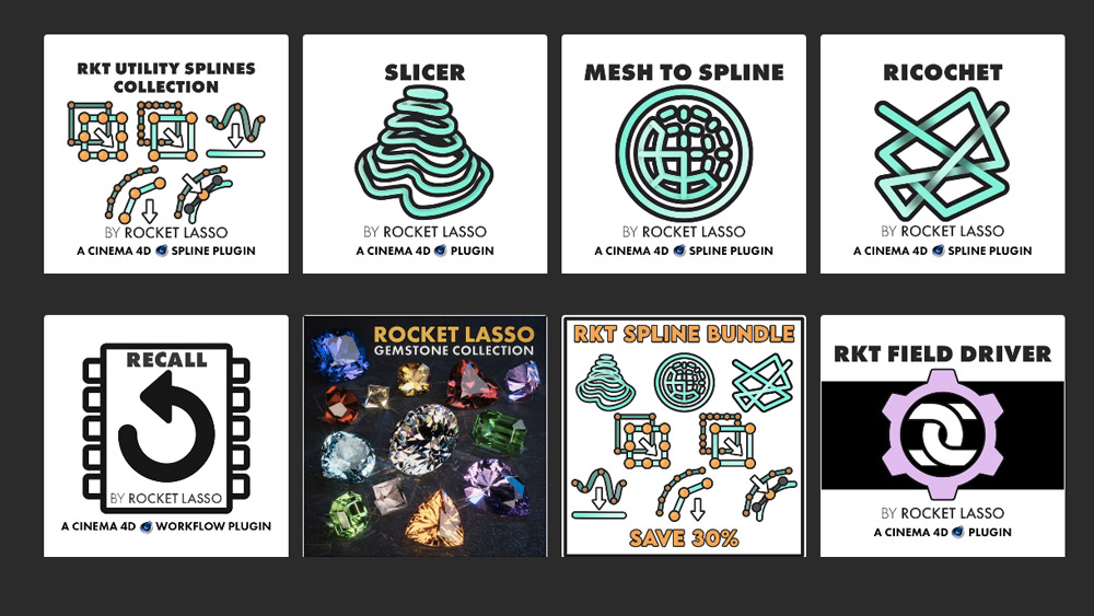
Rocket Lasso ➔
50% off all plug-ins (11/29 - 12/2)
Rokoko ➔
45% off the indie creator bundle with code: RKK_SchoolOfMotion (revenue must be under $100K a year)
Shapefest ➔
80% off a Shapefest Pro annual subscription for life (11/29 - 12/2)
The Pixel Lab ➔
30% off everything
Toolfarm ➔
Various plugins and tools on sale

True Grit Texture ➔
50-70% off (starts Wednesday, runs for about a week)
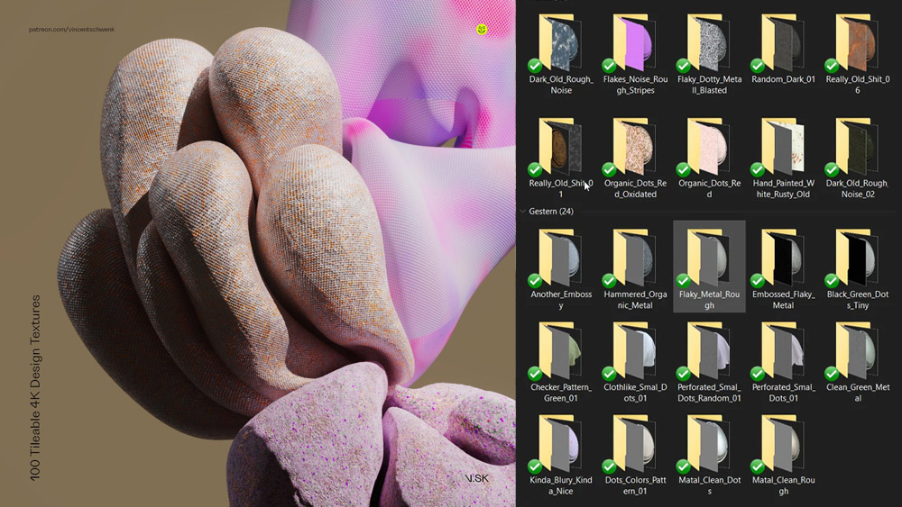
Vincent Schwenk ➔
50% discount with code RENDERSALE
Wacom ➔
Up to $120 off new tablets + deals on refurbished items


All-Access Pass
Unlimited access to 50+ courses, unlimited critique, live events, and 24/7 community. Join School of Motion All-Access today.