
Design Like a Pro Motion Designer
Master layout, color, typography, and composition for motion. Enroll in All-Access to unlock Design Bootcamp and 50+ other courses.

Does your motion design art stop people in their tracks? Do you want it to?
You want to make show-stopping motion graphics, but your game just doesn’t have that scroll-stopping finesse. While there are many ways to create arresting artwork, it all starts with the fundamentals. When you’re done with this tutorial, you will be able to break down and define design elements within a piece, and WHY they work. Ready?
Hi, I’m Justin Peterson, and I’m a director of digital content in sports. Working in live broadcast television, you have to wear many different hats. I actually started by roaming the sidelines as a videographer. When I got into motion design, I hit a wall with my graphics, wondering why they didn’t look polished. Today, I’m here to share with you the motion design lessons that helped get me off the sidelines and onto the playing field.
In this video, you’ll learn to:
- Understand design decisions
- Choose your type
- Identify principles of contrast
- Translate your camera skills to CG
- Make the cut
How to Design Show-Stopping Sports MoGraph
{{lead-magnet}}
Understanding Your Design
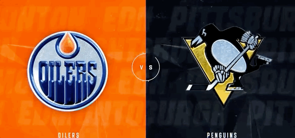
We're going to start off with a very familiar scene: the split-screen look. This is where the network wants to draw the line in the sand and have the audience pick a side. It's part of what makes sports such a fun pastime. Pick your home team and root, root, root!
You want big, bold logos and the team's colors and symbols working in the background. You can also use this split-screen design for player introductions, with their names, numbers, and stats opposite a hi-res image.
This design works because of balance. Neither team is given greater weight, which sells the upcoming competition as a battle of equals. Once you understand how this design choice improves the image, it's time to decide on the text.
Choose Your Type
There are two distinct typefaces, and you probably know them well enough: Serif and Sans-Serif. Serif has the extra "feet," the ornamental bits at the top and bottom. Sans-Serif is...without those feet. Pretty self explanatory.

Remember that typography is all about expressing the message to the viewer. You don't want anything that distracts from the message or legibility, so I always recommend you stick to Sans-Serif. There are tons of great fonts to choose from, and you can rest assured your audience will be able to pick up what you're setting down.
Identify Principles of Contrast
Contrast is used to creat emphasis, dominance, and dynamic energy within graphics. In the video above we go into detail on Size, Shape, Fill and Stroke, and Color and Texture.
Contrast is a great way of showing the relationship between various objects in your design. If you have a roomful of squares, the circle suddenly stands out. If every bird on a line is blue, the red one is suddenly more dynamic and interesting. In sports MoGraph, you can use contrast to create a narrative for the upcoming event and add even more interest for your audience.
Translate Your Camera Skills to CG
There are many transferrable skills going from real-life photography to CG camera work. For example, when I shot sideline videography, I often used a wide-angle lens and shot from a low angle. This ended up showing the athletes as larger-than-life, which is exactly the tone we were trying to strike. Well, the same is true with your graphics.
Notice how the low-angle logo pulls you in, presenting the object with a sense of power and reverence. The flat image, on the other hand, crushes the logo against the background. While it might technically work, it's nowhere near as effective or aesthetically pleasing.
The next time you're watching ESPN, pay attention to how many of their graphics are rendered with a wide-angle lens from a low angle.
Make the Cut
If you've been on social media in the past year, you've likely seen the trend of people throwing up a shoe and magically transforming their attire. In the industry, we'd call this a Match Cut. Well, it's also one of the most effective tools you can use to tie a bunch of images together for a great composition.
[ADD MISSING GIF HERE]
As you can see, I start with a logo, match the movement so it becomes a line, then match that movement again to become a number. I'm hiding the transformation in the cut, but the motion sells the magic.
Want to Take Your Design Up a Notch?
That’s it! Pretty simple, huh? Understanding the fundamentals of design can take your motion design game to the next level, but you’re not going to get it all from a YouTube tutorial. If you want to know more, check out Design Kickstart!
In this 8-week course, you’ll take on industry-inspired projects while learning key design concepts that will elevate your design work right away. By the end, you’ll have all of the foundational design knowledge necessary to start crafting storyboards that are motion ready.
-----------------------------------------------------------------------------------------------------------------------------------
Tutorial Full Transcript Below 👇:
Justin Peterson (00:00): You want to make showstopping motion graphics, but your game just doesn't have that scroll stopping finesse. Well, I'm here to tell you that you can get there, but you need to start with the fundamentals. When you're done watching this video, I want you to be able to break down and define design elements within a piece and why they work. Are you ready?
Justin Peterson (00:25): Hi, my name is Justin Peterson. I'm a director of digital content and sports working in sports. We all know that you have to wear many different hats. Actually started roaming the sidelines as a videographer. When I got started, when I started transitioning into motion design, I hit a wall with my graphics, wondering why they didn't look polished today. I'm here to share with you the motion design lessons that helped me get off the sidelines and into the game. In this video, you're going to learn to understand design decisions, choose your type, identify principles of contrast, translate your camera skills to CG and make the cuts before we begin, make sure you grab the materials at the link in the description
Justin Peterson (01:10): To kick this off. We're going to be starting in a familiar place, but first I want to give a shout out to Dixon, backseat, big block vis tech and two fresh creative for sharing their amazing work that we'll be using in this tutorial. The split-screen look is something that all fans have seen, regardless of whether they've recognized it as a split-screen look or not. It's a traditional matchup graphic where there's one team on the left side, one team on the right side. There's different ways to represent this, but essentially the design decision comes down to drawing a line in the sand and saying, who are you rooting for the team on the left or the team on the right. You'll see backgrounds with the team colors and the logos are going to be big and bold. So let's look at a couple of different ways to represent this.
Justin Peterson (01:51): We have the horizontal, we have a vertical version top and bottom, and then there's variations on this one as well, where we have a photo cutout as the hero, and then top and bottom. On the other side, this is a representation. That's the inverse of what I showed you with the players on the right-hand side and the players names top and bottom on the left. You'll also see that they implemented the horizontal structure here so that the players represent the horizontal structure left and right. And then over here, they do the top and bottom. So they basically combined a couple of different ways of approaching this into one graphic.
Justin Peterson (02:32): There are two distinct typefaces that you're probably aware of Saraf and San Saraf. So Saraf is going to be the one that has these extra ornamental elements or feet attached to the end of the letters. Whereas sand Sarah as the name suggests is without Sarah gifts. So most of the work that you're going to be doing in sports is going to be with sand Saraf. The number one rule of type is legibility. And with type that moves across the screen, your ultimate goal is to communicate and sand surf is going to be the choice because it's going to be sleek, clean and easy to read.
Justin Peterson (03:14): Contrast is used to create emphasis, dominance, visual cues, and most importantly, dynamic energy within graphics. We will cover the most commonly used types of contrast within sports graphics, size, shape, fill, and stroke and color and texture. The first type of contrast we're going to cover is size. So I've laid out two squares side-by-side and I'm going to pull this one out just so you can see that that is indeed side-by-side. I have the anchor points here right in the middle. And if I scrub side to side on this slider, you can see using size as a contrast element can create some dynamic movements. So I have an expression on this slider here, and I'm just going to play this back for you so you can see what I mean. Now it's a little crazy, but it gives you the idea of, of what using size contrast can do for you. And I have an example here to show what this looks like in an execution. All right. So if I go frame by frame here,
Justin Peterson (04:25): You can see a large logo on the side with some other elements and a smaller logo here. That looks kind of similar to this. Can you see that? So they're using contrast here to drive energy when it comes to revealing the teams, logos and names. The next kind of contrast that we have here is shape. So when I play this, ah, the circle stands out because it was all squares beforehand, and then you get the circle. So let me show you what that looks like in practice. I have set up these two squares, similar to what you saw on the size, the contrast size example. And I'm just going to move this out just so you can see they were two squares, but I moved it in. So that the center point is actually right in the middle here. And I'm going to increase the roundness here to be a circle.
Justin Peterson (05:27): So as I play this back, you see a, a circle and a square and at different points here, you can almost see like the key of a basketball court would look like here, the contrast between a square, with a circle on top. And I'm going to go back to this example, and we can also talk about the transitional elements that are used here in addition to the size. So you can see the triangle look here. And as I scroll, once it comes back through the other side, it flipped. So then the triangle is headed to the right, and that is how they reveal the rest of the, the logo. And the combination of the shapes with the size really drives this animation to make it feel like you're going back in space, but also gives it some depth as it's going back. Um, and then obviously that general way the triangles are facing are the angles in which the motion and movement is happening within the frame.
Justin Peterson (06:27): We've already talked about types of returning to that, look and feel here. Let's just get rid of the surf because we know we're going to be using sand Sarah, for the most part, just alternating the text from Phil to stroke. You can see the dynamic movement. And if you combine this with multiple other texts layers, you're going to be able to see how much dynamic movement this type of contrast can create. So let's hop on over to this example from Dixon's backseat and it's full of Phil verse stroke. Examples in this example, everything is stroked. And when you get to Rio, it's filled. So of all these other cities, the fact that Rio was filled in because the extra attention to it, I love the use of this 500 going from Phil to stroke because there's movement in addition to it. So as it comes in and as it settles, it switches to stroke in a cascading order that draws extra attention to the number 500.
Justin Peterson (07:28): If you've noticed up to this point, I've only used black and white in my examples. And that was intentional because I wanted to create some contrast of what black and white versus color is. And I've found that oftentimes it's easier to see an element when you're talking about contrast when it's black and white versus adding color. So I've tried to outline black and white and show you color examples. And I'm going to do the same thing here. So in this one, color and texture, alternate, if I go frame by frame, I am just changing color. I'm inverting color. And this is a very powerful way to use color within your work as well. A great example of this as the color change, texture change from big block, you can see as you get in here, they start with stroke. Then we go to fill and then we invert the colors.
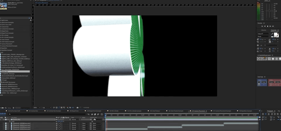
Justin Peterson (08:26): You see those, you see the colors change and invert in the background. Now let's focus on the single team logo. The reason I wanted to highlight this is because it showcases how powerful color and texture change can be color and texture is the primary thing that's changing. As it opens to reveal and the final logo, there's a lot of transferable information going from real life to CG. Here's a that you've already seen and you could see me down low angled up wide angle. And the reason for this is because low angle with a wide angle lens is going to make the athlete appear larger than life. So let's go to CG. And in this example, I have a transition that I created to show you the difference between what it looks like with a low angle wide angle lens versus an 85 millimeter lens. There's a huge difference.
Justin Peterson (09:23): I'm low. And the wide angle lens element allows me to be really close to the object. And when I play this back, you can see the two differences. The background on this one feels much further away and you see some lights up above it. And this one, the 85 millimeter lens, the background feels crushed and is real, feels much closer to the Shamrock than the wide angle lens did. The thing is I didn't move any of it. All I did was change the camera focal length. So let's jump into an example of low camera angles from vistech. You see how they keep the camera really low, to make things feel bigger than they are
Justin Peterson (10:05): Back to our black and white visuals here. I have laid out a circle and animated it out, and then I followed it for repetition. It's like a follow the leader type of an animation. And you're going to see this all over the place. In fact, if I go back to this last example, if you look at all the white elements, see how they come across the screen here, then it starts up top and comes down towards the bottom. And then they reuse that same white element to expand out and highlight the logo. Then it comes back across and leads up to reveal the player. So you can see how repetition is used to really drive that dynamic movement. Chances are, if you've been on social media in the last year, you've seen a certain type of video. You know, the ones where people throw up a shoe and all of a sudden their clothes change in our world. This is called a match cut. We're just going to jump right in here and talk about a match cut. So in this piece, I am taking a logo and adjusting size as it goes along the line. And then as it breaks through the line comes through and then I'm switching shapes. So it's transitioning from a logo to align to a rectangle. And this is the quintessential match cut, where you're taking an object. And while it's moving along a path, it changes or morphs into something else.
Justin Peterson (11:44): I have a piece here from big block that I want to talk through because it shows many of the examples here, not all, but many of the examples here to help and reinforce some of the lessons that you learned earlier. So let's call them out as we go along here, color, color Size from big to small Color Size, Color, shape, repetition text from stroke, and Phil's Color change within the strokes. And Phil's Inverted color. Now there's a cascading shape. So there's some repetition here in this triangle.
Justin Peterson (12:52): You see some sand surf, text, more cascading shapes here with repetition change in shape to, from a triangle to a rectangle repetition stroke, with a fill and size up from small to large. And then we took this triangle from here, this triangle that was here and flipped it on its side. And then it'll turn over and there's a little bit of color. Follow the leader there as well to really help drive that contrast. So I'm going to play that back for you so you can see it working all together in concert. That's it pretty simple, huh? Understanding the fundamentals of design can take your motion design game to the next level, but you're not going to get it all from YouTube tutorials. If you want to know more, check out design kickstart, and this eight week course you'll take on industry inspired projects while learning key design concepts that will elevate your design work right away by the end, you'll have all of the foundational knowledge necessary to start crafting storyboards that are motion ready. If you enjoyed this video, make sure you subscribe to the channel for even more tutorials, live streams and industry news and make sure you hit the bell icon. So you'll be notified when we've released our next tip.
Music (14:13): [outro music].
ENROLL NOW!
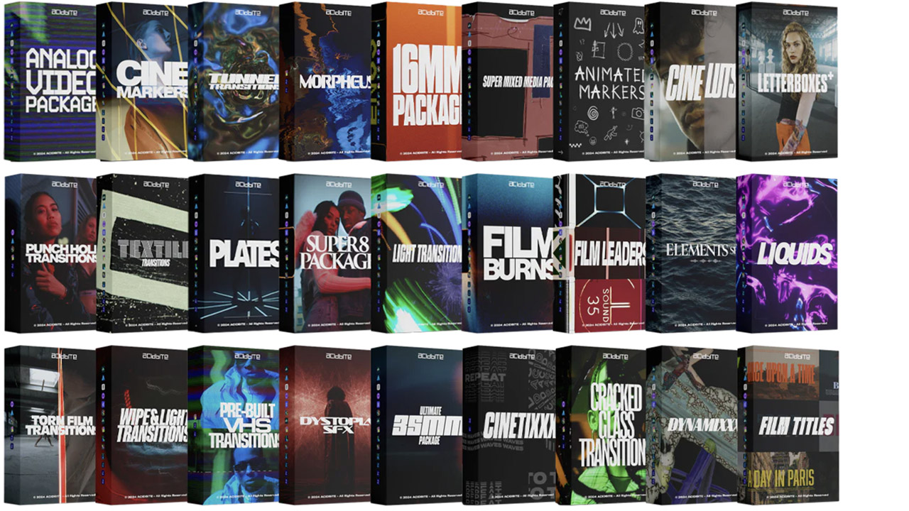
Acidbite ➔
50% off everything
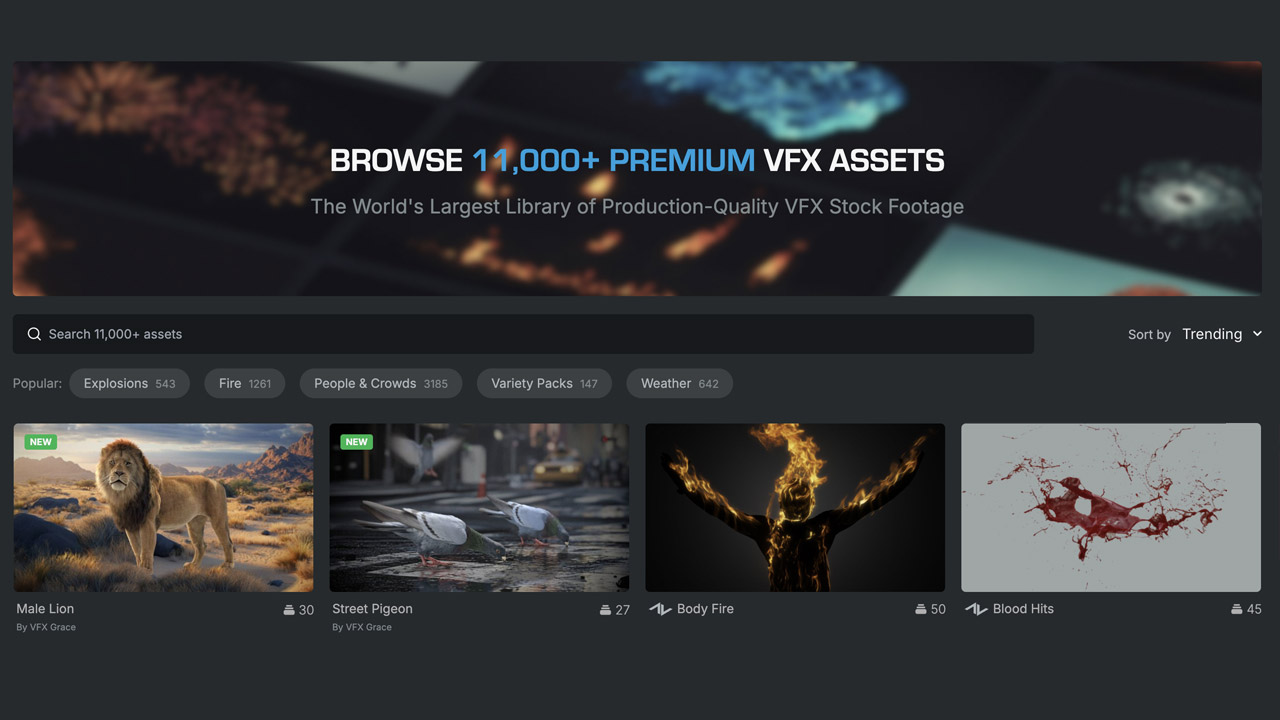
ActionVFX ➔
30% off all plans and credit packs - starts 11/26
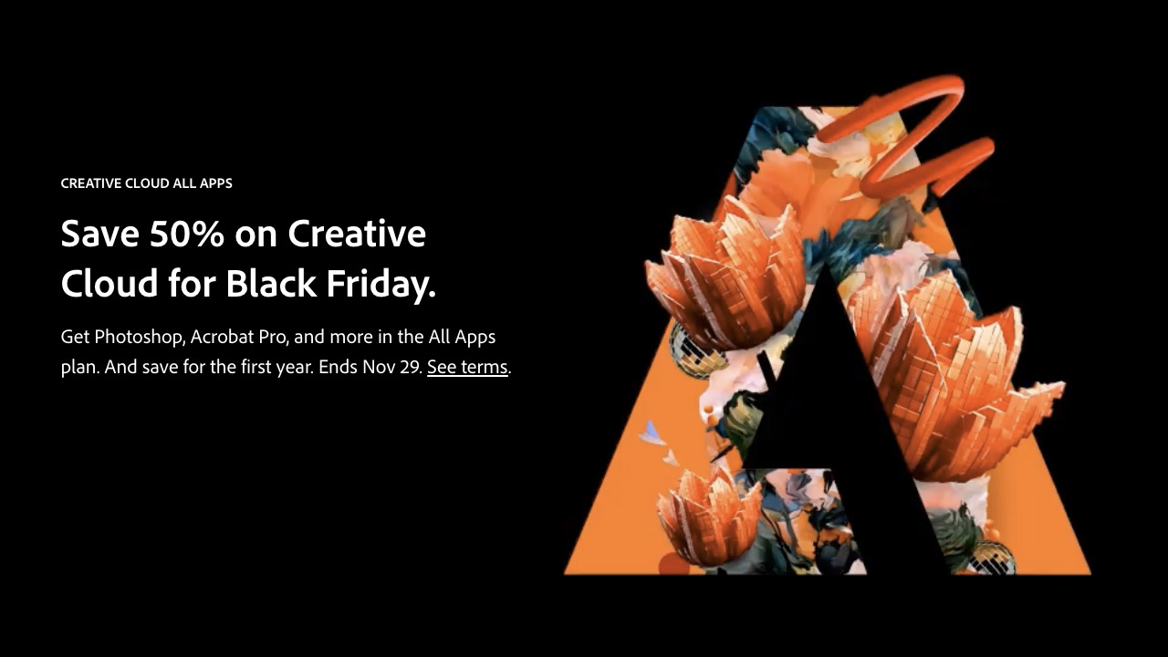
Adobe ➔
50% off all apps and plans through 11/29
aescripts ➔
25% off everything through 12/6
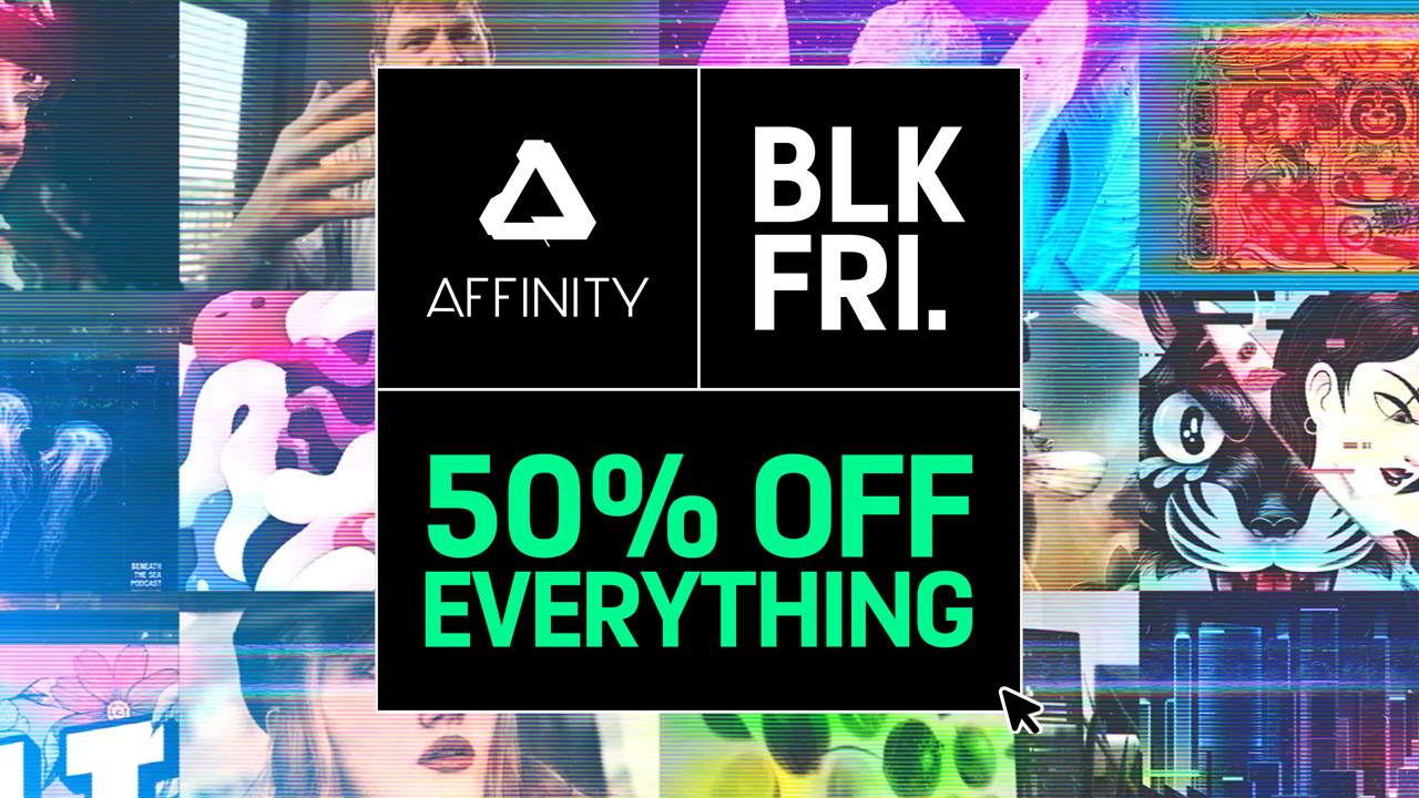
Affinity ➔
50% off all products
Battleaxe ➔
30% off from 11/29-12/7
Boom Library ➔
30% off Boom One, their 48,000+ file audio library
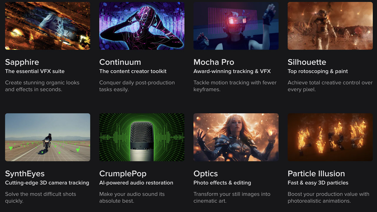
BorisFX ➔
25% off everything, 11/25-12/1
Cavalry ➔
33% off pro subscriptions (11/29 - 12/4)
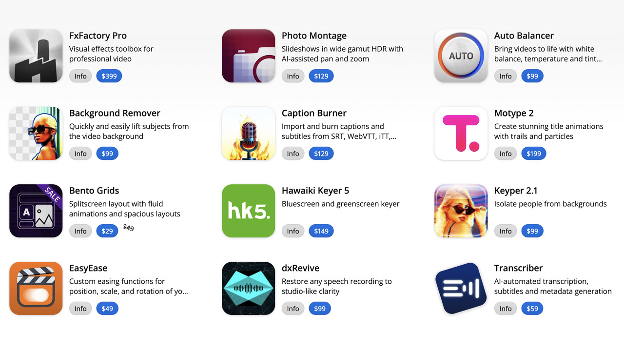
FXFactory ➔
25% off with code BLACKFRIDAY until 12/3
Goodboyninja ➔
20% off everything
Happy Editing ➔
50% off with code BLACKFRIDAY
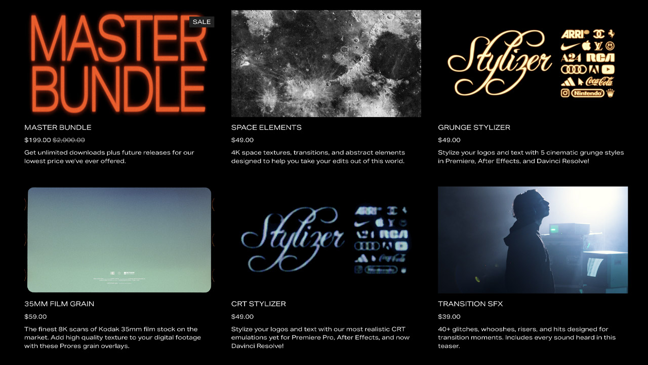
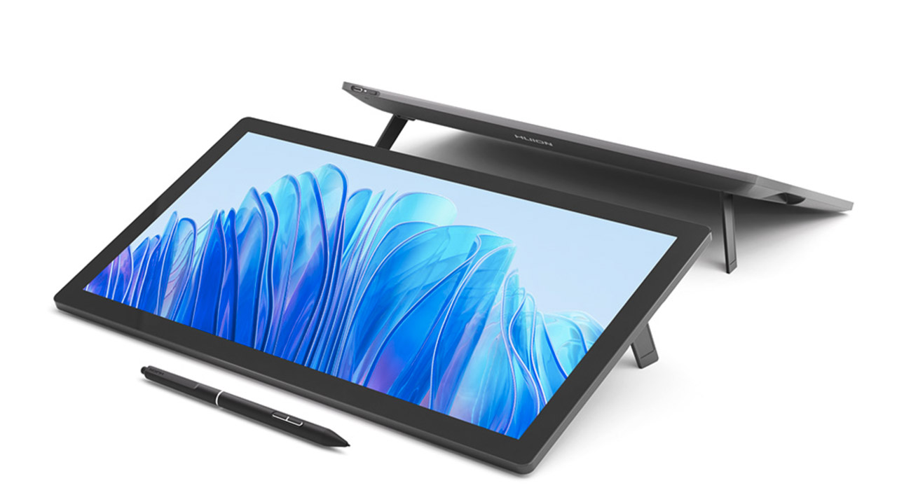
Huion ➔
Up to 50% off affordable, high-quality pen display tablets
Insydium ➔
50% off through 12/4
JangaFX ➔
30% off an indie annual license
Kitbash 3D ➔
$200 off Cargo Pro, their entire library
Knights of the Editing Table ➔
Up to 20% off Premiere Pro Extensions
Maxon ➔
25% off Maxon One, ZBrush, & Redshift - Annual Subscriptions (11/29 - 12/8)
Mode Designs ➔
Deals on premium keyboards and accessories
Motion Array ➔
10% off the Everything plan
Motion Hatch ➔
Perfect Your Pricing Toolkit - 50% off (11/29 - 12/2)
MotionVFX ➔
30% off Design/CineStudio, and PPro Resolve packs with code: BW30
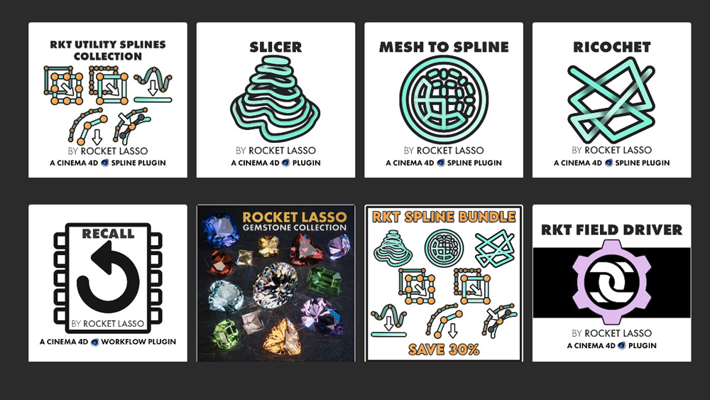
Rocket Lasso ➔
50% off all plug-ins (11/29 - 12/2)
Rokoko ➔
45% off the indie creator bundle with code: RKK_SchoolOfMotion (revenue must be under $100K a year)
Shapefest ➔
80% off a Shapefest Pro annual subscription for life (11/29 - 12/2)
The Pixel Lab ➔
30% off everything
Toolfarm ➔
Various plugins and tools on sale
True Grit Texture ➔
50-70% off (starts Wednesday, runs for about a week)
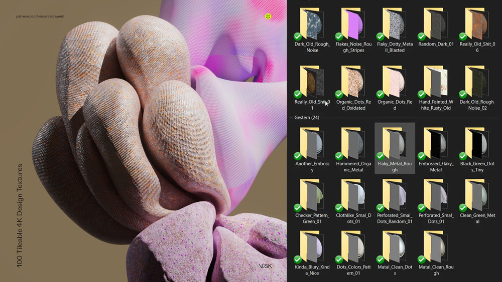
Vincent Schwenk ➔
50% discount with code RENDERSALE
Wacom ➔
Up to $120 off new tablets + deals on refurbished items

Design Like a Pro Motion Designer
Master layout, color, typography, and composition for motion. Enroll in All-Access to unlock Design Bootcamp and 50+ other courses.