All-Access Pass
Unlimited access to 50+ courses, unlimited critique, live events, and 24/7 community. Join School of Motion All-Access today.
Learn how to quickly create artwork in Adobe Illustrator with these essential tips for motion design workflows.
Sometimes the process of creating artwork is more of a pain than it needs to be. Often your imagination can be hampered by simply not knowing what your programs can do for you!
As you may know at this point, Adobe Illustrator is absolutely an essential tool for motion designers. However, many motion artists fail to learn the fundamentals of Adobe Illustrator, leading many to either avoid the program all-together or fumble around Illustrator like Mark Sanchez on Thanksgiving.
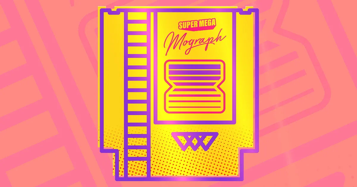
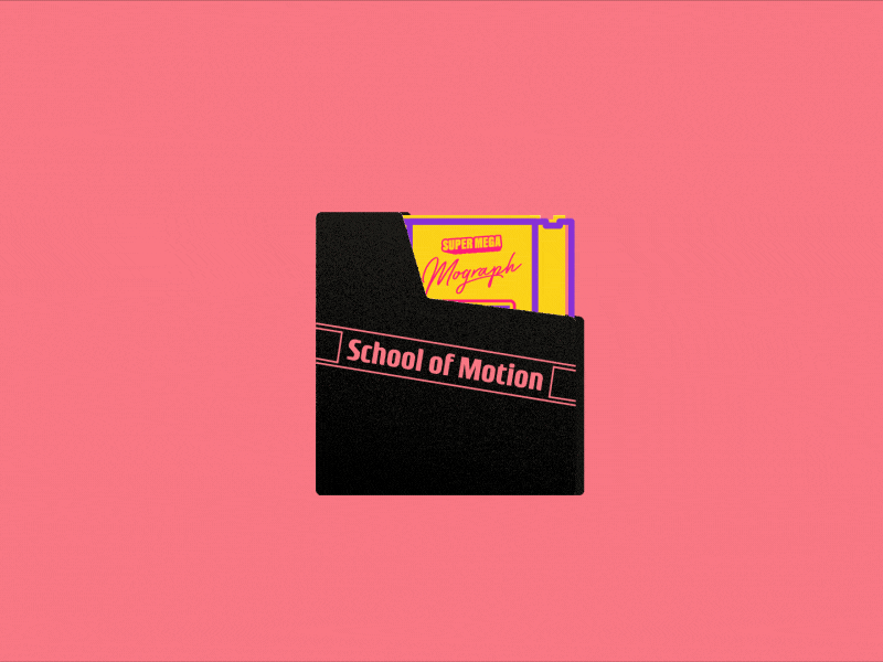
In this tutorial I'm going to help share with you some helpful time-saving tips for building illustrations for your motion design projects. It's a tutorial full of helpful Illustrator tips and how it relates to the motion design process. Also, the tutorial is themed after a Nintendo cartridge. So...Lets-a-go!
{{lead-magnet}}
Adobe Illustrator Tips for Motion Design Workflows
The tutorial above is going to cover a lot of different techniques and effects in Adobe Illustrator. Here's a list of some of the techniques we cover along with the timestamps:
- Using the Blend Tool (4:40)
- Editing a Blend (4:46)
- Perfecting Your Paths (5:50)
- Making Duplicates for Depth (11:56)
- Fixing Legibility (14:47)
- Locking Your Background (16:40)
- Developing Non-Destructive Artwork (17:27)
- Keeping Stroke Width Consistent (20:34)
- Isolating Layers for Clean Edits (21:40)
- Using Clipping Masks (25:15)
- Using Offset Paths (27:15)
- Creating New Color Groups (30:50)
- Grouping Layers for More Control (31:45)
- Shading (35:45)
- Creating Halftones (36:55)
- Adding Noise (43:45)
- Importing Illustrator Work into After Effects (44:30)
Learn More About Illustrator & Photoshop
Ready to learn more about Adobe Illustrator? Well my friend, I encourage you to check out Photoshop + Illustrator Unleashed here at School of Motion. The course is the best way to get up-and-going with both of these essential design tools. The course, like this tutorial, will show you how to look at these apps from the perspective of a motion designer. Along the way you'll get your work critiqued from professional motion designers and meet network with students from around the world.
You can learn more about Photoshop + Illustrator Unleashed over on the course page.
Hopefully you found this tutorial to be helpful. I don't know about you, but I'm ready to play some old-school Nintendo now!
-----------------------------------------------------------------------------------------------------------------------------------
Tutorial Full Transcript Below 👇:
Jake Bartlett (00:09): Hey, it's Jake. And in this video, I'm going to show you some of my favorite features of working inside of illustrators, specifically for motion design. Illustrator is one of those tools that I feel like a lot of motion designers dread opening up. They really don't want to get in there because the interface is different than after effects the tools behave differently. And you can get frustrated pretty quickly if you don't know what you're doing. And I really wish it wasn't that way because illustrator is one of my favorite programs. And you can really do a lot inside of it much easier than if you were making stuff right in after effects. So I'm going to walk you through making some artwork in a way that you probably haven't thought of doing before and then bring it into after effects and make it really quick animation.
Jake Bartlett (00:49): So by the end of this video, hopefully illustrator will be your new best friend. Let's jump in. Now what I have here are some artwork that's halfway there. It's not complete yet, but I have an old Nintendo entertainment system, original Nintendo cartridge, complete with the dust cover. So I'm going to jump over to my layers panel right here. If your layers panel isn't open, just come up to window, down to layers, and now we'll open up and I have this first object, a group of that dust cover. So I moved that off and we can see what's behind it. Here's our cartridge. And it's incomplete. This is what we're going to do. I'm going to finish completing this artwork. And if you want to follow along with me, you can go ahead and download the source project files for this video where you'll have both this state of the artwork, as well as the final project files, once everything is completed, but here we go.
Jake Bartlett (01:36): This is where I'm going to start. But before I go any further, I want to point out that I have my properties panel open, and I suggest that you have that open as well. So come up to window and go down to properties. This is just a really nice panel that basically brings up the most commonly used options for whatever you have selected. So, as I grabbed certain things, uh, it's going to update based on what my selection is and give me controls without having to dig through a lot of panels. So go ahead and open that up. Let's go ahead and get started with this section right here and add in some more details. If you're not familiar with the design of an NES cartridge, there are basically some sections in here. This is kind of like a little trench that has some dividing rectangles inside here.
Jake Bartlett (02:17): So I want to add in some lines and you might think to, you know, grab the rectangle tool and then drag a rectangle out and then I can make this, you know, the same way. Exactly. And then grab my eyedropper tool. I am the keyboard and then sample the other line so that it matches the style. And then I would have to maybe duplicate this and I'm using my smart guides. That's what these pink highlights showing up are. If you go up to view smart guides, command U is the shortcut. That's very helpful for snapping things to each other, but I can continue doing this, you know, holding option, clicking and dragging on an object to duplicate it all the way down. But there's another message that I think is a little bit quicker and more flexible. One thing that you're going to hear say a lot in this video is that this is one way of doing things.
Jake Bartlett (03:03): And that's something that I actually like about Adobe software is there's tons of ways to do any given task and the right way might be different for you than it is for me. And it might be different depending on the project. So in this case, what I'm going to do is switch to my line tool that's right here. And because I had already sampled that, uh, shape with my eyedropper tool, it loaded up the same style. So I have this purple stroke, which is what I want. I don't have to worry about that. And it even brought over the point size of 10 points. So I can go ahead and just click, hold shift and drag and let go in there. I've got my first line. Now I want to kind of position this so that it's making that first section about the size of the rectangle that I want.
Jake Bartlett (03:46): And I'm going to hold down option hover over it, get those two arrows click and drag to duplicate and I'll hold down shift just for good measure to make sure it goes only on that vertical axis and then bring it all the way down to where I want the last section of the rectangle to be so somewhere around here. Now, basically what I want is even rectangles that are all about this same size between here and here. And that is last section is a little bit bigger, which is how the original NES cartridge was. All of the rectangles were uniform up until about there. I'm not going to be super precise. You see, I'm not bringing over an actual reference photo and making this perfect, but that's about the distance I want it to cover. Now, what I'm going to do is use the blend tool to fill in and repeat that line between these two lines.
Jake Bartlett (04:31): So if you're not familiar with the blend tool that lives right over here in your tools panel, I'm going to click on that. And the way it works is by selecting two or more objects with the tool. So I'm going to start by clicking once right up here. And we're looking at that little white square, that's kind of where your mouse pointer will click. I'll click on that first and then I'll click on the second line and it fills it in with purple. So what's happening here? Well, it's basically blending those two lines together so that it's a nice, solid, smooth blend, but that's not what I want. So to get to my blend options, I'm now going to double-click on the tool, since this is selected, it's going to affect that blend, double, click that and bring up the blend options. First thing I want to do is make sure that I have preview selected so that I can see the changes that I'm making.
Jake Bartlett (05:19): And just like I said, the spacing is default to a smooth color. So it's just blending everything together. We're not seeing any space between those paths, but if I change this from smooth color to specified steps, this is basically the number of samples that it's going to use to create the blend. So if I just tap my down arrow, you can see that I'm lowering the number of duplicates until I can start to see between those lines and get it about where I want it. So somewhere around there, probably about 10, maybe 11 and I'll click. Okay. And then to make sure that these gaps are exactly the same as this one right here, all I'm going to do is grab my direct selection tool, select these two points right here. So I'm not adjusting this bottom one, this bottom path, and then click and drag it up until it snaps to that top line.
Jake Bartlett (06:10): And that way I can know for certain, every single one of these gaps is identical. Now, the reason why I use my direct selection tool is because if I were to just grab one of these two paths, now you see that it's selecting both of them and that's because the blend tool creates a group. So I can't edit one of those two paths using my selection tool. And that's just the nature of the blend tool. What's great about this technique is that I can now grab one of these two paths and manipulate it. And it's going to update all of that spacing for me automatically. So if I wasn't happy with the gap here, if I wanted to be a little bit smaller, I just drag it down a little bit and the spacing is 100% perfect. And if I want to adjust that again, to maybe add in one more line, I'll just select it and go into my blend tool, click on preview and increase the number of steps one more time.
Jake Bartlett (06:58): And there we go. I'm happy with that spacing, but I want to pay attention to one tiny little detail right here, which you can't even really see at this point, but it is something that is important to know and can really trip you up inside of illustrator. If you're not aware of it, I'm going to come up to view and switch to my outline view. Command is the shortcut for that. And what this is going to do is take off all the styling of my paths so that all I see are the actual paths and the text layers. You know, those are staying solid because they're texts. They're not actual outline paths. But what I want to look at is right here, this is the bottom portion of my blend. And I'm going to zoom in real close between this point. And this point, you'll notice this didn't actually snap to that edge.
Jake Bartlett (07:42): Even though I have my smart guides turned on. If I click and drag this and try and move it, you can see that it is not letting me snap it to that path. And it's not letting me go between these points. And it's almost like it's snapping to a grid. Well, that's actually exactly what's happening. It's snapping to a pixel grid. This is a concept you got to understand, even though illustrator is a vector program, when you export these graphics, whether it's as a JPEG or a PNG, or you're bringing it into after effects, ultimately it's going to be rasterized into pixels. Yes, the source artwork is vector, but it's going to have to be rasterized before you can actually see it, even when you're looking at it in illustrator right now, even though I'm zoomed into 1200%, it's Rasta rising it at 1200%. So that's something you really got to get a grasp on and to fix this problem inside of illustrator, I'm going to switch back to my outline mode command.
Jake Bartlett (08:39): Why on the keyboard was a shortcut. I'm going to come up to this top right corner right here, where we have align art to pixel grid. This is what's preventing me from lining up this point to this line. So I'm going to uncheck that. And then I can grab this anchor point and move it over freely. I'm not too concerned with being pixel perfect on this artwork, if you are, that is an important feature and something that is very helpful for making pixel perfect artwork, but I'm just going to clean this up. So it snaps to each edge and I need to make sure I do it for the top path as well, which as you can see, isn't aligned at all on any of these edges. So I'm just going to move this one up here and then scroll over, move this one up here.
Jake Bartlett (09:22): And now I can know that that's perfectly aligned and I'm going to leave that unchecked sled. I don't run into that issue anymore, but speaking of pixel, perfect. Let's take a look at one other feature that I feel like a lot of motion designers aren't aware of, which is coming up to view and saying pixel preview right here. What this does is gives you a rasterized preview of what your artwork will look like once you export it or bring it up in another piece of software. It's no longer presenting this as a vector artwork. You can see the pixels. If I zoom in, you can see not only does it pixel grid come up, but you're going to see this aliasing on the edges. And this is going to give you an identical preview of what you will see when you export it. That's very useful for getting an idea of what your artwork is going to look like.
Jake Bartlett (10:07): And it's especially helpful when you're trying to make that pixel perfect artwork. Again, I'm not worried about it, but it's something to be aware of. I'll turn that back off. We're back to our vector view and we can move on. Now this text rate here is cool, but I think we can make it a little bit better. I want to add some depths to this, make it look a little bit more 3d. And I also want to just stylize it a little bit, maybe slant it. So, one way to do that inside of illustrator is by coming over to the shear tool, which is underneath the scale tool right here, shear, and then with that selected, I can click and drag to kind of skew this around. And if I hold down shift that will help snap so that I can only, you know, distort it on a horizontal or vertical axis or for 45 degree angles.
Jake Bartlett (10:52): But I think I just want to give it a slight angle to kind of match this. MoGraph text a little bit how it might be a little bit too much, but that's nice because it's still editable text, but I like that style a little bit better. And I think that fits in with that text. It just feels like a more designed block of text that way. And now I want to give it some more depth and to do this, I'm going to use an effect. So again, I'm going to select that text and take a look at the properties panel. Now this is automatically bringing up the appearance panel, which is what I wanted to actually get to, but because I had properties panel open, it automatically suggests this might be something you want. Then I'm going to come down to this little effects button and choose, uh, under my illustrator effects, distort and transform it really quickly.
Jake Bartlett (11:34): I want to point out that illustrator effects are all vector effects that are manipulating your paths, where the Photoshop effects are all raster effects that are being applied on top of your vectors. They're not modifying the vectors. They're just applying things on top of them. Illustrator effects actually manipulate the paths. So we're going to go into distort and transform and find the transform effect. So bring up the transform effect panel. And again, I'm going to start by clicking on the preview button so I can see my changes. And this allows me to adjust the scale, move around my object, rotate it, and a bunch of other options. I'm going to use this effect to add some 3d depth to my text. So what I want to do is first increase the number of copies to say 10. So this is a lot like the repeater inside of after effects.
Jake Bartlett (12:20): So I'm, I'm creating 10 copies, but they're not transformed at all. They're all right on top of each other. That's why I'm not seeing anything, but if I just move this a little bit on the horizontal and vertical axis, there you go. You can see this is repeating that object in that transformation over and over again, just like the repeater on shape layers inside of after effects. So what I want to do is bring that in a lot, say maybe six pixels in each axis. And then I want to scale down the horizontal and vertical a little bit, maybe just a 97% on each axis. And then actually I'm probably gonna need to bring this in a lot more, maybe even just one pixel and see what that does. Okay. So I think I want to shift it over to the, on the horizontal, maybe two pixels and maybe the vertical we'll do 1.5 and there we go.
Jake Bartlett (13:10): That's looking pretty good. I'll click. Okay. And the problem now is that we can't read the text. So what I want to do is bring up the actual appearance panel and do that. I'm just going to click on these three little dots that opens up the full appearance panel. And we can take a look at what's going on in the appearance panel there. Our transform effect is showing up, but we can't really see anything else. Like the color of the text isn't showing up. That's because there is the actual object. And then there are the characters within that type object. If I double click on characters, that's where we're going to see the stroke and the fill for that text. I want to change the colors of this text so that the fill is actually yellow and the stroke is this magenta color. So to do that, I'm going to click off of this so that I'm not editing that type anymore.
Jake Bartlett (13:57): Switch to my eyedropper tool and shift click on this yellow color. That's going to apply the color to whichever one of these two, I have selected the fill or the stroke. If I would have had the stroke active, it would have applied the yellow to the stroke, and I want that stroke to be magenta. So with that active, I'm going to shift, click on this text and there we go. We've got the stroke around the fill and that's great, but there's an issue. If I made this a stroke, any bigger let's, uh, go into the characters, change the stroke up a little bit. My fill has vanished. If we click off of it, we can't see it anymore. And that's because the stroke is over top of the fill. They go back into those characters. Again, I'd really like that stroke to appear behind the fill.
Jake Bartlett (14:39): That's not something I can do to the characters themselves, but I can do it to the object. So what I want to do now is actually backtrack a little bit and get rid of this stroke, get rid of this fill. So with that selected, I'll click on the cancel button and get rid of the fill. So there's nothing there. This is now just an empty text layer. Those pads are there, but they are not styled. Then I'm going to select the text again, instead of going into the characters, I'm going to add a fill and a stroke to the actual object rather than the characters. So the stroke again, I want that to be the magenta color shift, click with the eyedropper on that, grab the fill shift, click on the yellow. And now, because this is on the object, not the characters. I can move that fill on top of the stroke.
Jake Bartlett (15:26): Great. Now I can make this as big as I need it to be. So probably around five points to fill in all those gaps. And I'm going to make the cap in corner nice and round by clicking on this text rate here and choosing round cap and round join. Maybe make that just a little bit bigger, making sure that all of those gaps are gone and actually, you know what? I could lower that to be whatever stroke with, I want go back into my transform and then just increase the number of copies. So I'll increase this to maybe 20 and then divide these horizontal and vertical numbers by two. So two would become one and 1.5 would become a one or 0.75. And that way they're just more samples scrunched into that same amount of space. I think that looks pretty good. I'm zoomed in really far.
Jake Bartlett (16:14): If I press command, one is zoomed 100%. Now you can't see those individual samples at all, but it adds some depth to that text. I like that. I'm just going to shift it around a little bit. So it fits a little bit more nicely within that gap on, uh, between the M and the H. But I think that's going to work out just great. Okay. Next up. We need to add the games logo, which will live right here and it is going to be a key frame. So what I want to do is start making that key frame. I'm going to lock my background just so I don't accidentally manipulate it by pressing command two, with that selected, that will lock whatever you have selected. And we're going to put a key frame logo right in here, but we got to build it. So what I'm going to do is base this on a square.
Jake Bartlett (16:57): So I'm going to select that and then drag out a box while holding shift and make a square. Now this is that same background color. I should probably make that styled the same as the cartridge. So I'll just sample the triangle for that outline and then shift, click on that yellow to give me that yellow fill. There we go. Now I need to make this a key frame and you might think, you know, just grab the pen tool, grab that object, add in some points and then bring them in a little bit. But I'm actually going to do this in a little bit different way. That's a little less destructive. So I'm going to undo until we're back to our normal square. Then I'm going to duplicate this square, move it over by holding option and shift, clicking and dragging, and then rotate it 45 degrees.
Jake Bartlett (17:39): So I'm going to switch to my rotation tool are on the keyboard, click and drag while holding shift snap to that 45 degrees and then move this over about where I want it to cut that key frame. Then I'm going to duplicate it, bring it over here. And I want to make sure that both of these are on a equal distance from the center of this square to do that very quickly. I'm just going to select all three objects. And then my align panel shows up here. If you don't see this panel up here, come up to window control, make that, uh, make sure that selected, but then we're going to come over to this button right here, horizontal distribute center. And before I click it, I want to make sure that align to selection is checked not to art board or key object. That way it's going to look at what I have selected.
Jake Bartlett (18:23): I'll click on this. And it just barely shifted because I was pretty close, but shifted that square over just enough. So that it's perfectly centered between these two objects. Then I want to select all three of these and come over to my Pathfinder, which shows up in my properties panel and go over the second one, which is minus front and then hold down option and click. And what this does is creates a compound shape. You might've been familiar with the Pathfinder already, but this allows me to use those two objects to cut holes into the object behind it. And because I held down option, I'm able to manipulate this after the fact and preserve that Pathfinder operation. So if I looked at this and said, you know what? I think the square on the inside should be a little bit bigger. I could grab it with my direct selection tool, a on the keyboard, switched to my scale tool S on the keyboard, click and hold shift, and just make it a little bit bigger, or maybe I don't want these to actually be at 45 degree angles, a select those two points.
Jake Bartlett (19:24): Uh, again, scale, uh, is S on the keyboard is scale tool shift, click, and drag that out. And now those aren't quite as dramatic, but this is all nondestructive because I'm using a compound shape rather than just, uh, destructively expanding that Pathfinder operation. So I think that's a pretty good looking shape. Now. I want to position that about where I want it. So I'm gonna grab the center and move it to about the center of this object. I think that looks about good, and I want to scale it down. So I'm going to grab this transformed point handle, hold down, option and shift to scale it proportionally from the center and scale it down about that big, maybe a little bit smaller. Now that seems to have worked, but it caused one issue. If we zoom in here, you'll notice that this stroke with is no longer the same width as the rest of my strokes, and I want that to be consistent.
Jake Bartlett (20:15): So what happened was, uh, if I de-select everything, I just clicked on my art board. There's this little option that has scale strokes and effects selected, and that is going to scale down the stroke with as well as the entire object. So now I have 4.9, eight, nine as the stroke with instead of 10 points. So let me undo that, uh, that scale operation uncheck that scale strokes in effects, and then scale this down one more time. There we go. Now you can see that the object is scaling. The vector pads are scaling, but the stylized stroke is not, it's staying at 10 points and I can reposition this. However I need it to be. And there we go. Perfect. There's also the scale corners, checkbox. That's something to be aware of. It wasn't applicable to my object, but if I wanted rounded corners, which I think I do, I would select my object, press a, to get to my direct selection tool and then increase my corners, a radius up here, I'll hold down shift and click up to give a 10 point radius.
Jake Bartlett (21:14): I think that's a little bit too much. So maybe back that off to say five, if I were to scale this up, now, the corners are going to scale with it. If I had scale corners unchecked, then they will not. That will always stay five point roundness, no matter what. So be aware of that, it definitely comes in handy and helps you stay less frustrated when you're trying to manipulate things. And you're not sure why things are changing or not changing the way that you're expecting them to. All right. I think I want to make this a little bit wider. So I'm going to double click into this object to get into isolation mode, which allows me to edit just the objects in the group. I can't edit anything else and then just make it a little bit wider. So it's a little bit more Squatty of a key frame.
Jake Bartlett (21:54): I think that looks pretty good. Maybe make these two objects a little bit, uh, uh squattier as well. And my object, uh, or my transformed box is at a 45 degree angle. I don't want that. I want it to reset. So I'm going to come up to object, transform, reset, bounding box, and then click on this handle, hold option and squat that down a little. So there we go. We've got a little bit more of a stylized looking ease, key frame, and now I want to stylize it a little bit more right now. It looks exactly like the background, but it's the logo basically. So I want to make it pop a little bit off of that background to do this. I'm going to also use the blend tool to make a kind of interesting looking shading effect. So let's start by drawing two lines, just like we did with these ones over here.
Jake Bartlett (22:41): I'll switch to my line tool, which is the backslash on your keyboard. And I'm going to draw the first one in line with the top of that key frame. It doesn't really matter how wide it is, as long as it's going past that key frame. And then we're going to duplicate that all the way down to the bottom. Now this time, instead of keeping both lines, the same width, I want to make the top one thicker, maybe not 20 points, maybe around 15, and then the bottom one thinner. So maybe five points. Then I want to blend those two together. So I need to be careful with this, but I'll select my blend tool. Make sure I click on this object then on this object, nothing behind it. And it blends them together. Uh, I don't need that roundness on the corners. So I'm just going to grab my stroke, turn those back to just being straight caps.
Jake Bartlett (23:27): And then I want to adjust my blend so that it is against specified steps and drop it down so that I see gaps between every line, maybe something like that, maybe one less click. Okay. And now I'm going to take this a step further and not only blend the shapes, which you can see that the blend is going from the thick line to the thin line and it's interpolated between there, but he can also do this with colors. So I'm going to grab my direct selection tool and grab this bottom line and make this the magenta color. So with that selected, I'm going to press, I am a keyboard, make sure that my stroke is active, hold down, shift and click on that magenta text. And there we go. We've got this nice blend of not only size, but the colors blending from this dark purple to the magenta color.
Jake Bartlett (24:13): Then I want to take this key frame object, which I am happy with the shape now. And I want to use it as a container for these lines. So I need to move it above those lines. So I'm going to go to my layers panel, find that compound shape and drag it above the blend. Now I don't need the styling of this path anymore, and I don't need the compound shape editability of this anymore either. So I'm going to open up my Pathfinder by going to window Pathfinder. And I'm going to apply that, uh, operation of the Pathfinder operation by clicking on expand. And now I have just this, uh, vector path with nothing else extra, and I can use it as a clipping mask of these lines. So I'm going to just increase the size a little bit so that the paths cover the entire, uh, blend behind that object.
Jake Bartlett (25:03): And I'm going to just go ahead and get rid of the styling. I don't need to see that at all. I'm just going to make sure that this is about the size of the objects behind it. Shift, click on that blend and then make a clipping mask. Now you could come up to object, a clipping mask make, or the shortcut for that is command seven. What that's going to do is use the top object as a mask to contain that object behind it within, and now I have this kind of gradient retro looking blend that is making up the shading of the key frame. And it's contained within that shape. And from here, I can manipulate this further. If I want this line to be a little bit thinner, I'll just drop it down to maybe two. There we go. That's looking pretty cool, but I don't think on its own, it's communicating enough that that's supposed to be a key frame.
Jake Bartlett (25:50): So I want to add a stroke and outline around the shape, but I want to do it in a little bit of a stylized way. So first of all, I'm just going to scale this whole object down just a little bit, and then I want to copy that path, not the blend behind it. So I'm going to double click into this, uh, object to get that isolation mode, select that path and copy, and then double click out of it to get back out of isolation mode and press command shift V to paste in place. And now it can add some strokes on here. So first of all, I want to make a magenta outline. So I'm going to make sure that my stroke is active, press I on the keyboard to get to my eyedropper and shift, click on that magenta color. I'll make that nice and thick 10 points and round off the cap and the corner.
Jake Bartlett (26:33): So there we go. We've got our path, but it is covering up that blend. And I don't want it to be touching it at all. I could move it back one step in the layer order by grabbing it and dragging it down once. But then you see the blind overlapping the stroke, and that's not going to work. Another option would be to select that path again, move that a stroke from aligning to the center to the outside, but then it looks like it's just containing that, uh, blend. And again, that's not the effect I'm going for. I want to have a yellow gap between this outline and the blend. So I'm going to undo that. And then I'm going to add an effect, and this is another one of those illustrator effects I'm going to go to effects, go to path and then offset path preview one more time.
Jake Bartlett (27:16): And what this is going to let you do is exactly what it allows you to do inside of after effects, which is just offset that path from the original. So I want to push this off. Maybe 10 pixels, I'll change the join to round. So that's nice round corners, and I think that's going to work. Maybe push it off just a little bit more somewhere around there, click. Okay. And then I think everything just needs to scale down a little bit. So I'm going to grab both the blend and the outline. This might be a little difficult. So let me actually just grab them here. I'm going to target the clip group and I'm going to shift, target the path and then scale them both down with the scale tool S on the keyboard, hold shift to scale proportionately. And there we go. Maybe that outlines a little too thick.
Jake Bartlett (27:59): So I'm just going to make sure I have that selected and then decrease that just a little bit, maybe around six points. And because I didn't have scale strokes and effects checked, I'm going to need to manipulate this a little bit. Cause that top line right there, that gap is not thick enough for my taste. So I think right about there is going to work a little bit better. The offset now is a little bit larger than I like it. So this is just part of working inside of illustrators pushing and pulling things until you're happy with the way that they look. So I'm going to grab that offset paths and just drop it down a few points maybe around 10. And I think I'm actually just going to stray away from that 10 point thickness a little bit, grab that path. I'm gonna move this up.
Jake Bartlett (28:40): So it's easier to select drop that thickness down a little and then maybe even reduce the corner rounding. So I'm going to select that and then just turn it down to zero. And then from there, just increase it a little bit, maybe two points, even as enough, something like that, but I need to make sure I do that to the actual clipping mask for that blend as well. So I have that selected and I'll go in to those corners again, set it to zero and then increase it just maybe two pixels. So there we go. Those are a little less rounded. Now that outline is a little thinner. I think this is looking pretty good. Let's look at 100% preview. I like that. I just want to make it a little bit more Squatty. So I'm going to adjust this by switching into my outline view, selecting my direct selection tool so that this way I only select the portions of the path that I want to manipulate, hold down, shift and press the right arrow to move it over just a little.
Jake Bartlett (29:33): Then I'll grab all of this again and align it to the center of that object. There we go. It snaps to the center command, why to get back out of there. And there we go. We've got a nice fat looking Squatty key frame that has this nice blend on the inside. That fancy outline around it. I liked the way this is looking. Let me just shift this over a little bit. Think that is all aligned a little bit more nicely, and we can move on to the next step, which is adding a little bit of a stylized look to the entire cartridge. So what I want to do first is this kind of offset stroke style where you're moving the stroke kind of misaligning it from the field. And typically you'd probably think of doing this with two copies of the same pad, this one for the fill and one for the stroke, but we can actually do this a lot more efficiently.
Jake Bartlett (30:18): So what I want to do first is grab everything that has this yellow fill and purple outline. So just to make sure I get everything I'm going to go to my layers panel and target all of those objects. The first one is the outer shell. I'll ship click on this rectangle, this group, uh, not the text, these two lines though, the blend for this little trench area right here. And I think that's everything with all those selected. I'm going to remove the fill and the stroke. But before I do that, I want to make sure that I save them somewhere. So I'm going to open up my swatches panel window swatches, and I'm going to start by actually just clearing everything out. These are just the default swatches that are, uh, included with every single file that you create inside of illustrator. But I want to clear them all out.
Jake Bartlett (31:02): I'm going to click on this folder shift, click on this swatch here. So everything is selected and delete them. Yes, I want to delete them. And then I'm going to wit that selected come up to this little menu and say a new color group. And I'll just call this cartridge and make sure selected artwork is selected. And these two check box are unchecked click. Okay. And that's going to create swatches with what I have selected now this lighter purple. I don't know why it created that. I don't see how I'm using that color anywhere in my artwork. So I'm just going to drag that to the trash. But now that I have those stored, I can safely clear out the fill and the stroke and know that I can always get back to those colors. Now, what I want to do is group all of these pads together because there's all styled exactly the same.
Jake Bartlett (31:50): So I'm just going to press command G on the keyboard to group them together. And there we go. That's now showing up here and I'm going to take this opportunity to just kind of label some of these objects and groups. So this first one, I'm going to double-click and call cartridge. This is helpful just to keep everything organized. I'll group, these two objects together. Cause that's the key frame and I'll call that key frame. And then I'm going to rename this one, a dust cover that is turned off right now. That's why we don't see it. And then we've got the text. I'll just group those two together as well. Call that text. All right. And this one is the background. So BG for background. Now I want to take those paths, that group that, uh, is no longer styled and I want to apply the fill and the stroke to the entire group rather than the individual.
Jake Bartlett (32:39): So let me open on my appearance panels so we can see exactly what's going on. I have my group selected. That's what we see up here at the top, not the contents. Uh, but if I just de-select one more time and grab that I'm on the group and I can now add a fill and a stroke is automatically applied as well. So for the fill, I want to make that the yellow color and for the stroke, I want to make that the purple color, make it 10 points, make sure that it's rounded on both the cap and the corner. And we're back to what we had before. The benefit of this now is that I can offset the stroke using one of our effects across every path that makes up the cartridge. And that way can manage it all from one place instead of having to do it to every single object.
Jake Bartlett (33:22): So the way that we're going to do this is make sure that our stroke is selected, not just the object, but click on the actual stroke and then click on the effects button, go to distort and transform and back to the transform effect. This is, what's so powerful about illustrators that you can apply an effect like this directly to a fill or a stroke or the entire object. It's totally up to you. But with that selected, all I have to do is tap my up arrow on the horizontal or the vertical axis, and I can offset that stroke. So it looks like 10 pixels in both directions is going to give me a decent offset. I'll click on. Okay. And there we go. I have this offset stroke that's based on the entire group and I don't have to have multiple copies. You see that if I were to manipulate any one of these paths, that stroke is going to update with it, which is really, really convenient.
Jake Bartlett (34:14): Now I need to reposition some of this other stuff a little bit, and some of my grouping rearranged the order of these objects. So I need to make sure that text goes back on top of the cartridge, but basically I need to move the text group and the key frame group over now, so that it's aligned to the center of the stroke, which has been offset a little bit. So I'm gonna move it over and down just a little bit. I'm just eyeballing. I'm not being too concerned with being perfect with that, but now we have this kind of cool offset stroke from the fill. Next, I want to add some stylized shading to this, and I'm going to do it in a very similar way. Another really powerful feature of the appearance panel is that you can not only have effects applied to strokes or fills, but you can have multiple strokes and fills.
Jake Bartlett (34:55): So if I make sure that I have my group selected, I'm looking at that group in my parents' panel. I could duplicate this stroke by dragging it down to the new, uh, icon right down here. And now I have two strokes. I'll grab the second one and change the color to mean something I don't know, bright and green and an increase this size. You can see, there we go. We've got a third or a second stroke underneath that purple one. And if I wanted to, I could go into the transform effect and really shift this around. So that it's just crazy. Maybe I have just a second stroke going off in a different direction. Maybe I want to keep that at 10 points and change the opacity to something like overlay. It's totally doable. And it's all being based on those original vector paths. Now, obviously that's not something I wanted to do.
Jake Bartlett (35:38): So I'm going to delete that instead. Oh, and I got to make sure that I have that group, uh, selected, then delete that stroke. Instead, what I want to do is add a second fill. So I'm going to duplicate this one and I want to change it the second one, the one on top, uh, to be a gradient. So I'm gonna make sure that selected, I'll go over to the gradient button and there we go. I've got my gradient panel popping up on me and let me give myself a little bit more room to work here, but now I can modify this gradient so that it is instead of going left to right, coming from the bottom up and to do that, all I have to change is this right here, change it to negative 90 and press enter. And I've got this dark to light and I can rearrange the sizing of this gradient, however I need to.
Jake Bartlett (36:23): So maybe I don't want it to be quite as big, but something like, uh, around here bringing that shading down. But obviously I don't want this black and white gradient on its own. What I want to do is apply an effect to this fill and then blend it on top of the original color. So I'm going to come down to the effects panel in this time, I'm going to go into the Photoshop effects, which if you remember, was raster effects, things that are being applied, not to the paths, but to the actual visual representation of those paths. Once they've been rasterized. So I'm going to come down to the pixelate category and go to color half tone with all these defaults selected. I'm just going to click, okay. So you can see what this effect does and I'm gonna turn off the stroke. So it's a little bit easier just for now, but it's basically taking that gradient and splitting it up into C M Y K, and making this halftone pattern, which is actually a print technique that people use in the real world.
Jake Bartlett (37:17): But that's not the effect that I'm going for. What I want to do is make all of these dots line up on top of each other, so that they're basically just black. So what I want to do is go into that color half tone, making sure that selected, going to my color halftone and change the channels. Uh, these are represent cyan, magenta, yellow, and black, and change all of the angles to be the same number. So I'm going to just go with this first number, which is 108 and put it in all of the other channels. So 1 0 8 on all click. Okay. And now they're all aligned to that 180 degrees, and I've got the black and white from there. I'm going to change the opacity of just that fill color by clicking on that opacity. And actually I'm not going to change your password.
Jake Bartlett (37:59): I'm going to change the blend mode. That's just under the opacity panel to multiply. That's going to blend out all of the white we can see through now to the background, yellow color and turn that stroke back on. So now I've got this halftone shading in the background. It's not very pretty yet, uh, but it is there. What I can do is go into that color half tone and change the radius down to say six, to make all those dots a little bit finer. And then another thing that will change the way that this looks is my gradients. So with that selected that pressed G to get to the gradient and I can manipulate this a little bit further. So let me bring this point up and then change this color instead of being pure black to, as being a lighter color. And that will make the dots a lot smaller.
Jake Bartlett (38:42): Cause that's just how halftones work. The darkest areas have bigger dots. The lighter areas have smaller dots. So we can very interactively change the way that this looks just by manipulating the gradient, which is really helpful. But let's say that I actually want some color in there. Well, instead of just leaving it black and white, I'm going to select that color, go to this little menu and make sure that I'm on a hue, saturation and brightness. And that will give me sliders that allow me to introduce some saturation, maybe turn up the brightness. Actually, if you want solid color, you pretty much need to turn the brightness all the way up. And then you can kind of use the saturation as a way to control the width of the dots. So something like that. And I'll shift this over to being more of an orangy color, maybe increase that a little bit.
Jake Bartlett (39:28): So we see some more of those dots, but this is a great time to preview the pixel preview. So I'm going to go up to view pixel preview and see what that looks like. I think that's looking great. Those dots are looking really nice. It's a subtle effect. I don't want it to be overbearing, but just gives it a little bit of a texture to the bottom of the cartridge right there. And I'll turn my pixel preview back off. All right. So that's a really powerful use of the appearance panel. We're also going to apply this to the dust covers. Let me grab that, uh, enable that and bring it back to the top and the do a very similar thing to the actual container. So I'm going to make sure that I only select that shape and I'm going to add a second fill, bring that right above the dark color and then change this to a gradient.
Jake Bartlett (40:15): And it's going to remember the settings that we had before. So I need to change this to not having any color at all. I'm just going to take the saturation all the way out, turn the brightness down so that something like this. And then this time, instead of doing a halftone effect, I'm going to use a grain to make a grainy looking gradient. So I'm going to go to my effects down to texture and then grain. And if you're familiar with the Photoshop filter gallery, this is pretty much identical to what you get in there. I want to manipulate some of these settings. I'm going to change my grain type from regular to stippled. And it's going to give me this nice little pointy, crispy, crunchy looking grain, maybe turn this contrast down and at the intensity down as well, somewhere around there, click. Okay.
Jake Bartlett (41:01): And then again, it changed the opacity of that fill to being multiply because this, uh, background object isn't colored, I'm not worried about the color. So I'm just going to leave it at, uh, at multiply. I'm not going to change the colors. I just want to manipulate the actual darkness of that black, so it can get pretty dark down here and then feather out up here. I can also change the direction of this gradient. If I just click and drag, I can free form, draw this out. And it looks like you need to go in the opposite direction, but something like, uh, I dunno, maybe this produces a nice ingraining gradient. It's a little bit hard to see, but just like the halftone, I don't want it to be, you know, like overpowering. I don't want it to be an eyesore, just some subtle texture.
Jake Bartlett (41:45): There is all I need. Maybe make it just a little bigger. I'm going to grab this point, drag it down a little. And that way we can see that texture nice and clear, pretty much all the way across that dust cover. Now I can see that offset stroke peeking out behind that dust cover. So I'm going to just select the dust cover, make sure that it's aligned to the center of my document. Uh, I looks like I'm gonna need to bring up my align panel to do this. So let me just close some of these that I'm not using right now, and then bring up my window align panel. And then just to make sure that aligned to art board is selected and center it on the horizontal and vertical axes. There we go. Now that centered up and I can reposition the cartridge based on that positioning.
Jake Bartlett (42:27): So I'm going to select everything else, drag it up and over a little bit so that it sits right behind that dust cover. And we don't see any of that offset stroke peeking out behind it. Very nice. And with that, my artwork is complete and it is ready to bring in after effects. Now there are 1,000,001 ways to bring artwork from illustrator in after effects. I'm not going to cover all of them right now. I'm actually going to use a technique that you probably don't use all that often, which is basically just treating this artwork as layers inside of after effects as rasterized graphics, no shape layers necessary, because most of this stuff that I've done actually won't translate into shape layers. I could recreate a lot of this effect inside of after effects, but I have no need to, I don't need this artwork to be shaped layers.
Jake Bartlett (43:15): All I need is the dust cover and everything else, two layers, I don't need to manipulate the halftones. I don't need to manipulate the shading on the cartridge or on the dust cover. It's all fine the way it is. I don't need access to anything else. So what I want to do is just separate each object into its own layer, because that is important when bringing layers, uh, from an illustrator file into after effects, it doesn't look at the individual objects. It looks at layers and merges everything in them. So to break everything up into their own layers and first going to group the entire cartridge text and key frame group that together, and then select the entire layer, target that layer, come up to this menu and say, release to layers sequence. That's going to convert all of those groups into their own layers, but they're still sub layers within the main layer.
Jake Bartlett (44:07): So I need to grab all three of these, drag them out, and now I have four layers so I can get rid of that original one. It is empty. Now I'll named this one at BG for background, this one, a cartridge, and this one dust cover. And now I have those three individual layers that will come up as individual layers inside of after effects and I can animate them. So let's jump in after effects real quick. I need to bring in my artwork. So I'm going to right-click and go to import and file, and then grab that cartridge artwork on my desktop, click on open and make sure that I'm importing it as a composition with the footage dimensions, being the layer size click on. Okay. And there we go. I've got my composition. I want to first make sure that I have the right frame rate.
Jake Bartlett (44:50): I do not. So command K to get into my composition settings, change that to 24 frames per second and click. Okay. And just like that, I have my background layer. I have my cartridge and I have my dust cover and I can animate this, not going to do anything too complicated here. Just a very basic animation of the cartridge coming out of the dust, leave in the dust leaves, going down to the bottom. So let's jump forward, maybe 12 frames shift page down to go 10 page down twice to go two more and I'm unframed 12 and I'll start there. So I'll select both the dust cover and the cartridge option P to set position, key frames, and then go forward maybe one second. And I'm going to move the cartridge, uh, cover all the way down off the screen. And I'm going to move this one up just a little bit.
Jake Bartlett (45:38): Now this looks a little bit funny, uh, just because of the resolution of my screen, I'm fitting it. Um, but this is nice and crisp and clear if I zoom into 100%. So I'm just going to zoom to fit. Just don't mind it, that low resolution quality. All right. With those, I'm going to select both key frames, easy, ease them, and then go into my graph editor and probably change this to my speed graph. And then I'm just going to manipulate these handles a little bit. So it's a nice ease bell curve. All right. And that might be a little bit slow. So let me bring this over.
Jake Bartlett (46:13): Not bad now. I just want to offset them a little bit in time so that the sleeve starts. And actually I did that backwards. So I want the, uh, the cartridge to start moving after the dust sleeve. So there we go. The dust sleeve goes down and then the cartridge comes up and then right about here. I want it to go back on. So I'm going to select this key frame set, copy and paste it and then offset them again. Three frames. Um, it looks like it was that 1, 2, 3 frames. Yes. So they're going to come back and I need to time reverse these key frames, right? Click time reverse so that it swaps those pairs of key frames and it comes back to where it started. So right about there I'll set my work area and preview that. So it comes out and it goes back in and then it loops.
Jake Bartlett (47:02): Okay, great. Next I want to bring kind of a shimmer, a light, a shine on this cartridge, just for a little bit of an effect rate here to do that. I'm going to add a light sweep, um, effect. And this is affects console from video copilot. If you haven't used it, uh, you don't know what I'm looking at, what you're looking at, that's what I'm using, but I'm just going to apply light sweet here. Um, and I'm going to manipulate this a little bit, so I want to make it nice and bright. Sharp is fine. The width can be nice and thick and the edge intensity can be down. Edge thickness can be gone. I'm going, gonna change this angle a little bit and then change the color to be based on this yellow. Maybe make it a little bit more orange, nice and saturated, something like that.
Jake Bartlett (47:53): And that's going to give me a really quick and easy way to make this light sweep, the shimmer that I want. So I'm gonna start with it off to the side, add a key frame on the center and then move forward. Maybe, I don't know, four frames, maybe five and shift that over to the right side. So it goes real fast and let's just see what that looks like, pops out. Okay. Maybe one more frame looks good. I'm just going to make the intensity a little bit bigger or greater so that it just shines a little bit more. And then what I want to do is duplicate that effect, make it a little bit smaller, change that with down and then offset it a little bit. So I'm going to press a, you to bring up that key frame and Senate, uh, forward one frame and I've kinda got this double shimmer.
Jake Bartlett (48:44): I think that looks pretty good. And then I just want to repeat that I want it to happen twice. So I'm going to copy and paste these key frames, offset them by one frame again, and then probably just butt them right up against that second pair so that it just loops around itself twice very quickly. And I'd really like this second one to be a little bit closer to the original. So I'm just going to zoom in here, grab these key frames, go to my graph editor, make sure they are selected and then make sure that allow key frames between frames is selected. And then I can shift this around more freely. I'll just tighten those two up a little bit. There we go. Let's preview that again. Pops out. Shimmer shimmer goes back in loops. There we go. Just like that. I've got my looping animation with this stylized artwork that was very customized inside of illustrator illustrator.
Jake Bartlett (49:38): Doesn't have to be frustrating for motion designers. It was for me at one point, but once I sat down and really dug in and learn the software, I realized all of the tools that it has available that after effects just doesn't. I love working with vector pads in illustrator more than any other program. So I hope that this video gave you a little bit of insight into what it's like creating artwork inside of illustrator that you can then bring into after effects and animate. If you like to learn more about making things inside of illustrator and in Photoshop, check out my course, Photoshop and illustrator unleashed right here on school of motion, where I dive deep into both of these pieces of software with motion design, specifically in mind for the complete beginner or somebody who's been doing motion design and just hasn't been using these two programs to their full potential. It's a four week where we dive deep into both Photoshop and illustrator, so you can get up and running and using these two programs to your advantage in your motion design projects. That's all for this video. Thanks for watching.
ENROLL NOW!
Acidbite ➔
50% off everything
ActionVFX ➔
30% off all plans and credit packs - starts 11/26
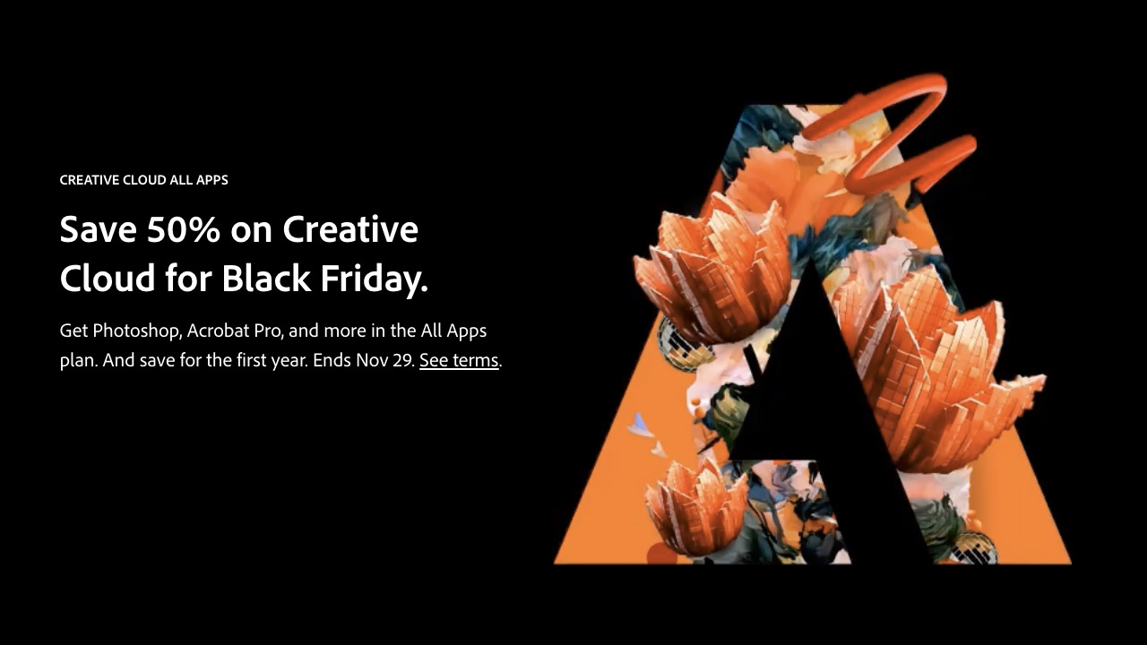
Adobe ➔
50% off all apps and plans through 11/29
aescripts ➔
25% off everything through 12/6
Affinity ➔
50% off all products

Battleaxe ➔
30% off from 11/29-12/7
Boom Library ➔
30% off Boom One, their 48,000+ file audio library
BorisFX ➔
25% off everything, 11/25-12/1
Cavalry ➔
33% off pro subscriptions (11/29 - 12/4)
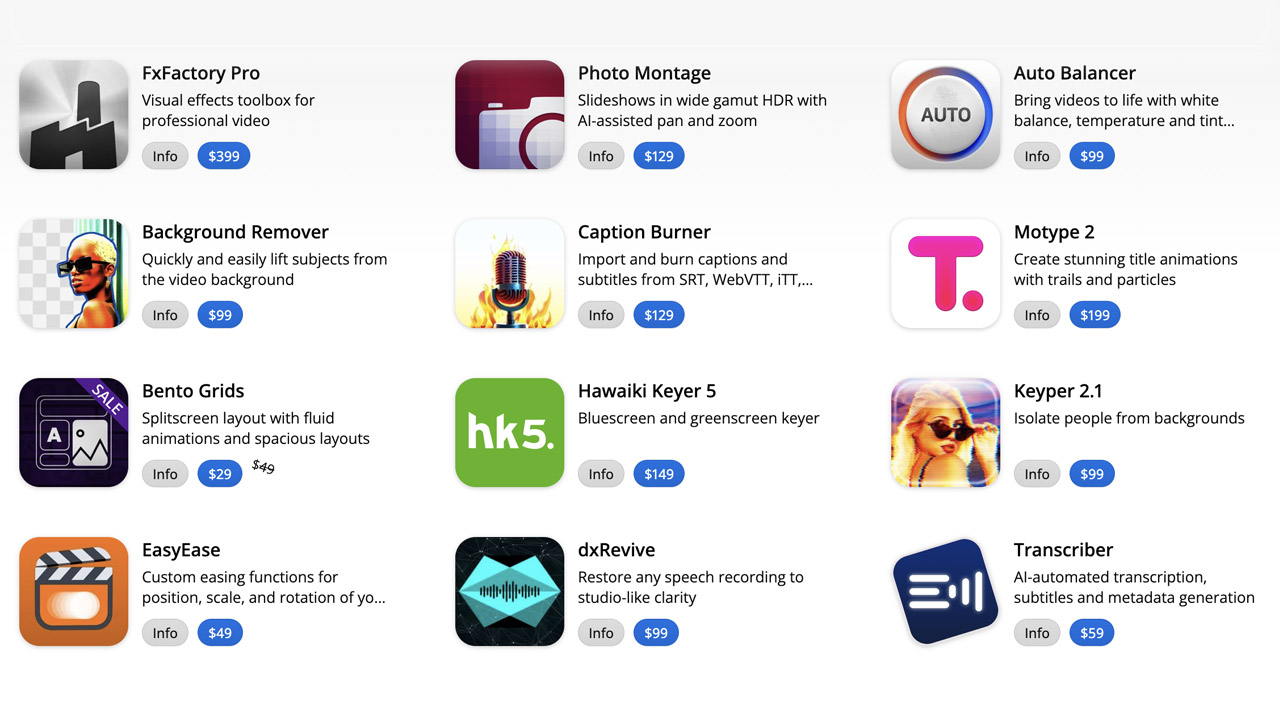
FXFactory ➔
25% off with code BLACKFRIDAY until 12/3
Goodboyninja ➔
20% off everything
Happy Editing ➔
50% off with code BLACKFRIDAY
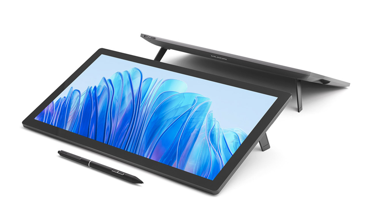
Huion ➔
Up to 50% off affordable, high-quality pen display tablets
Insydium ➔
50% off through 12/4
JangaFX ➔
30% off an indie annual license
Kitbash 3D ➔
$200 off Cargo Pro, their entire library
Knights of the Editing Table ➔
Up to 20% off Premiere Pro Extensions
Maxon ➔
25% off Maxon One, ZBrush, & Redshift - Annual Subscriptions (11/29 - 12/8)
Mode Designs ➔
Deals on premium keyboards and accessories
Motion Array ➔
10% off the Everything plan
Motion Hatch ➔
Perfect Your Pricing Toolkit - 50% off (11/29 - 12/2)

MotionVFX ➔
30% off Design/CineStudio, and PPro Resolve packs with code: BW30
Rocket Lasso ➔
50% off all plug-ins (11/29 - 12/2)
Rokoko ➔
45% off the indie creator bundle with code: RKK_SchoolOfMotion (revenue must be under $100K a year)
Shapefest ➔
80% off a Shapefest Pro annual subscription for life (11/29 - 12/2)

The Pixel Lab ➔
30% off everything
Toolfarm ➔
Various plugins and tools on sale

True Grit Texture ➔
50-70% off (starts Wednesday, runs for about a week)
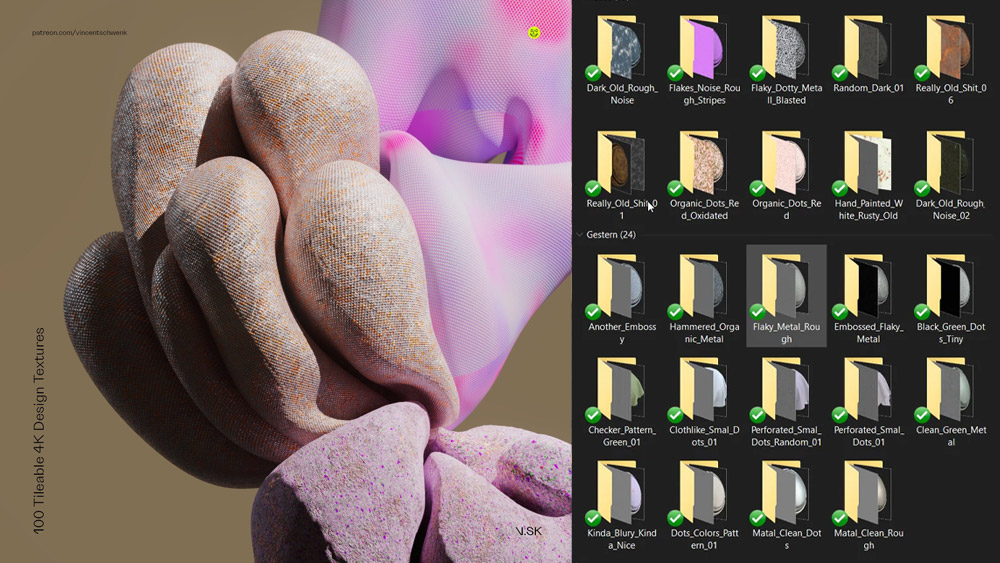
Vincent Schwenk ➔
50% discount with code RENDERSALE
Wacom ➔
Up to $120 off new tablets + deals on refurbished items


All-Access Pass
Unlimited access to 50+ courses, unlimited critique, live events, and 24/7 community. Join School of Motion All-Access today.