Start Your 3D Journey in Cinema 4D
Master the essentials of 3D modeling, lighting, and animation in C4D. Enroll in All-Access to unlock C4D Basecamp and 50+ other courses.

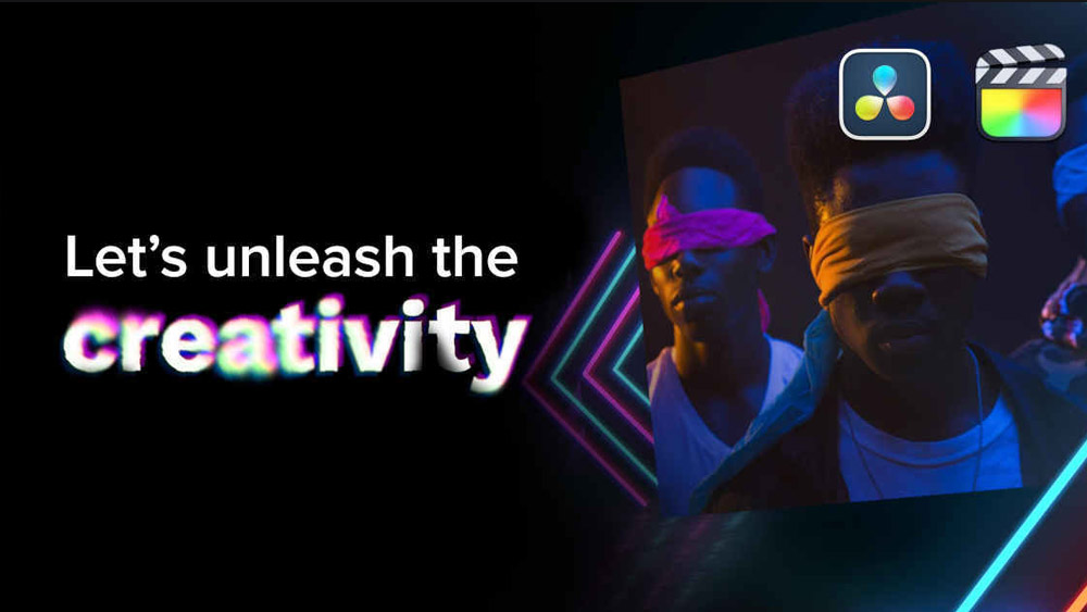
How to take your renders to the next level with color theory and grading.
In this tutorial, we're going to explore Color Theory and color grading. Follow along to get tips for creating better renders!
You'll learn how to:
- What is Color Theory?
- Choose color schemes
- Utilize exposure and gamma controls
- Understand and use highlight rolloff
- Use Look Up Tables (LUTs)
- Use color to integrate 3D objects into a scene
- Use DaVinci Resolve
In addition to the video, we've created a custom PDF with these tips so you never have to search for answers. Download the free file below so you can follow along, and for your future reference.
{{lead-magnet}}
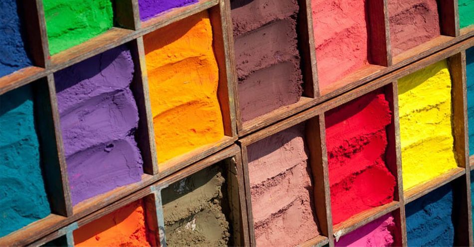
In motion design, and really all visual arts, Color Theory is practical guidance to color mixing and the effects of a specific combination. Colors can affect the mood of a painting, the story telling, and how characters are perceived.
Much of the job of crafting images in photography or film is done by the photographer or DP, but often the Colorist sweetens the image or even radically changes the look in post. If we train ourselves to be better colorists, our renders will benefit from these techniques greatly.
Just the act of choosing specific colors to use in our scenes can be a powerful way to bring design and life into our renders.

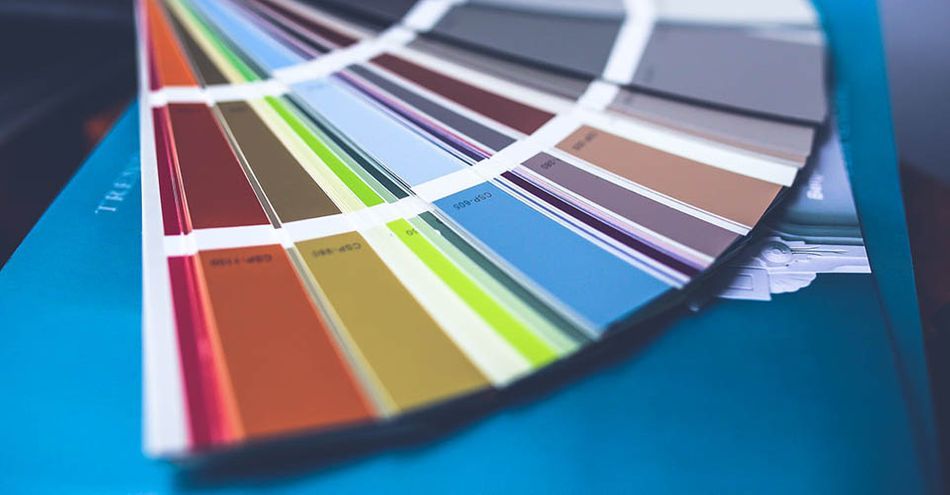
For example, using Adobe Color we can create various color schemes—complementary, split complementary, tetradic, monochromatic, and analogous—and then apply these to our texturing and lighting work.
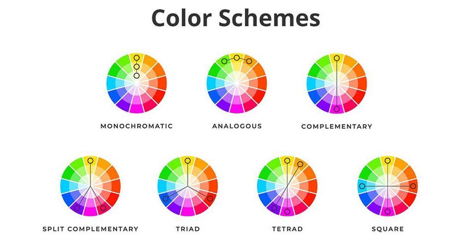
An obvious and popular combination is cyan and orange (as seen in Transformers) because those are complementary colors—and skin tones are orange in general, so they contrast very nicely with cyan.
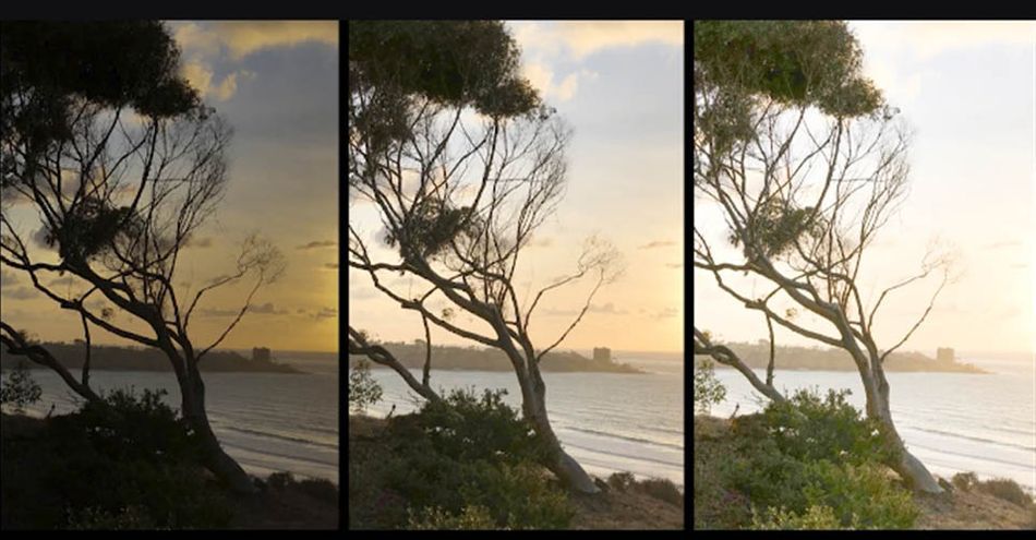
Other super important controls are exposure and gamma, and all third party renderers have controls like these for exposure. For instance, here my highlights are blown, so I just need to pull down the exposure. Or here, I can drop the gamma to gain more contrast, but increase the exposure because that caused the render to go too dark.
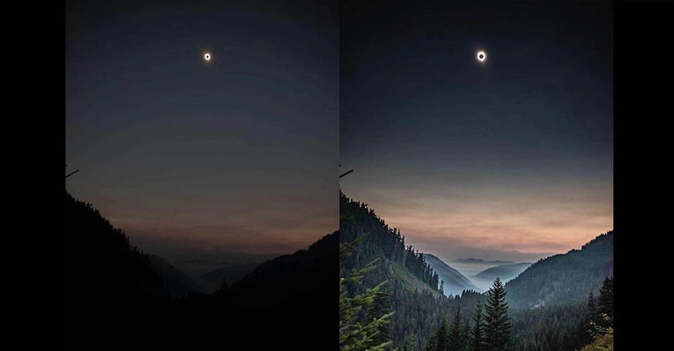
With high-end cameras, we get more dynamic range. Cameras such as the Arri Alexa also produce an amazing highlight rolloff, which means rather than clipping at a hard white, they attempt to compress those highlights into a softer gradient that clips in not such a harsh manner. Often colorists work to produce this effect in the grading suite.
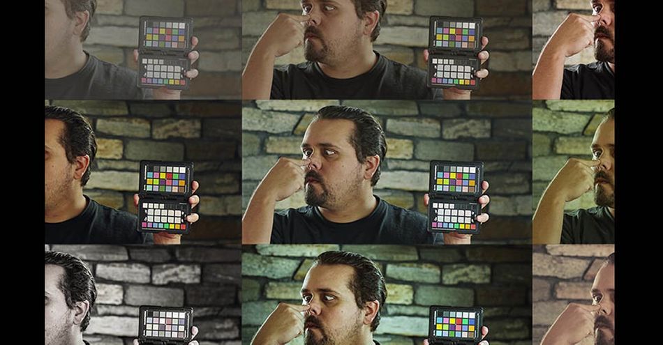
I love to use LUTs in Octane, much like a DP using a viewing LUT in his or her monitor. LUT stands for Look Up Table, and it just means a color transform or color grade where values are shifted across the board.
Some of my favorites are from this Osiris pack, and I especially love vision 4 and vision 6 because they constrain the palette without overly wrecking the colors. I prefer LUTs that are subtle to ones that are super heavy handed.
One LUT never fits all, so it’s good to try a bunch, kind of like instagram filters.
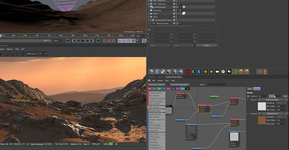
Another instance where we need to be concerned about color is in terms of texture and integrating 3D objects together. For example, this displacement texture doesn’t match the dusty sand very well at all, but if I go in and alter the hue, saturation, and value of the diffuse, we’re getting much closer. Also, we can do a trick here that integrates these rocks further by using a falloff node set to normal vs vector 90 degrees, and then creating a more reddish sand color that pools around the base of all the rocks.
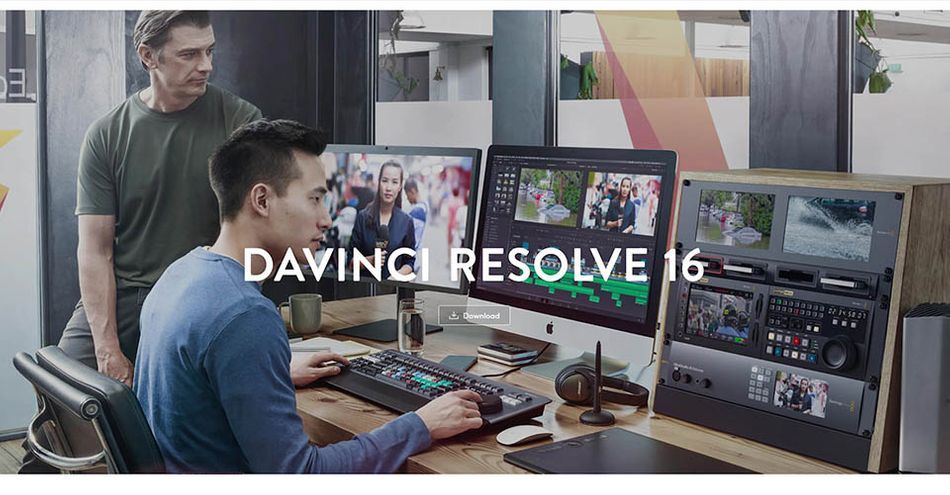
It is very helpful to learn color grading tools to sweeten your renders even further. My favorite is DaVinci resolve, a free tool that combines editing, color correction, visual effects, motion graphics and audio post production all in one software tool. I go in-depth in the video above on how DaVinci Resolve enables me to fine tune my renders and try out a number of looks.
Understanding color theory and utilizing it in your renders puts you in elite company. There are so many amazing artists out there that skip this crucial step. You can get your work to a professional level with enough time and practice, but having the patience and understanding to grade like a true Colorist will separate you from the pack.
Want more?
If you're ready to step into the next level of 3D design, we've got a course that's just right for you. Introducing Lights, Camera, Render, an in-depth advanced Cinema 4D course from David Ariew.
This course will teach you all of the invaluable skills that make up the core of cinematography, helping to propel your career to the next level. You’ll not only learn how to create a high-end professional render every time by mastering cinematic concepts, but you’ll be introduced to valuable assets, tools, and best practices that are critical to creating stunning work that will wow your clients!
-----------------------------------------------------------------------------------------------------------------------------------
Tutorial Full Transcript Below 👇:
David Ariew (00:00): Colorists enhance the lighting created by the director of photography, drawing us into the picture and subtly influencing our emotions with color by training ourselves, to be better colorists, we can create more evocative renders.
David Ariew (00:19): Hey, what's up, I'm David Ariew and I'm a 3d motion designer and educator, and I'm going to help you make your renders better. In this video, you'll learn how to choose color schemes for your renders. Utilize exposure and gamma controls, understand highlight roll-off and bring that property into our renders. Use Lutz or look up tables, use color to integrate 3d objects into a scene, and finally use DaVinci resolve to bring the most out of our renders. If you want more ideas to improve your vendors, make sure to grab our PDF of 10 tips in the description. Now let's get started much of the job of crafting images and photography or film is done by the photographer or director of photography, but often the colorist sweetens the image, or even radically changes the look in post. If we train ourselves to be better colorists, our renders will benefit from these techniques greatly.
David Ariew (01:04): Just the act of choosing specific colors to use in our scenes can be a powerful way to bring design and life into our renders. For example, using Adobe color, we can create analogous monochromatic, triadic, complimentary and split complimentary schemes as well as a bunch of others. And then apply these to our texturing and lighting work. For instance, here in my ice caves music video, I went with a fairly analogous scheme ranging from cyan to blue, to purple to magenta. I've got a similar thing going on in this Intel video with an even more constrained, analogous scheme of blue and cyan, but at certain points I bring in a complimentary scheme of cyan and orange. This one is really popular in blockbuster movies because skin tones in general are orange. And that contrast very nicely with the cyan background here in this famous image from Steve McCurry, the red is complimentary to the green and this Zed piece.
David Ariew (01:52): I start out with complimentary colors though with the pop of magenta and the Zed logo, but then I move into a double split complimentary situation, which includes yellow, orange cyan, and blue. They're really Adobe color. Doesn't have a color scheme for the situation, which is normally referred to as Techtronic meaning four colors. And here this middle color between cyan and blue, isn't represented in my shots. Now all of this isn't to say that you always have to follow the rules. I like this color scheme here a lot from a render I did for the dead mouse cube, but it doesn't follow any defined scheme. It's got purple, some hits of magenta, kind of a seafoam green, blue, yellow, and a bit of orange all mixed together. And I think it looks great. Other super important color controls our exposure and gamma and all third party renderers have controls like these, for instance, here, my highlights are blown, so I just need to pull down the exposure or here I can drop the gamut to gain more contrast, but that made the render a bit too dark.
David Ariew (02:44): So I can compensate by raising the exposure with higher end cameras. We get more dynamic range, which just means we can see more into the shadows and the highlights and cameras like the Arri. Alexa also produce an amazing highlight roll off, which means that rather than clipping harshly at white, they attempt to compress highlights into a softer gradient that clips, but not in such a harsh manner. Often colorists also work to produce this effect in the grading suite. Octane has a nice control for this here called highlight compression. And this is what the shot looks like before and after you can see how this slider really helps to reign in the highlights and create a nice effect. I don't use this all the time though. Cause sometimes it can create an overly low contrast look. And other times I do just want really harsh highlights in my shots.
David Ariew (03:24): Next, I love to use Luts and octane to view through much like a DP using a viewing lens in his or her monitor, let stands for lookup table. And it just means a color transform or a color grade essentially where color values are getting shifted across the board. Some of my favorite LEDs are from this old Cyrus pack and I especially love the vision for envision six lots because they constrain the color palette without overly wrecking the colors. I prefer lots that are subtle than ones that are super heavy handed. Here's how we add them in octane in octane camera tag, we just go to our camera imager tab and then click on enable camera imager here. When we troll down custom led, we can just go to our field and select the light. And that's all there is to it. One leg never fits all.
David Ariew (04:03): So it's good to try a bunch kind of like Instagram filters and this can be used in combination with the white balance control here. For example, this led shifted things to blue for me here. So I can compensate against that by dialing blue into the white balance. And now I've got a healthier range of colors going on. Another instance where we need to be concerned about color is in terms of texturing and integrating 3d objects together. For example, here are these rocks from this displacement texture don't match the dusty sand very well at all. And if I go in and mix a reddish brown color into the diffuse map of the material, we're getting much closer. Also, we can do a trick here that integrates these rocks further by using a falloff node set to normal versus vector 90 degrees, and then creating more of a sand color that pulls around the base of these rocks.
David Ariew (04:45): This really blended in nicely. And just to explain this in more detail, what's happening is only the more vertical surfaces are being selected here, which you can see if I change the color to a bright red. And that just makes it feel like the sand is collecting in these areas. Rendering object buffers is also extremely useful for adding more contrast to your hero characters and bringing more attention to certain focal points within your scenes. On top of all of this, it's very helpful to learn, to use color grading tools, to sweeten your renders even further like DaVinci resolve, which is free and my personal favorite. So here, I've got an ungraded version of my render and I'm just going to drag this into the media pool and resolve, and then I'll jump into the cut here. And then I'll drag this down here to create a new timeline and then I'll just jump over to color.
David Ariew (05:25): And so here, we've got access to a bunch of color controls, including scopes, which are really helpful for viewing the information about the color. Our main controls are down here and I'm just going to take the lift for starters, which means our shadows and drag this down a little bit. Now we also need to bring the gamma, which means our tones down a little bit, and this is starting to look a lot more healthy at this point. We can also come over here and just add a new node with alt S, which means new serial node. And here I've got a bunch of my favorite Lutz and if I just mouse over them, then we can see a preview. KTX is pretty nice. Vision six is one of my favorites and vision four is great too. I'm going to go for vision four and just click.
David Ariew (06:02): And now we've applied the what? Now, if we want to dial back on the strength of this, we can actually come over to our key window here and just take our key output down, which basically just mixes up and down the whole node though. I'm pretty happy with it at one, if you've got it set to a certain number and you want it to jump back to the default, you can just double click. Now you can see here in our RGB parade that we've got a lot more green in the highlights and less blue. So we've got kind of a yellow tint to the highlights, which I don't mind a ton, but if you want it to neutralize this, you could come over here and start messing with the gain, which just means the highlights. Now here, it's going to act really weird and you're never going to get what you want because we're actually grading through the lot right now.
David Ariew (06:35): So this can actually be a cool thing. Like if we come to the gamma, we can really shift the colors around here to get some pretty unique results. And I find that grading on the same note as the lot really alters the colors dramatically, but here, I don't think we want to do that. We just want to neutralize. So let's hit all to S again to create another node. So just like after effects, we're applying one correction after another. So here now, if I mess with the gain, you're going to see this behaves a lot more. Normally. Now, if we look over at our parade, we can kind of try and match these a little bit nicer. So something like that, and I can hit control D to disable this or enable it. But honestly, the scopes are not everything. They can give you an idea of where your colors are, but really just user I to judge in this case, I don't really like this note, so I'm just going to delete it.
David Ariew (07:17): Okay. So now I'm going to create a new serial note here with alt S and then this is kind of an interesting thing we can do. We can bring up the gain to get a much brighter exposure. And at this point we're clipping our highlights, but say, we want this exposure with real and highlights. What we can do is we can come over here and jump from primary wheels to log. And here, these color controls are a lot more narrow than our primary wheels and only affect a small slice of the picture. So here, if we zoom into this highlight and we dial back on this highlight wheel, we're just going to compress the highest highlights down into this region. So let's bring this down until we're just shy of weight and you can see how, when I'm altering this, it's really just effecting this top range of image versus when we're in primary wheels.
David Ariew (07:57): And I mess with the gain, we're affecting a lot more of the picture, same thing with, mid-tones see how we're just affecting that little slice and shadows. Now you can do funky things with this by accident. If I dial down on the shadows, you'll see it kind of gets this weird unnatural look with very dark shadows here and not so dark shadows here. So I don't tend to mess with these color controls that much, but I do like this little trick of bringing up your exposure and the primary wheels using the gain, and then bringing it back down to recover the highlights in the log. Now at this point, this is way too bright. So if we come back to our primary wheels, we can mess with the gamut a little bit. And then if we enable and disable this, we can see that we brought up the exposure without blowing things out, which is pretty cool.
David Ariew (08:42): Now, maybe I find this correction a bit too extreme. I can come into our key input here and just take the gain down to maybe half strength. And now you can see the difference that it's made. Now let's add yet another note with all S and then if we come over to our curves, we can definitely do some cool contrast curves here and alter the look. But instead of that, I'm actually going to come over here and choose a different kind of curve. So we've got Huey versus Hugh, where if we pick a Hugh like this, we can shift the color of that hue. So for instance, say we wanted to change the color of our red sign here. We can just pick this color and then start shifting it. Let's make it a bright pink, and here's all the things we're affecting. So it is affecting kind of a lot of the image, but that's okay.
David Ariew (09:22): It's looking a little bit hyper saturated, so we can jump down to the next curve here and choose you versus saturation and choose this same color. And then just de-saturate. So if I hit control D to disable this, you can see how we're shifting the reds in our scene. Next, if I jumped down to luminance vs saturation, this one's pretty interesting where I can de-saturate either the shadows or the mid-tones or the highlights in our shot. So say, I just want to neutralize all these highlights to the same kind of white color. I can just drag down here and you can see them all coming up to the same line. And if we look over here at the noodle signs, say, you can see these going from a bit of a yellow, to more of a true white same thing here. We've got a bit of yellow cast, and now it's more white.
David Ariew (10:03): So this is very much like our saturate white slider that we saw in octane. We could also go in and de-saturate the shadows. If we wanted to just like this, though, you have to be careful because see how this is kind of tearing apart, because I've made such a harsh curve. We want to drag this out. So it's much more of a soft gradation. Now, I don't think I want to de saturate the shadows. So I'll just hit undo on that. And if you want to reset any window, you can just click here. Now say we like this grade, what we can do is we can actually save the memory by hitting all one or all two, or all three, whatever you want. And then let's create a totally new grade and just delete all of this, add in a new node. And then we'll just try out a totally different Le like vision X here, and then I'll drag down on the lift.
David Ariew (10:48): And now we'll hit all two to save that. And then let's just right. Click and reset this. And then we can go for this one, which is pretty crazy, same thing, dragged down on the shadows and see how in this node, we're never able to hit black because we're grading through the lot and that's constraining us. So let's add another serial node and then bring it down to black, maybe boost the mid-tones. Okay. And then we'll hit all three to save that as our third grade. Now, if we hit control one, we can jump back to our first grade control. Two is our second grade and control three is our third grade. So it's really easy to store a bunch of different looks and experiment in a program like this. We can also do things like add in power windows here. If I just create a new node, I can click on this circle button and then just drag this out and change the shape to whatever I want.
David Ariew (11:33): And then this is the feather. So it's really quick to add a vignette here, and then I can just drag down on the gamma and then we'll invert it here. And we've got ourselves a vignette. Then we can take down the opacity so that we're not darkening the edges too much. So there's a before and after. So that was a very quick rundown on resolve. There's a ton that I didn't cover, but you can see just how powerful of a program it is for manipulating color. By keeping these tips in mind, you'll be well on your way to consistently creating awesome renders. If you want to learn more ways to improve your renders, make sure to subscribe to this channel and hit the bell icon. So you'll be notified when we drop the next tip.
ENROLL NOW!
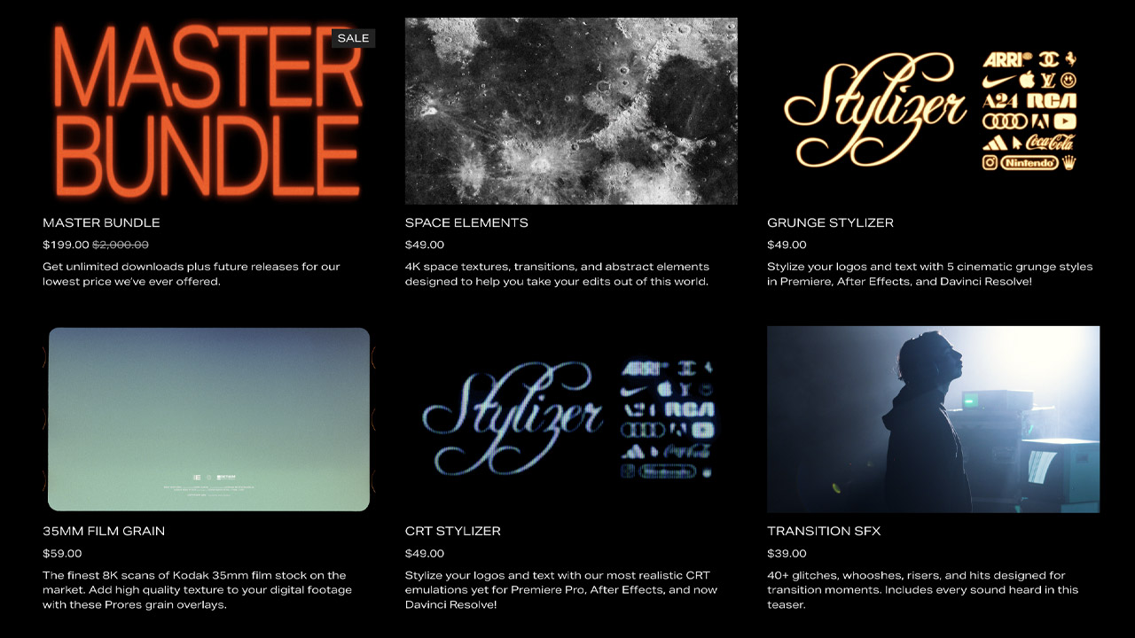
Acidbite ➔
50% off everything
ActionVFX ➔
30% off all plans and credit packs - starts 11/26
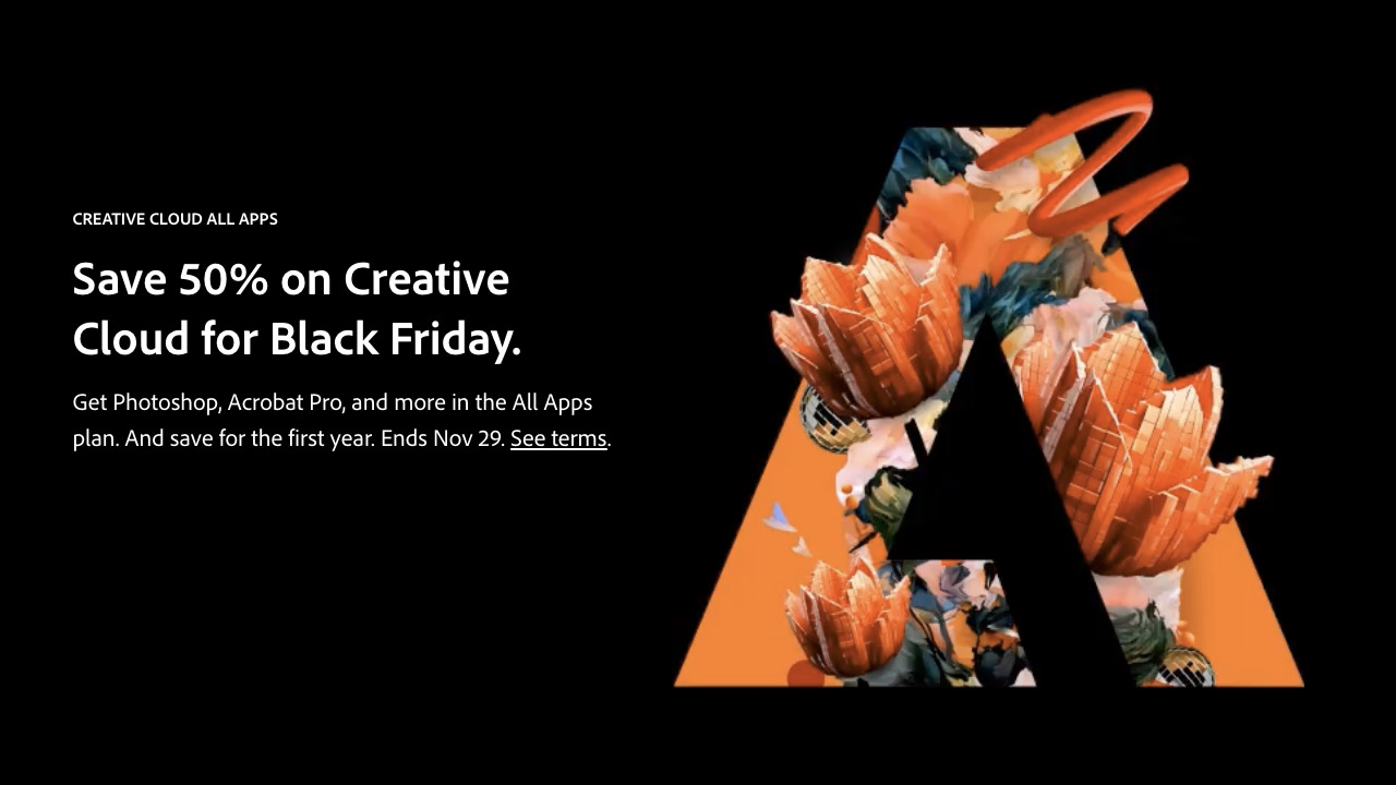
Adobe ➔
50% off all apps and plans through 11/29
aescripts ➔
25% off everything through 12/6
Affinity ➔
50% off all products

Battleaxe ➔
30% off from 11/29-12/7
Boom Library ➔
30% off Boom One, their 48,000+ file audio library
BorisFX ➔
25% off everything, 11/25-12/1
Cavalry ➔
33% off pro subscriptions (11/29 - 12/4)
FXFactory ➔
25% off with code BLACKFRIDAY until 12/3
Goodboyninja ➔
20% off everything
Happy Editing ➔
50% off with code BLACKFRIDAY
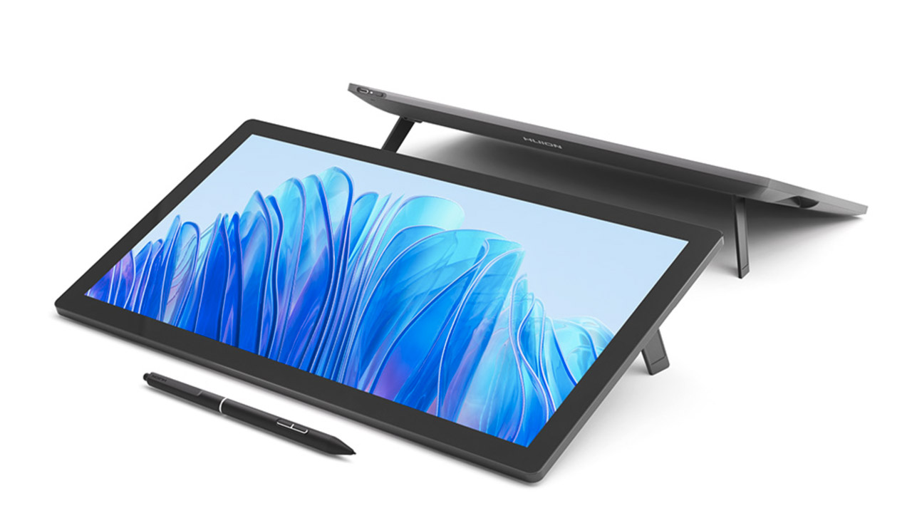
Huion ➔
Up to 50% off affordable, high-quality pen display tablets
Insydium ➔
50% off through 12/4
JangaFX ➔
30% off an indie annual license
Kitbash 3D ➔
$200 off Cargo Pro, their entire library
Knights of the Editing Table ➔
Up to 20% off Premiere Pro Extensions
Maxon ➔
25% off Maxon One, ZBrush, & Redshift - Annual Subscriptions (11/29 - 12/8)
Mode Designs ➔
Deals on premium keyboards and accessories
Motion Array ➔
10% off the Everything plan
Motion Hatch ➔
Perfect Your Pricing Toolkit - 50% off (11/29 - 12/2)
MotionVFX ➔
30% off Design/CineStudio, and PPro Resolve packs with code: BW30
Rocket Lasso ➔
50% off all plug-ins (11/29 - 12/2)
Rokoko ➔
45% off the indie creator bundle with code: RKK_SchoolOfMotion (revenue must be under $100K a year)
Shapefest ➔
80% off a Shapefest Pro annual subscription for life (11/29 - 12/2)

The Pixel Lab ➔
30% off everything
Toolfarm ➔
Various plugins and tools on sale
True Grit Texture ➔
50-70% off (starts Wednesday, runs for about a week)
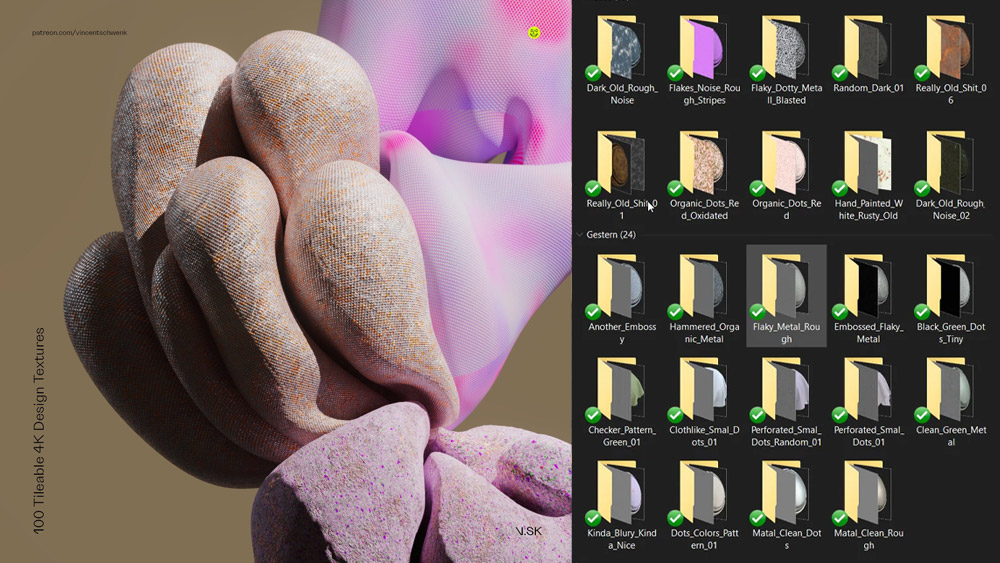
Vincent Schwenk ➔
50% discount with code RENDERSALE
Wacom ➔
Up to $120 off new tablets + deals on refurbished items


Start Your 3D Journey in Cinema 4D
Master the essentials of 3D modeling, lighting, and animation in C4D. Enroll in All-Access to unlock C4D Basecamp and 50+ other courses.