All-Access Pass
Unlimited access to 50+ courses, unlimited critique, live events, and 24/7 community. Join School of Motion All-Access today.
Spice up your title design with these After Effects tips for video editors
You're comfortable editing video, but are your titles a little...half-done? Do those lower thirds seem flat and uninteresting? Is your typeface competing with your images for attention? Sounds like you need some fundamental title design tips...and it just so happens, we've got a few.
We’re back for the third and final part of this title sequence upgrade—make sure to check out parts one and two if you haven’t already. Today, we’ll be covering:
Let’s finish this thing up!
Useful Design Tips for Titles
We’ve been working on upgrading this title sequence for two tutorials, and it's time to finish things up. We’ve arrived with something that’s definitely an improvement, but I think we can go even further and have these titles actually make sense for the concept of our show.
Now, you might consider yourself an editor with no real design training. Sure, you've developed your critical eye and have a sense for placement, but there are design fundamentals that can improve any composition. Obviously we can’t cover everything in a few paragraphs, but I’m going to try to quickly run through some tips I wish I’d known a long time ago.
READABILITY
Readability should be priority number one. If you’re putting text on a screen, people are going to try to read it, and they’ll be frustrated if they can’t.
If you’re putting that text over moving footage—especially if it’s only up for a short time—you need to make it as easy to read as possible. This provides the “why” for most of the following tips.
TYPEFACE
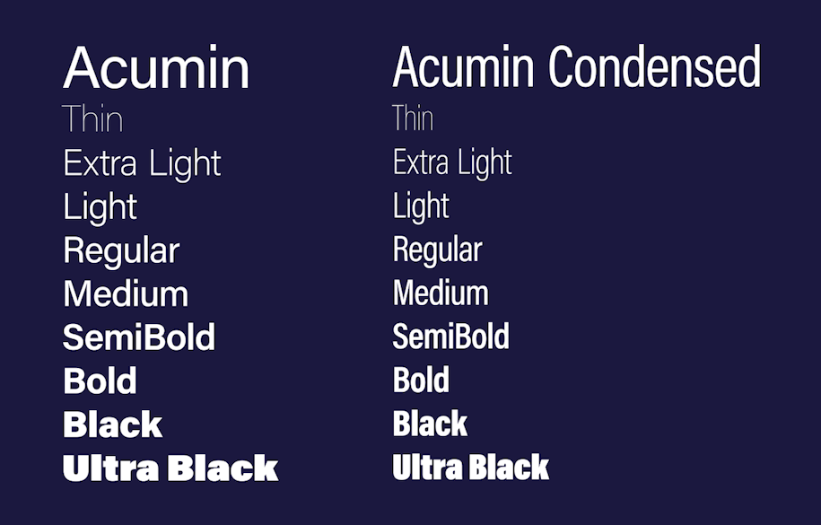
We already talked a little bit about choosing typefaces, and how a sans-serif typeface is usually going to be a safe choice for video. They’re easier to read, and while they can definitely have different styles, they’re usually cleaner and more neutral. We generally want to complement the video content, not overpower it, right?
Generally speaking, find a solid sans-serif choice that has multiple weights and styles available. It’s going to give you a lot of options, and opportunities to create some contrast while keeping a consistent feel.
CONTRAST
Contrast can mean many things. I would highly recommend checking out this other tutorial by Mike Frederick that goes far more in-depth with these ideas, and how to use them to create interesting and effective title designs…but here’s the quick version.
The most obvious kind of contrast for us is probably contrast in value, or Light vs Dark. You need to color your text properly, and find an area of the frame where it can hold its own against the footage. If you don’t have an appropriate area with enough open space, that’s when you start thinking about boxes or those "good old" drop shadows. These additions can call a lot of attention to themselves, so you want to use them thoughtfully.
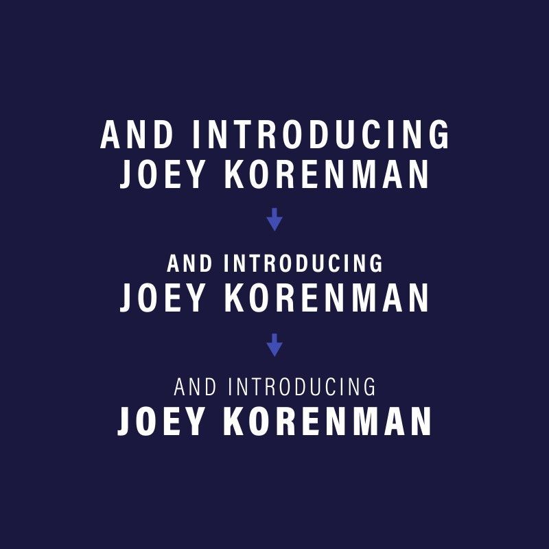
HIERARCHY
Contrast can be a great way to communicate things quickly. Using contrast in SIZE helps communicate which line of text is more important. Different font WEIGHTS contrast two lines even more. This helps establish what’s called hierarchy—the layout and sizing of this type tells our brain what to pay more attention to.
RULE OF THIRD AND GRIDS
Remember that Rule of Thirds I mentioned in the first video?
You can call up rulers in any of Adobe’s design apps by pressing CTRL/CMD + R, and create guides for yourself by dragging them from the ruler bar. In After Effects, you can view a proportional grid by pressing CTRL/CMD+', and you can adjust the settings in Preferences > Grids & Guides.

Grids and guides are very helpful for placement and overall composition, but it can also help you keep tabs on just how big your titles are getting. If you find yourself going too far beyond 1/3 of the width, for example, maybe stop for a second and ask yourself if there’s a reason for it to be so big!
Coming from an editing background myself, I always was curious about design in my own career, but never felt like I was as strong as I could be with it—until I took Design Bootcamp. This course equipped me to make intentional design choices, instead of just trying things until it kinda worked. The quality of my work, not to mention the confidence boost it gave me, was a huge step up. If this little crash course in design piqued your interest, I HIGHLY recommend it.
Reworking our title design

Let’s put some of those ideas into practice. I want to keep these titles fairly simple—mostly just text—but let’s pick a nice typeface that makes sense for this project and see if we can apply some of those design fundamentals.
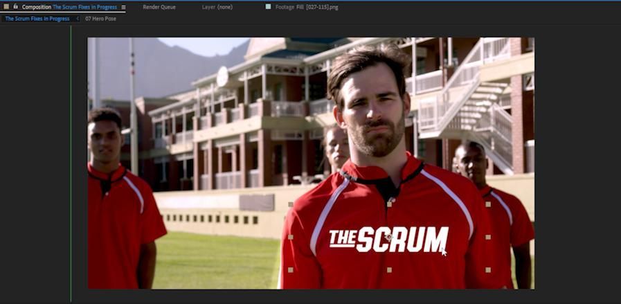
I started by looking at references—always a great way to start out. In most of the examples I saw, the type was usually sitting over a pretty open area, and also pretty small compared to the main subjects of the images.
The references also provided me a couple layout ideas, which you can see above. Rugby is kind of a rough, chaotic game, so I wanted a bold typeface that could stand to be textured ... and maybe I could animate the texture to help it stand out. The bottom-right example stood out to me - but in this case, the texture was already baked into the font.
The typeface I chose is Authority from Retro Supply Company. Fortunately, there’s a Rounded Italic version that has the same feeling, but without the texture - which means I can add my own! Perfect.
It’s still nice and simple - just a typeface and this one little element - but we’ve got some nice contrast in size, and I think this has the style I'm after.
You may notice I'm working in Photoshop above; if you’re already comfortable working in Photoshop or Illustrator, you can absolutely work there first! Design is what those apps are made for, and they both have ways to import your work into After Effects. Now let’s bring our titles into AE, and animate them.
Animating titles in After Effects
IMPORT YOUR TITLE INTO AFTER EFFECTS
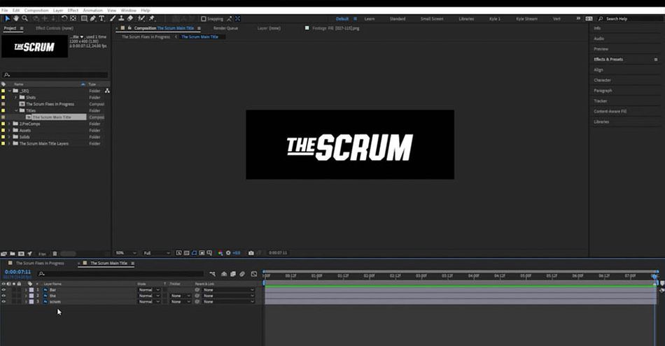
I’ll start out by importing my Photoshop file—Composition > Retain Layer Sizes. This creates a Composition, which will be our composed layout from Photoshop, and a folder with the layers inside it.
Now let’s bring this title down into our timeline, just above our last shot. I’d like this to align the title with the beginning of the shot, so if I start dragging it and then hold Shift, it’ll snap into place. I’m going to position that over the player's chest, and scale it down just a bit.
Diving inside this precomposition, I’d like to try that same Tracking animation we used in our previous video. This text isn’t actually editable right now, but we can change that! I just need select that layer, come up to the Layer menu > Create > Convert to Editable Text. See how the icon changed? Now it’s editable! Awesome.
APPLY TEXT ANIMATION PRESET TO YOUR TITLE
I’ll come to my Effects and Presets panel, search for “tracking,” and grab that Increase Tracking preset that we used back in the first video.
Hit Home to move to the first frame, then double-click the preset.
All right, and let’s reveal those keyframes by pressing U. As you probably remember, this is going to be way too much, so let’s go to the second keyframe and change that to 4. I think that’ll be a good amount.
I’ll drag this second keyframe out to our marker holding Shift again to snap, to the end of the timeline in this case.
CREATE AND ANIMATE THE BAR MATTE
I would also like to see if we can do something with this bar element. I'll start by hitting CTRL/CMD + D to duplicate, renaming the copy "Matte." On this new copy, I'll scale that up just a bit, then I’ll right-click on Position and choose Separate Dimensions. We’re only going to be moving this on X—horizontally—and I’d like a little more control.
Around one second, make a keyframe on the X Position, hit Home to jump back to the first frame, and then scoot this off to the left until it’s just past the first bar.
On the original copy of the bar, we'll look under the TrkMatte column in the modes panel. (If this isn't visible, press Toggle Switches/Modes at the bottom of the timeline panel, or press F4.) Choose Alpha Matte "Matte", meaning it will use our "Matte" layer as a ... matte for this layer.
As "Matte" this moves into place, it’ll reveal (the visible version of) the bar. Nice.
APPLY AND ANIMATE THE TEXTURE
I'd like to create that texture we saw back in the original design, but creating it here in After Effects means it's easily animated, and I can make it look just the way I want.
I’ll choose Layer > New > Solid. Let’s go ahead and rename this layer “Texture.”
I'll come over to Effects and Presets and search for “fractal.” Grab the Fractal Noise effect and apply it to the Solid layer. This effect is great for generating all kinds of textures - we just need to dial in these settings.
I'm going to crank up the Contrast to about 300 and Set the Brightness to 120. Now, I just need to open up Transform and turn the Scale way down to 12.

Now, I want this to move, and fortunately that’s also built right in. Let's come down to Evolution, create a keyframe at the first frame, and then hop to the end and set this to 50 full rotations.
I'm actually going to make a second copy of this noise, by using CTRL/CMD + D to duplicate it. Set the Scale just a little bit smaller for some variety. This effect actually has a blending mode built right into it - it's a dropdown at the very bottom of the controls. I can set this to Multiply itself over the other instance of the Fractal Noise effect. We just got twice the texture!
Lastly, I'll open up Evolution Options and change the Random Seed property to any other number, just so it doesn’t look too similar to the first version of the effect.
I'll finish this off by applying a Posterize Time effect, set to 2 - now this entire layer (but only this layer) will run at 2 frames per second. Lastly, I'll set this layer's Blending Mode to Stencil Luma, meaning its white and black values will determine the visibility of every layer below it, within this composition.
Nice. Looks pretty organic, but we could come back and tweak this some more if we wanted to.
WOULD YOU LIKE TO SEE MORE?
Now we can easily version this out to create our actors' names. We've still got a few other tricks left to finish this thing off properly, so head back up to the video and watch the full tutorial!
After all that work, our final title sequence is a huge improvement over the clunky original.
They've definitely come a long way from where we started, and hopefully you picked up several useful techniques that you can use to start improving your own work right away.
Learn how to design like a pro
Thanks so much for coming along with me on this epic-length tutorial series. It was great having you here. And if we've sparked your interest in diving deeper into the power of design, might we suggest...Design Bootcamp!
Design Bootcamp shows you how to put design knowledge into practice through several real-world client jobs. You’ll create style frames and storyboards while watching typography, composition, and color theory lessons in a challenging, social environment.
ENROLL NOW!
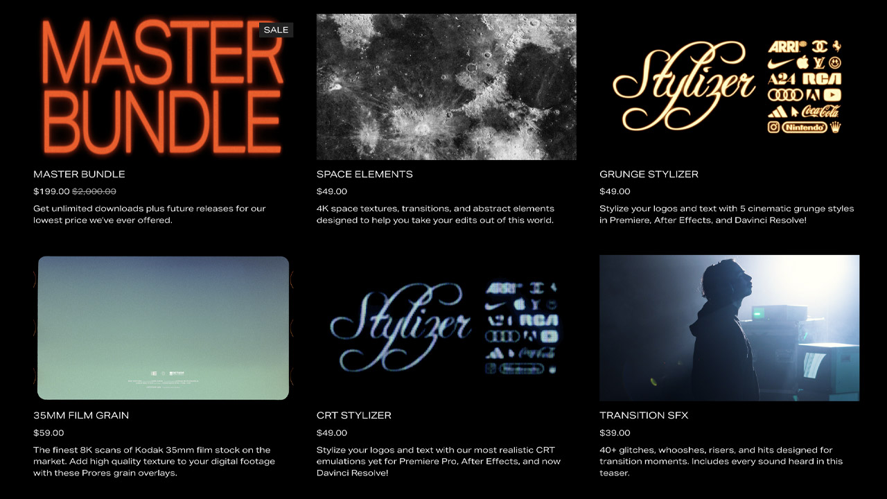
Acidbite ➔
50% off everything
ActionVFX ➔
30% off all plans and credit packs - starts 11/26
Adobe ➔
50% off all apps and plans through 11/29
aescripts ➔
25% off everything through 12/6
Affinity ➔
50% off all products
Battleaxe ➔
30% off from 11/29-12/7
Boom Library ➔
30% off Boom One, their 48,000+ file audio library
BorisFX ➔
25% off everything, 11/25-12/1
Cavalry ➔
33% off pro subscriptions (11/29 - 12/4)
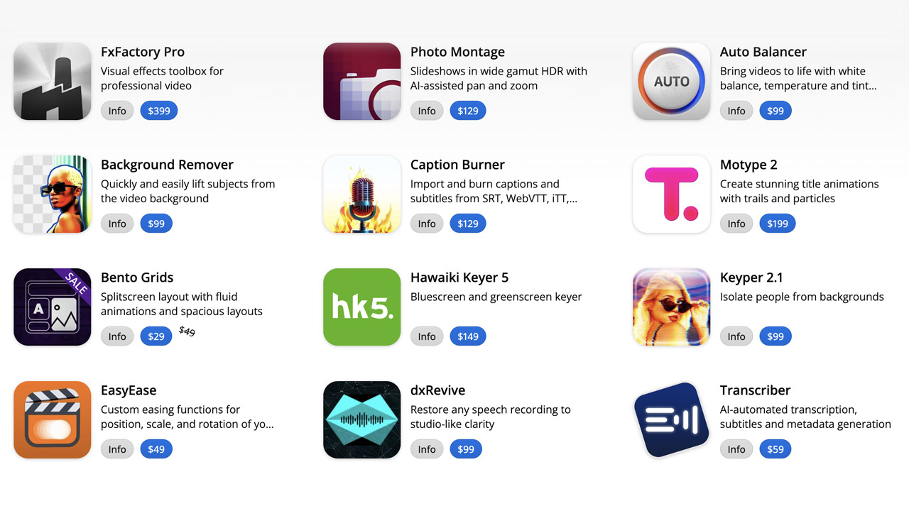
FXFactory ➔
25% off with code BLACKFRIDAY until 12/3
Goodboyninja ➔
20% off everything
Happy Editing ➔
50% off with code BLACKFRIDAY
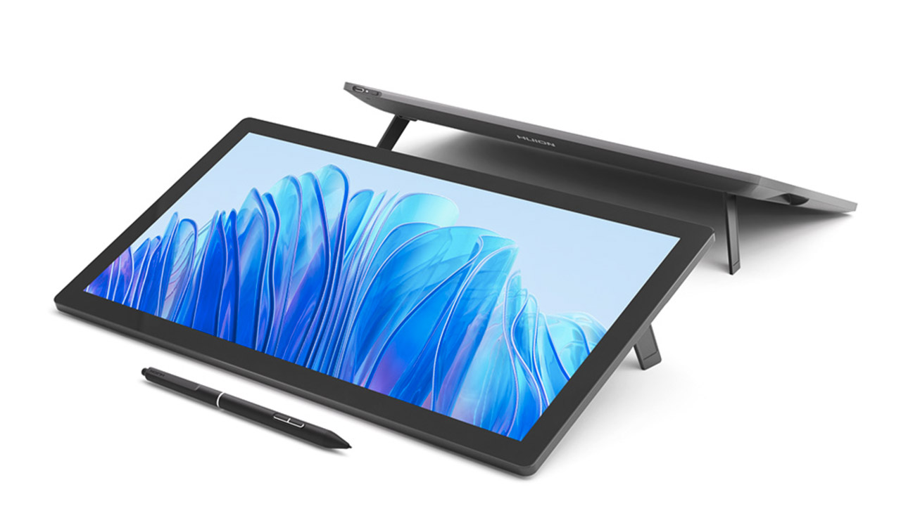
Huion ➔
Up to 50% off affordable, high-quality pen display tablets
Insydium ➔
50% off through 12/4
JangaFX ➔
30% off an indie annual license
Kitbash 3D ➔
$200 off Cargo Pro, their entire library
Knights of the Editing Table ➔
Up to 20% off Premiere Pro Extensions
Maxon ➔
25% off Maxon One, ZBrush, & Redshift - Annual Subscriptions (11/29 - 12/8)
Mode Designs ➔
Deals on premium keyboards and accessories
Motion Array ➔
10% off the Everything plan
Motion Hatch ➔
Perfect Your Pricing Toolkit - 50% off (11/29 - 12/2)

MotionVFX ➔
30% off Design/CineStudio, and PPro Resolve packs with code: BW30
Rocket Lasso ➔
50% off all plug-ins (11/29 - 12/2)
Rokoko ➔
45% off the indie creator bundle with code: RKK_SchoolOfMotion (revenue must be under $100K a year)
Shapefest ➔
80% off a Shapefest Pro annual subscription for life (11/29 - 12/2)

The Pixel Lab ➔
30% off everything
Toolfarm ➔
Various plugins and tools on sale

True Grit Texture ➔
50-70% off (starts Wednesday, runs for about a week)
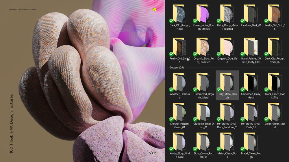
Vincent Schwenk ➔
50% discount with code RENDERSALE
Wacom ➔
Up to $120 off new tablets + deals on refurbished items


All-Access Pass
Unlimited access to 50+ courses, unlimited critique, live events, and 24/7 community. Join School of Motion All-Access today.